hpyhnt 1000
Well-Known Member
Yeah, I think it was Earth Station that was that light blue. CCore looks like it was tan with brown trim back then,
One more thing, I'm almost certain that Innoventions has been repainted within the last few years. Its color is more of an earthy/mocha brown with a darker trim rather than the salmon pink we all loved to hate. Actually, its now almoost in the same color palette as the original color scheme of CCore.
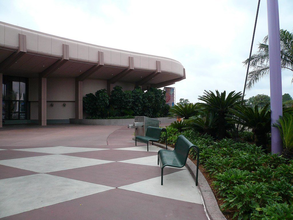
This doesn't look like salmon pink to me... :shrug:
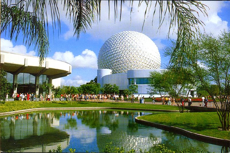
Here's that old salmon pink...

Notice how the support trim color used to be a really light pink.It is defintiely much darker and much more brown these days.
One more thing, I'm almost certain that Innoventions has been repainted within the last few years. Its color is more of an earthy/mocha brown with a darker trim rather than the salmon pink we all loved to hate. Actually, its now almoost in the same color palette as the original color scheme of CCore.
This doesn't look like salmon pink to me... :shrug:
Here's that old salmon pink...
Notice how the support trim color used to be a really light pink.It is defintiely much darker and much more brown these days.


")