There's never enough purple dragon talk.
Our dear dragon (DD31) being the embodiment of the park, I might as well use him as a bridge to lament the demise of the unity of style and vision as represented by the ubiquitous John Hench purple.
This is unity and harmony. FW West is a cohesive land:
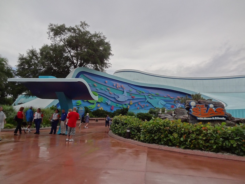
Below is lunacy. As if they gave the park to a few eight year olds.
'..and bring some crayons. We'll be cutting out some cardboard figures too. And decorating some signs. Make sure your kid is wearing old clothes!'
Hell yes....excellent photo references there.
The contrast of the comparisons is stunning.
It clearly puts into focus what the different attitudes are about the Park and it*s concept/purpose was to the folks who originally designed and created it, and what it is currently being thought of by the new regiment.
Quite telling...these images...of not only that aspect, but what the general public is accepting.
Instead of stunning design elements and a real sense of theme, we get bright colors and cartoon settings.
This is NOT the MK. If i want to visit a Park with MK vibes, i go there. When one wants to be mentally stimulated and ( back in the day ) inspired, one would visit EPCOT.
Trying to turn EPCOT into another MK-type of Park is shortsighted and downright nutty to put it mildly.
I suppose someone could look at these photos and say that the original design intent of EPCOT looked *boring* or *dated*. I am not really sure where people get that impression, because in my humble opinion, i find the original Pavilion designs as timeless and beautiful...as building design goes.
I am just focusing on the buildings themselves here, not the various attractions within.
The Pavilions themselves, all the original Pavilions, i do not see as *dated*.
They look just as eye catching today in those old photos as they did back in the day, and even look good today.
Sure things need to be replaced or updated once in while..stuff wears out, tastes change...etc...but why the sudden dramatic change of direction?
The genius of the original designers* intent shines through and each original Pavilions look was indeed timeless. I wish some of those Pavilions had kept their original outer appearance. I know many here will agree that they wish some of the interiors were kept original, too....including attractions.
I understand the need to sometimes freshen things up a bit, but in several cases the change cluttered the senses and took away from the clean, sharp look that they originally had.
The changes made over the years, particularly the color palette, messes with that original design intent.
To sum up my feelings on the matter...
Those folks who painted the place in John Hench Purple, and built buildings that looked like spaceships...and filled said buildings with some utterly amazing concepts that inspired with their forward thinking messages understood what it was all about.
The folks who paint over those purples, demolish the buildings that look like spaceships, and then fill the buildings with some somewhat diluted or downright shallow concepts that are quickly forgotten after the initial thrill do not understand what EPCOT is supposed to be about.
 That's disappointing. I do believe it's time to do something with that area, so it's bittersweet for me.


