using those suggestions, instead of cropping, use the free transform tool, and change perspective, make it thin on the one end and work your way to the larger end, where you would still have those instruments showing.
also, if you are afraid of not having enough to fill in blank space. how about making several layers of one photo, stack them on top of each other, just move each one slightly around. it will look like you have several photos stacked on top of each other.
sort of like a deck of cards pushed over.
clear as mud right?
sorry, just a thought.
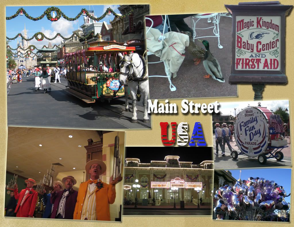
i like the duck photo, but i agree with you, perhaps cropping out a little more of the jacket, or even making the background a bit blurry, keep the ducks in focus.
again, just some ideas.
but overall i like the photos, the one thing i would consider changing would be the cut out of the baby care center. to me it throws the photos off.
again, sorry, just trying to help and give other ideas.