My estimate: they're actually re-theming it as "Tom Morrow-land."I think the problem that I have with what they're doing now is that it feels like a wholesale trade in of Tomorrowland as a themed land for Tomorrowland as a commodity - as if instead of theming the place to any notion of Tomorrow (or some weird, cartoonified, gunked-up version of that) they've decided to theme the place to Tomorrowland™. It's becoming a playground masquerading as a hacked-up version of the vintage Tomorrowland, weirdly built on the grounds and framework of the original, with none of the meat that made that place work and offering no solution to the problems that caused it to be removed in the first place.
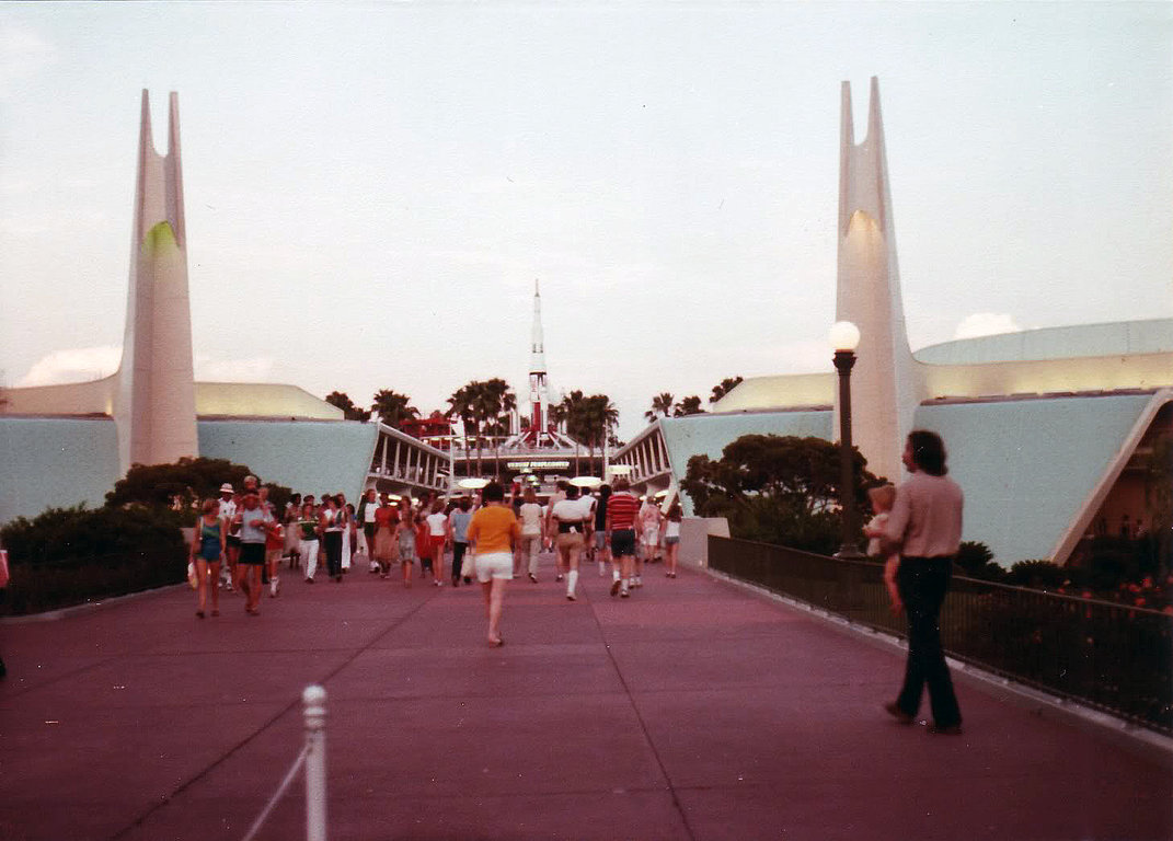
Not only is that a little too self-indulgent, but it's a relatively obscure reference. People like us can appreciate the new color schemes as a throwback, but does anyone else recognize that's what it is? I'd guess that most people - even people who visited back in the heyday of the original - wouldn't get it. So now the land continues to lack futuristic attractions to make the case for any tomorrow-ness, but now it also lacks any visual language that captures any culturally understood version of "tomorrow". At least you could say of the remnants of Tomorrowland 94 that they registered as futuristic-looking. '71 Tomorrowland isn't a large enough touchstone to communicate to the audience that it needs to speak to - unless you actively loved it the first time, you won't get it now.
Not to mention the even more obvious weirdness of the fact that their point of reference for design is now actively the past.
TRON at least suggests an arguably forward-looking aesthetic, but it makes it all the more surprising that they're trying to turn back the clock on the rest of the land instead of dressing things up to agree with the new neighbor. I feel like a "TRON-skinned" Tomorrowland would work much better than this retro palette they've literally painted the land in as a depiction of some version of Tomorrow, plausible or otherwise, and would work to actually unify the land and its old and new offerings. The work they've been doing throughout the land only seem to distance it further from TRON, rather than dress the space in a way that's sympathetic to the new construction. I figured that would have been the top priority of the reskinning.
If you're not building the land's content around the theme of "Tomorrow", at least let the setting sell that theme. Otherwise the name now truly means nothing.
I say this all passing no judgement on the people who like it, I'm just surprised to see Disney play it this way with their Tomorrowland Redo.
-
The new WDWMAGIC iOS app is here!
Stay up to date with the latest Disney news, photos, and discussions right from your iPhone. The app is free to download and gives you quick access to news articles, forums, photo galleries, park hours, weather and Lightning Lane pricing. Learn More -
Welcome to the WDWMAGIC.COM Forums!
Please take a look around, and feel free to sign up and join the community.
You are using an out of date browser. It may not display this or other websites correctly.
You should upgrade or use an alternative browser.
You should upgrade or use an alternative browser.
News Tomorrowland love
- Thread starter marni1971
- Start date
Parker in NYC
Well-Known Member
Before we had glow-in-the-dark aliens...
I'm of the Dreamflight generation - I was so moved to see it again in its entirety. My dad used to cool his heels in the plaza with coffee, most likely striking up conversations with any and all, while I went on the attraction over and over. I miss those trips so much.
Texas84
Well-Known Member
Before we had glow-in-the-dark aliens...
Martin's side-by-side ride through comparison to Buzz is a must see.
Donaldfan1934
Well-Known Member
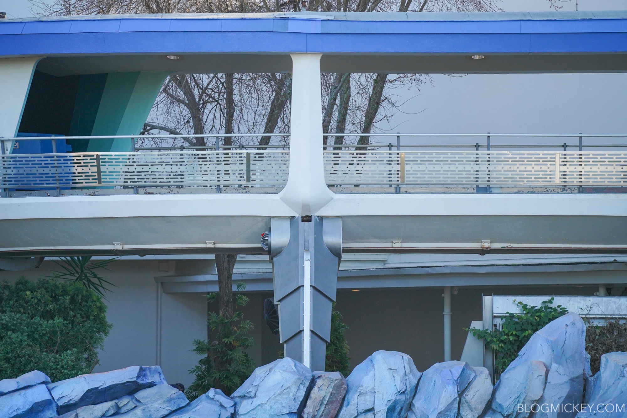
Look on the bright side. The fact that the legs weren’t cheaply altered while under the scrims means there’s still hope for them to be properly removed later. My guess is their removal would also necessitate the removal of the red neon lights under the track, so I assume that process won’t begin until work on the supports is finally completed.Now about the "legs"...


Tomorrowland Visual Refresh Continues at Magic Kingdom; Land Entrance Partially Complete
Walt Disney World news, photos, and reviews! We provide you with daily news from the Walt Disney World theme parks and beyondblogmickey.com
Donaldfan1934
Well-Known Member
While I agree that the CoP sign is a good example of how to bridge the gap between two styles, I disagree that TL ‘94 should be the style to transition from. The original TL style is at least sleek and clean like Tron is while TL’ 94 was the exact opposite with most of its features being made up sharp edges and visible nuts and bolts.I really wish they'd just taken the opportunity to freshen up the parts of TL '94 that had fallen into disrepair and then dress up everything past Rockettower Plaza in a way that transitions from Buck Rogers to TRON. The new Carousel of Progress sign is a good example of a style that could bridge the gap.
trainplane3
Well-Known Member
Oh I'm not going to worry about the legs yet. I will worry if there's an update and they're painted white.Look on the bright side. The fact that the legs weren’t cheaply altered while under the scrims means there’s still hope for them to be properly removed later. My guess is their removal would also necessitate the removal of the red neon lights under the track, so I assume that process won’t begin until work on the supports is finally completed.
I think they should rework the neon to a LED setup that could change color at night. It'd add a nice splash of color to the land and shouldn't be overpowering since it's adjustable. Even better since the PM already has RGB lights above it that are barely used.
Donaldfan1934
Well-Known Member
Agreed.Oh I'm not going to worry about the legs yet. I will worry if there's an update and they're painted white.
Agreed again. Something like that would certainly help it blend in with TRON at night.I think they should rework the neon to a LED setup that could change color at night. It'd add a nice splash of color to the land and shouldn't be overpowering since it's adjustable. Even better since the PM already has RGB lights above it that are barely used.
The land looks better everyday. Hope they are allowed to keep this process going for a long time.
I hear you and @marni1971 are going to see it together when you make your first visit to the MK.
Looks like one of the sections of roof supports is done:

Now about the "legs"...


Tomorrowland Visual Refresh Continues at Magic Kingdom; Land Entrance Partially Complete
Walt Disney World news, photos, and reviews! We provide you with daily news from the Walt Disney World theme parks and beyondblogmickey.com
Wake me up when the bring back the waterfalls.
You know something impressive like this.

rct247
Well-Known Member
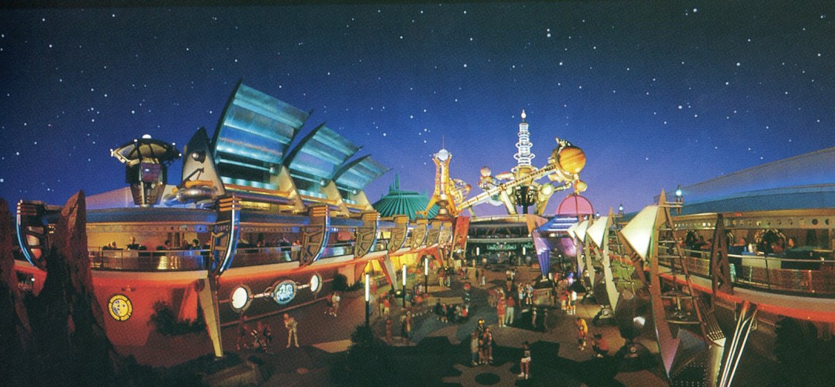
I'm sad seeing Tomorrowland '94 go. I loved the Sci-Fi City concept. I know many of the elements had that industrial 1930s/1940s futuristic look, they could have been changed ever so slightly to be more modern. The removal of the light columns outside of Monsters was a great example of something that could have been kept.

It just looked so vibrant and exciting.

It just looked so vibrant and exciting.
I'm sad seeing Tomorrowland '94 go. I loved the Sci-Fi City concept. I know many of the elements had that industrial 1930s/1940s futuristic look, they could have been changed ever so slightly to be more modern. The removal of the light columns outside of Monsters was a great example of something that could have been kept. View attachment 446726
It just looked so vibrant and exciting.
Man, that land would be always busy, even with no one in it.
trainplane3
Well-Known Member
Wake you up?Wake me up when the bring back the waterfalls.
You know something impressive like this.

Well I guess you'll be sleeping forever then.
I'm sad seeing Tomorrowland '94 go. I loved the Sci-Fi City concept. I know many of the elements had that industrial 1930s/1940s futuristic look, they could have been changed ever so slightly to be more modern. The removal of the light columns outside of Monsters was a great example of something that could have been kept. View attachment 446726
It just looked so vibrant and exciting.
View attachment 446720
I agree, I am quite fond of the steampunk motif, but do have an appreciation of the smooth futuristic modern touch which was originally envisioned.
The problem right now, is that Tomorrow Land doesn't know what it wants to be.
SplashJacket
Well-Known Member
I'm sad seeing Tomorrowland '94 go. I loved the Sci-Fi City concept. I know many of the elements had that industrial 1930s/1940s futuristic look, they could have been changed ever so slightly to be more modern. The removal of the light columns outside of Monsters was a great example of something that could have been kept. View attachment 446726
It just looked so vibrant and exciting.
View attachment 446720
I actually find these photos very interesting.
Tomorrowland 94' has an aesthetic more similar to Discoveryland and what Tomorrowland is becoming most closely resembles Tomorrowland in Shanghai.
Given that Tron is coming to MK I say the transition is justified and will undoubtedly be an improvement.
That being said, I also did not hate the Tomorrowland 94' aesthetic, however, I feel like it was very half-baked. Had it been executed properly it could have lived up to Discoveryland.
Overall, very excited about the improvements. I would like to see some water features pop up.
MadTeacup
Well-Known Member
Sorry to be that guy, but clearly you're all missing the work they've been doing on the legs. They've been replacing the ornaments at the top and bottom that look like a heat sink or other-worldly bolt with a flat, round piece of plastic. I believe they've begun painting some of the legs white as well.Oh I'm not going to worry about the legs yet. I will worry if there's an update and they're painted white.
I think they should rework the neon to a LED setup that could change color at night. It'd add a nice splash of color to the land and shouldn't be overpowering since it's adjustable. Even better since the PM already has RGB lights above it that are barely used.
I totally agree with all the neon. Replace all the red and blue with programmable RGB LEDs.
Last edited:
jt04
Well-Known Member
I actually find these photos very interesting.
Tomorrowland 94' has an aesthetic more similar to Discoveryland and what Tomorrowland is becoming most closely resembles Tomorrowland in Shanghai.
Given that Tron is coming to MK I say the transition is justified and will undoubtedly be an improvement.
That being said, I also did not hate the Tomorrowland 94' aesthetic, however, I feel like it was very half-baked. Had it been executed properly it could have lived up to Discoveryland.
Overall, very excited about the improvements. I would like to see some water features pop up.
"Sci Fi City" steampunk was a great idea but OG T-Land resonates better IMO because it more reflects what Walt Disney designed in his time. It has become iconic and timeless in every sense.
MadTeacup
Well-Known Member
Walt never actually designed anything. He trusted the creative people around him to design wonderful things. It is my belief that despite it negating the original concept of Tomorrowland (a showcase of what the future will hold), the Spaceport theming of Tomorrowland '94 is something Walt would have gotten very excited about. It was a well-planned land with a great story tying all the theming together. Additionally it had fun mini-stories happening throughout, such as RoboNews. If anything, I believe he would have seen a land like TL94 fully funded so that the theming and great storytelling would have carried on throughout the entire land. Mind you, I have no way of truly knowing this. I also hate playin up the Walt nostalgia. Walt's nostalgia was mainly rooted in american history. Otherwise, he didn't exactly strike me as a nostalgic person. I believe the best way to actually honor Walt is by creating change."Sci Fi City" steampunk was a great idea but OG T-Land resonates better IMO because it more reflects what Walt Disney designed in his time. It has become iconic and timeless in every sense.
Register on WDWMAGIC. This sidebar will go away, and you'll see fewer ads.
