Disney Analyst
Well-Known Member
*Muffled screams from below*“Garde a l'eau!” *Splashing noises*
*Muffled screams from below*“Garde a l'eau!” *Splashing noises*
For the record, I'm not upset (I really like this addition to the France pavilion!), maybe just confused.Is the upset that the shutters cover part of a wall that is not a window?
Because, once you put the flower boxes on, you presume the window goes all the way down. That's what the finished product looks like. That's what guests who did'nt follow the construction see. It looks like Parisian windows with flower boxes and shutters...
View attachment 503674
View attachment 503675
For the record, I'm not upset (I really like this addition to the France pavilion!), maybe just confused.
Yes, I think that's what looks odd/off to me. I get that the final result is meant to look like a full-length window (the bottom of the windows are at floor level), and that the "railing" sits in front of the window.
I know that these are just facades on a ride building and that they're not going for realism here, but even just at a glance, it seems off to me.
Maybe it's because the windows on the blue building don't have the appearance of the sort that can open, so my brain can't make sense of what's happening here. There's a small sliver of unthemed wall between the "window" and the "railing"- is this meant to look like the window is opened? If so, is that the height at which a sliding window would stop?
Maybe it's that a permanent flower box would typically sit below the bottom of the shutters (so the shutters can be closed without disturbing the flowers) or within the window setback (so that the flowers would be inside the shutters when closed). Otherwise, it's more like the image you included, where either the flower box is temporary or the shutters aren't used.
At a glance, it's hard for me to imagine where the floor of each level in the building is relative to the windows. The weird "windoor" may be the culprit here, where are we to imagine this opening leads to? A landing in a stairwell? Midway up the wall on a two-storey room? Also the relatively low "railing" height in each window makes it seem like the bottom of the railing should be at knee-height instead of level with the floor.
On the yellow building, if the blue shutters only extended down to the top of the flower boxes, I think it would make more sense to my eyes.
Again, I get that these are nitpicks. But with something like this (especially if they're trying to play with forced perspective), the small details kind of add up to an uncanny valley of believability.
Of course, all of this is my opinion and that it's all still a work in progress and that none of this matters in the grand scheme of things and I'm not trying to complain or shill for/agains Iger and I like Epcot and am happy we're getting something new!
View attachment 503748
You’re right on the mark here. It’s really easy to notice these weird or unusual design choices in a still photo but in person? From the ground? Surrounded by people? This reminds me of the time they added that weird off-center window in NOS. I don’t think I’ve ever naturally noticed it without purposefully looking for it, despite the fact that it’s in a major thoroughfare.I think almost everything about the blue building is off for various reasons. It's just poorly designed.
With that said, I'm not sure how much it will matter when you're actually in the area. I have a feeling it's going to be the kind of the thing that is much easier to notice in photos like this (and from the Skyliner) than it will be when you're actually there. It's not a focal point and the perspective from the ground will be different.
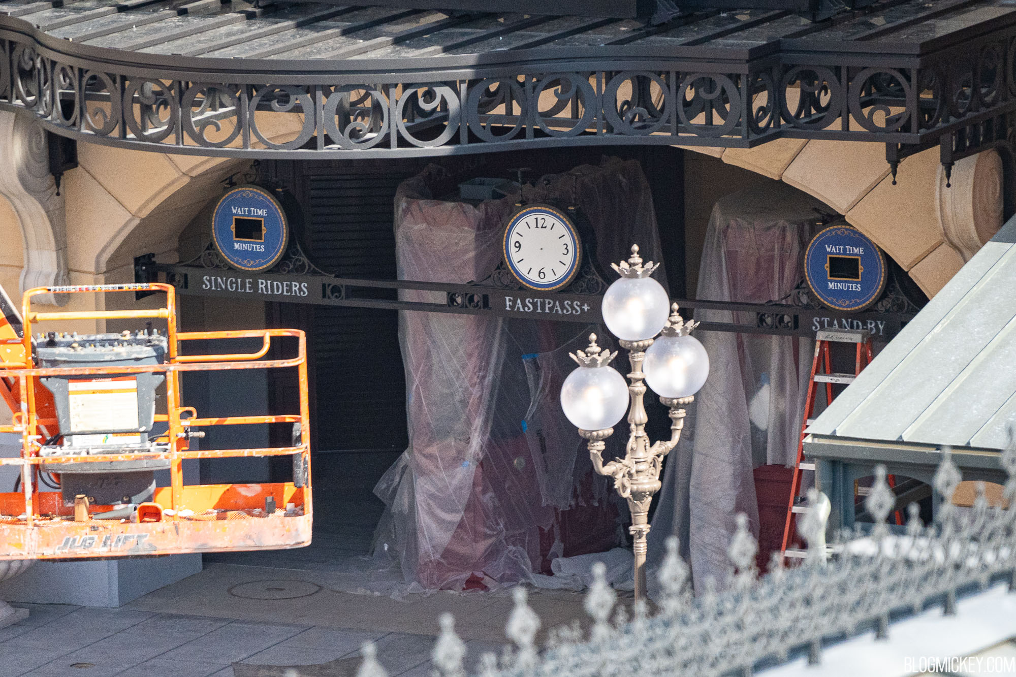
Agree, I wish we would get a more old-fashioned looking Marquee sign for the actual ride. The Paris version looks like a new piece of shiny plastic....which it is.Looks like the signs are hand-painted, similar to the marque sign for the entrance to the expansion area. Cute and nice! Little touches like this make a big difference for sure.
If they are they’re a very very good match for the originals.Looks like the signs are hand-painted, similar to the marque sign for the entrance to the expansion area. Cute and nice! Little touches like this make a big difference for sure.
Justifiable questions! The problem is that they're placing back-stage fabrications that were designed to be seen only from across the water(if at all) onto the guest's stage. In the concept art, it looks like the entire IdF show building was going to get a new facade with more detail and architectural sense. To save money, they added paint, texture, and flower boxes in an attempt to hide this instead. So there's no real logical answer to these design choices because they were never meant to be seen up close. I think shorter shutters that stopped right above the new flower boxes could've helped them make more sense.For the record, I'm not upset (I really like this addition to the France pavilion!), maybe just confused.
Yes, I think that's what looks odd/off to me. I get that the final result is meant to look like a full-length window (the bottom of the windows are at floor level), and that the "railing" sits in front of the window.
I know that these are just facades on a ride building and that they're not going for realism here, but even just at a glance, it seems off to me.
Maybe it's because the windows on the blue building don't have the appearance of the sort that can open, so my brain can't make sense of what's happening here. There's a small sliver of unthemed wall between the "window" and the "railing"- is this meant to look like the window is opened? If so, is that the height at which a sliding window would stop?
Maybe it's that a permanent flower box would typically sit below the bottom of the shutters (so the shutters can be closed without disturbing the flowers) or within the window setback (so that the flowers would be inside the shutters when closed). Otherwise, it's more like the image you included, where either the flower box is temporary or the shutters aren't used.
At a glance, it's hard for me to imagine where the floor of each level in the building is relative to the windows. The weird "windoor" may be the culprit here, where are we to imagine this opening leads to? A landing in a stairwell? Midway up the wall on a two-storey room? Also the relatively low "railing" height in each window makes it seem like the bottom of the railing should be at knee-height instead of level with the floor.
On the yellow building, if the blue shutters only extended down to the top of the flower boxes, I think it would make more sense to my eyes.
Again, I get that these are nitpicks. But with something like this (especially if they're trying to play with forced perspective), the small details kind of add up to an uncanny valley of believability.
Of course, all of this is my opinion and that it's all still a work in progress and that none of this matters in the grand scheme of things and I'm not trying to complain or shill for/agains Iger and I like Epcot and am happy we're getting something new!
Thanks. Yeah, I truly wasn't trying to be nitpicky, more just trying to sort out why it just feels "off" to me. I think you're right- there is some translation from this being a backstage area to onstage that may be to blame. I'm sure it'll look fine in person from the expected vantage points.Justifiable questions! The problem is that they're placing back-stage fabrications that were designed to be seen only from across the water(if at all) onto the guest's stage. In the concept art, it looks like the entire IdF show building was going to get a new facade with more detail and architectural sense. To save money, they added paint, texture, and flower boxes in an attempt to hide this instead. So there's no real logical answer to these design choices because they were never meant to be seen up close. I think shorter shutters that stopped right above the new flower boxes could've helped them make more sense.
Do we have any idea of what the background music will be for this new area? Maybe the same as in DLP?
If they are they’re a very very good match for the originals.
While some of the facades were pre-existing, that explains some of the weird decisions like the ridiculous size of the cornice on the yellow building, it’s not a good excuse. A change in use necessitates a change in design. These types of nonsensical elements also exist on the entirely new builds. There’s all the weirdness of the crêperie and even the main attraction building. Look at the photos of the attraction entrance, to the left are more odd openings. They have balconies but are really short, shorter than the French doors to the right and similar in size to the openings above which do look more like windows. Then the railings are really tall. Why would someone build a balcony outside a window with really tall railings?Justifiable questions! The problem is that they're placing back-stage fabrications that were designed to be seen only from across the water(if at all) onto the guest's stage. In the concept art, it looks like the entire IdF show building was going to get a new facade with more detail and architectural sense. To save money, they added paint, texture, and flower boxes in an attempt to hide this instead. So there's no real logical answer to these design choices because they were never meant to be seen up close. I think shorter shutters that stopped right above the new flower boxes could've helped them make more sense.
Certainement, mon ami!Probably already been mentioned, but are we expecting this ride to be totally in English? The DLP version is pretty half and half.
While some of the facades were pre-existing, that explains some of the weird decisions like the ridiculous size of the cornice on the yellow building, it’s not a good excuse. A change in use necessitates a change in design. These types of nonsensical elements also exist on the entirely new builds. There’s all the weirdness of the crêperie and even the main attraction building. Look at the photos of the attraction entrance, to the left are more odd openings. They have balconies but are really short, shorter than the French doors to the right and similar in size to the openings above which do look more like windows. Then the railings are really tall. Why would someone build a balcony outside a window with really tall railings?
")
It’s fine to be nitpicky. You pay top dollar for WDI to be nitpicky.Thanks. Yeah, I truly wasn't trying to be nitpicky, more just trying to sort out why it just feels "off" to me. I think you're right- there is some translation from this being a backstage area to onstage that may be to blame. I'm sure it'll look fine in person from the expected vantage points.
Register on WDWMAGIC. This sidebar will go away, and you'll see fewer ads.