Virtual Toad
Well-Known Member
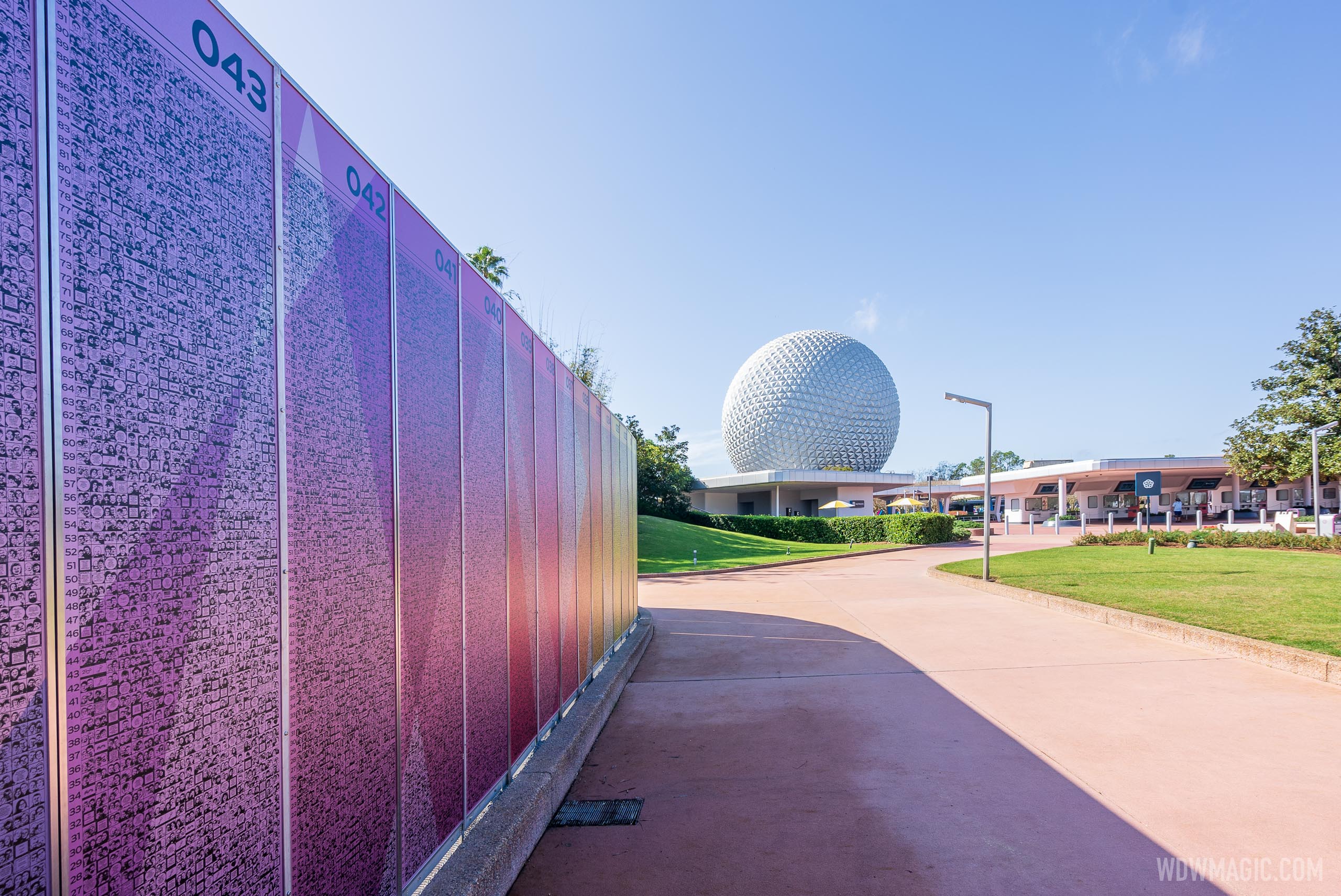
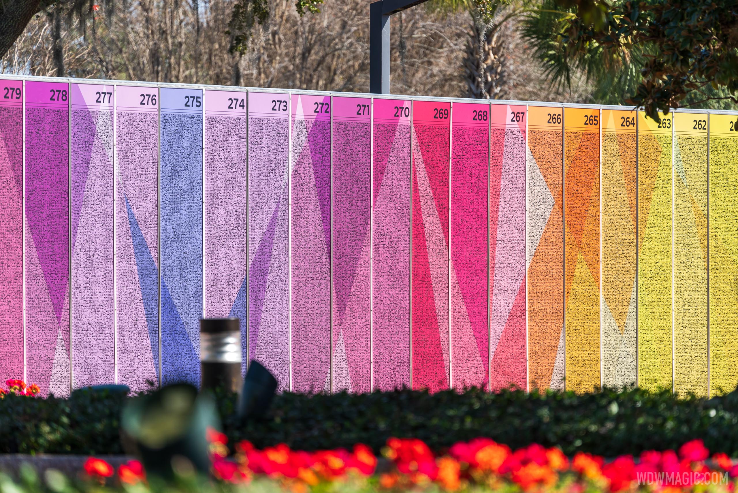
Not exactly reverent, understated or powerful, is it? It's like easter candy, circus peanuts, and a border wall / security perimeter / construction fence all wrapped up into one.
They're not *in* EPCOT. They're outside the gate.Great.... More walls in Epcot.
People here complain about literally everything. I think they look great and make the area in front of the park feel more transitional instead of just Parking -> Security -> Spaceship Earth.
As opposed to the other parks that are Transportation -> Security -> Weenie? Not sure how colored walls off to one side change that.


You could turn around and walk immediately into EPCOT's 100 acre parking lot...Feels claustrophobic
Yeah I feel the same way, And there are a lot more to come, at least up to the mid 400's.Anyone else feel like there’s more now than when they were on the monoliths? Also surprised me that they “reprinted” them, I had assumed that they would just attach the old panels to a new wall.
I like it though, can’t wait to find our pictures once again!
Yes.Just a hunch - Management, and by extension WDI, expect people with tiles to love these, and line up to take their picture with their tile with big smiles on their faces and post it on Instagram. Because that’s all that matters, right?
I'll ask the guys on the ISS to take a shot the next time they pass by.Wow, quite colorful. Maybe a little too colorful.
Is there any elevated shots of this wall to better understand it's size?
you could probably see it from thereI'll ask the guys on the ISS to take a shot the next time they pass by.
I feel like they are intentionally doing this. It's a widely used architectural technique to compress space so that the space you're presented with after moving through it feels larger and even more grand. Frank Lloyd Wright is famous for it, referring to it as compression and release.Feels claustrophobic
Anyone else feel like there’s more now than when they were on the monoliths? Also surprised me that they “reprinted” them, I had assumed that they would just attach the old panels to a new wall.
I like it though, can’t wait to find our pictures once again!
Register on WDWMAGIC. This sidebar will go away, and you'll see fewer ads.
