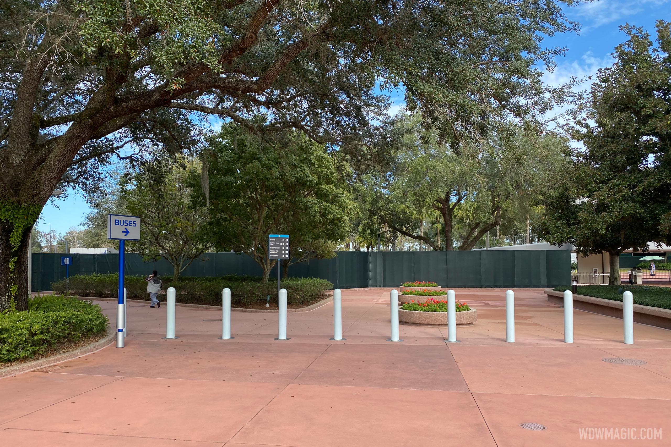
News New Park Entrance coming to Epcot

Gabe1

Ivory Tower Squabble EST 2011. WINDMILL SURVIVOR
That's why a more brightly colored wall is a better choice to keep it from looking like a cemetery memorial, like the monoliths did.
I hope I am wrong however I see myself walking past the wall and thinking Vietnam Wall while seeing 9/11 tribute spotlights in background. I do wonder if the same imagineer designed both.

FCDD3B3F-6038-4A27-9DB5-72FE958EF417.jpeg

B7C71649-7841-447B-B40D-62783ED939D2.jpeg
 

markham

Well-Known Member
Forgive me if this has been covered elsewhere, I looked but couldn't find it. I'm guessing that these are entirely new given the look of them and that it would be cheaper to just remake them rather than attempt to reclaim and reuse from the tombstones. But...they also seem to be printed vinyls rather than any etched surface? The look of the original tiles was because of the etching, seems kind of odd on flat wall mounted vinyl graphics.

Other than that though, this could have been so much worse and I even kind of like it. Reminds me of the supergraphic wayfinding and placemaking systems one would find at an Olympic Games. There are definitely worse things you put outside the gates of a park containing a world showcase/celebration.

5fb3e4560937e5392a5d99bc648ba452.jpg
03_Oly_835_0.jpg
 

WDWFREAK53

Well-Known Member
Better than the tombstones...but feel that they really could’ve done more with the design aside from flats walls. Imagine if they were separated and in the shapes of the pavilion icons? Still not perfect but at least people would find it interesting to walk through.
 

Goofyernmost

Well-Known Member
I'm not offended but there is no comparison to the Vietnam Memorial except that it is a wall. The Vietnam Memorial is close to being a shrine in my mind. It has dignity and stands for something that was far more important then a few hard to see mug shots of Epcot visitors. The colors alone show that there is a certain amount of joy in the Epcot presentation. The Vietnam one does not project joy or a good time had by all. It represents 55000+ young people that never got to grow old and play with their grandkids or ride Spaceship Earth. Please don't compare the two in anyway.
 

esskay

Well-Known Member
They're way better than the tombstones but still looks like a pretty low effort half arsed attempt. I know theres a heck of a lot of them to fit in so logistically this would be challenging, but some sort of garden area outside the park with them dotted around would've been more appropriate.
 

UNCgolf

Well-Known Member
They're way better than the tombstones but still looks like a pretty low effort half arsed attempt. I know theres a heck of a lot of them to fit in so logistically this would be challenging, but some sort of garden area outside the park with them dotted around would've been more appropriate.

I don't think there's really room for that. These things are going to take up a decent amount of space just as solid walls; trying to build a garden and scattering them throughout would likely require more space than the whole EPCOT entrance.
 

J4546

Well-Known Member
the entrance is only getting better and better imo. I like the colorful look of them and they act as legit security fences too so thats cool. I know im in the minority but I like the way epcot is going for the most part. The only major thing Im not liking right now (and it is major) is the way harmonius is shaping up to look on the lagoon.
 

Horizons1

Well-Known Member
I'm very glad I'm not the only person whose mind immediately went to the Vietnam War memorial! Tempting to leave flowers on the way past, though I suspect the vase would be confiscated by security.

That said, I don't mind the new Leave A Legacy wall and it's certainly a lot nicer than the hideous monoliths.
No matter where these things go they remind many of a cemetery. At least this time it’s a colorful cemetery!
 

Virtual Toad

Well-Known Member
the entrance is only getting better and better imo. I like the colorful look of them and they act as legit security fences too so thats cool. I know im in the minority but I like the way epcot is going for the most part. The only major thing Im not liking right now (and it is major) is the way harmonius is shaping up to look on the lagoon.
Maybe I'm getting old, but I kind of miss the days when Epcot (and all of WDW's other parks and resorts, and Disneyland, and my local sports stadium, and my children's schools, and my community's airport, and everything else I can't think of right now) didn't need "legit security fences." Sigh. Specific to Epcot, I see the need the fences fulfill, but from a design standpoint there were probably better ways to secure the perimeter of the park without literally fencing it in. Especially for a park that's supposed to be (or was supposed to be) a utopian vision of the future. So the fences touch a nerve, not just as a person but as an Epcot fan. Not that I could come up with a more suitable solution. Perhaps one doesn't exist. Perhaps it does. Maybe fencing everything in is just a part of where we are. But I wish it didn't have to be that way. First impressions matter and this one is somewhat conflicting for me.
 
Last edited:

nicb88

Well-Known Member
The section in this area went up last night

Leave-a-Legacy_Full_40622.jpg

I like the concept of this very much, I just feel like they’re a tad too tall, and because they’re opaque, it really gives a closed in vibe in photos. Maybe in person it doesn’t feel as much this way?
 

Virtual Toad

Well-Known Member
What these new Leave a Legacy walls need is an amazing nighttime lighting package. Make them come alive and be something wow to look at.
I was wondering about that specific thing- will there be enough light for folks to find their tile after the sun sets?

With the walls taking shape on the bus/monorail side, I can start to see the logic behind the design as far as creating/maintaining a "secure zone." My original distaste for fences aside, adorning them with the LAL tiles may have been the best choice for the designers, given the mandate they were likely given. If the colors do in fact tie in with the ticket booths, then perhaps the look will indeed provide some sort of thematic cohesion.

One doesn't have to necessarily agree with an approach taken to see the justification for it I suppose. But agreed a nighttime lighting package would make a huge difference.
 

Register on WDWMAGIC. This sidebar will go away, and you'll see fewer ads.

Back
Top Bottom