lazyboy97o
Well-Known Member
So you're in a huff because other people dislike the stations for different reasons that you?Again, I think any out-of-park extravagance is a waste. But clearly I'm wrong, according to our resident experts.
So you're in a huff because other people dislike the stations for different reasons that you?Again, I think any out-of-park extravagance is a waste. But clearly I'm wrong, according to our resident experts.
The issue is not that the designs are low key. They're giving you the middle finger by wasting money outside the parks. They're not giving you what you want but that hasn't dawned on you in your quest to play dramatic.Well maybe if the reasons you guys didn't like them were valid. You all are just moaning into an echo chamber because you like to hear yourselves speak. You also think your opinions on architectural design and theme are so superior than us commoners. I'm so glad Disney is giving you guys a proverbial middle finger with these low key designs. Its as if they don't care what the super fans want (thank god!)
Does anyone know if the hub station at CBR will allow people to get off one line and queue for another line in the middle of the station? What I hope doesn't happen is what happens if you switch monorail lines at the TTC, where you have to go down one ramp and up another. I hope it's just a matter of getting out of one gondola and walking a few steps over to the queue for another line. It could be done easily if there's enough space between all three lines there; I just didn't know if that was how it would be designed. I'm sorry if this has been answered already.
I think that's because at least previously in its history (and hopeful for the future) Disney had "ungodly high standards" for exterior-park infrastructure.

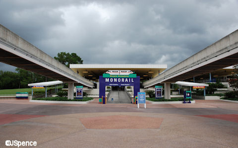
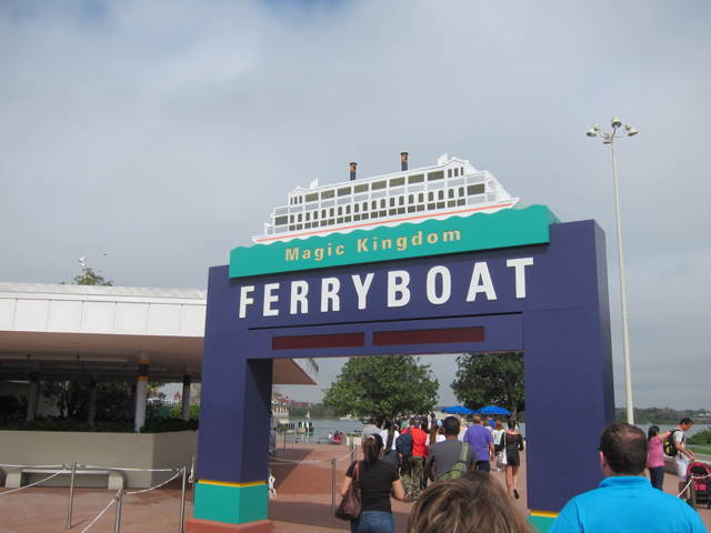
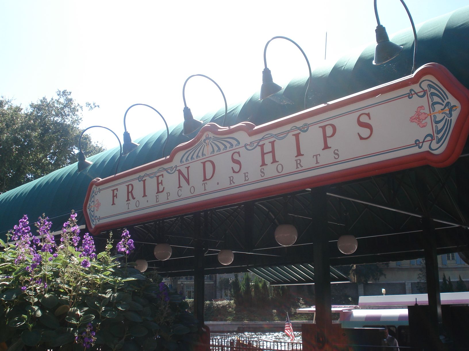
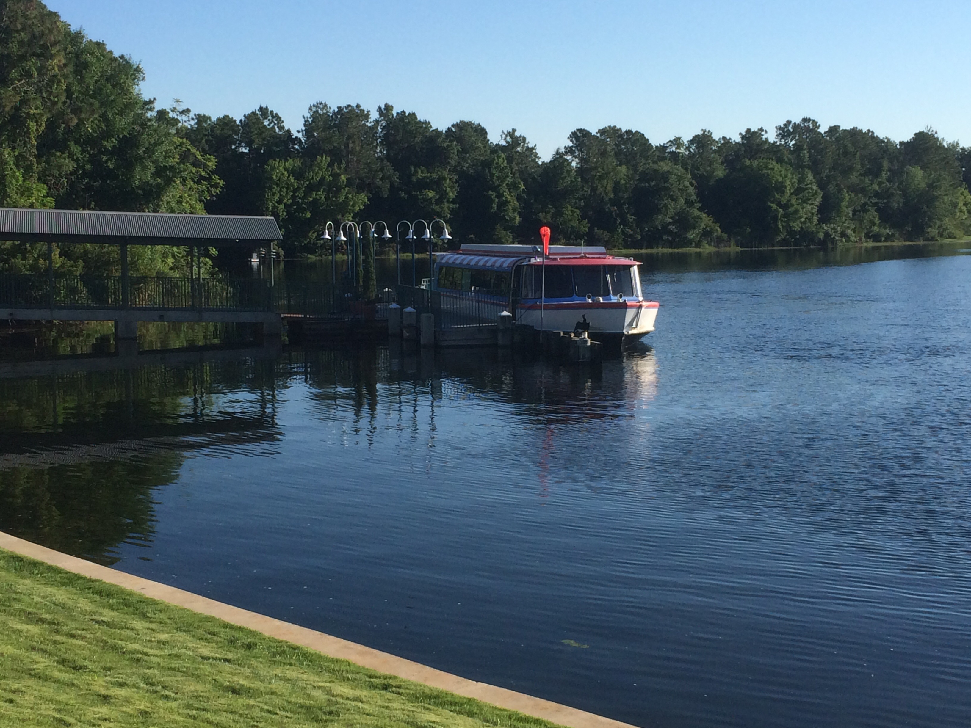
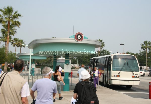
I find the current DHS bus station well themed.That's right! Just look at the original toll plaza, now that was a piece of well themed infrastructure from the hey day of Disney!
And who can pass up the highly detailed intricate themeing of the current Monorail Station that is the first place most guests see when visiting MK! Or that very ornate Ferry Boat station...


But yes, I can see how the Skyliner station might clash with the current boat dock at international gateway with its complex french/European details...

Im especially concerned over how much the boat launch at DHS will overshadow the new Skyliner station...

But at least we have the super detailed bus stations there to help balance things out...

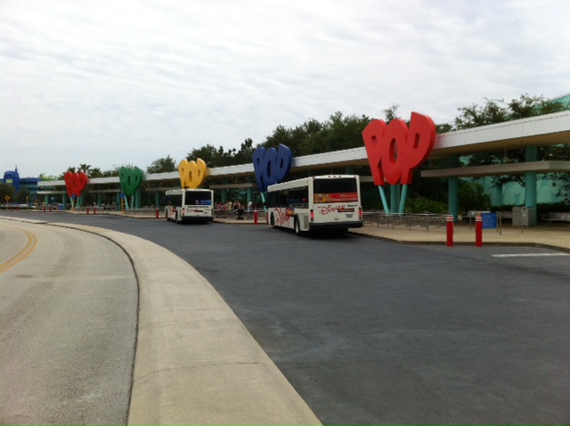
I just hope when the POP/AoA station is revealed it lives up to the standard already established by the resort. I'll only accept something as detailed and themed as the current bus loop!

Let's be real, the skyliner stations look great and exceed most structures created for transportation needs at Disney currently. Could they be even more detailed and well themed? Yeah, probably, but what we have is way better than what most here would have expected and will be great additions to the Disney Landscape... besides, concept art is just that... art. I will wait for the actual structures before sharpening the pitchforks...
This may be the biggest reason why all three lines turn around at CBR South. If two of the three were connected here, it would create a “wall” and anyone trying to get from one side to the other would have to go down a level or up and over some sort of bridge. I picture a large open area between the three terminals with room for queuing. Rails will probably still connect all three lines for maintenance and parking purposes.
Explanation...
I agree with that. For what is a bus shelter that there are 20 copies of, it's fine. I couldn't see them doing something crazy for a small bus shelter.I find the current DHS bus station well themed.
That's right! Just look at the original toll plaza, now that was a piece of well themed infrastructure from the hey day of Disney!
And who can pass up the highly detailed intricate themeing of the current Monorail Station that is the first place most guests see when visiting MK! Or that very ornate Ferry Boat station...


But yes, I can see how the Skyliner station might clash with the current boat dock at international gateway with its complex french/European details...

Im especially concerned over how much the boat launch at DHS will overshadow the new Skyliner station...

But at least we have the super detailed bus stations there to help balance things out...

I just hope when the POP/AoA station is revealed it lives up to the standard already established by the resort. I'll only accept something as detailed and themed as the current bus loop!

Let's be real, the skyliner stations look great and exceed most structures created for transportation needs at Disney currently. Could they be even more detailed and well themed? Yeah, probably, but what we have is way better than what most here would have expected and will be great additions to the Disney Landscape... besides, concept art is just that... art. I will wait for the actual structures before sharpening the pitchforks...
Hey... does that bus stop have A/C?
So what I’ve learned over the last couple of pages is that the TTC and other monorail stations are great because they have a specific architectural style based on their location
Thank you for doing the work that I'm too lazy to do.
You have provided evidence of what I am talking about.
It's called 'cherry picking' - glad you found information tailored to be agreeable... so agreeable.
Here's another conclusion that can save you the trip... Disney hasn't always batted 1.000 - and citing examples of things that have pretty much universally been panned for their failure (like the values) as proof of your 'standards' is... well... oh why do I even bother.
That depends on when a cut happens and the circumstances of the cut.Isn't is the role of concept artists and imagineers -- before the blueprints are locked down -- to dream big? They'll almost certainly come up with ideas that are outside the budget. And yes, I realize we're talking about Disney's relatively bloated budget here, but even then, such bloated budgets can be exceeded with even bigger dreams.
But when reality hits, a land goes from three to two rides; or, a grand structure becomes less grand. If the artist/imagineer knew exactly how much was the cost of what they were drawing/planning and saw it was way over budget, they would have scaled back the drawing/plans themselves in the first place and no one would have been the wiser.
But when their blue sky drawings/plan get seen and then get cut down by budget, then there is a claim of cheapness on the part of Disney. Was a budget actually approved and then cut back after the approval? If so, then that would be a sign of penny-pinching. Was a plan/drawing evaluated to be too costly for the approved budged and so the plan/drawing was cut back to stay withing that budget? If so, then that's not a sign of penny-pinching.
If one wants to argue that WDW should spend more lavishly (or get their money's worth) on a budget for gondola stations or a new themed land, then that's a good point to make. But seeing something cut back from initial design... I don't know if that's the fault of the initial design surpassing budget or a bean-counter slashing budgets.
Isn't is the role of concept artists and imagineers -- before the blueprints are locked down -- to dream big? They'll almost certainly come up with ideas that are outside the budget. And yes, I realize we're talking about Disney's relatively bloated budget here, but even then, such bloated budgets can be exceeded with even bigger dreams.
Isn't is the role of concept artists and imagineers -- before the blueprints are locked down -- to dream big? They'll almost certainly come up with ideas that are outside the budget. And yes, I realize we're talking about Disney's relatively bloated budget here, but even then, such bloated budgets can be exceeded with even bigger dreams.
But when reality hits, a land goes from three to two rides; or, a grand structure becomes less grand. If the artist/imagineer knew exactly how much was the cost of what they were drawing/planning and saw it was way over budget, they would have scaled back the drawing/plans themselves in the first place and no one would have been the wiser.
But when their blue sky drawings/plan get seen and then get cut down by budget, then there is a claim of cheapness on the part of Disney. Was a budget actually approved and then cut back after the approval? If so, then that would be a sign of penny-pinching. Was a plan/drawing evaluated to be too costly for the approved budged and so the plan/drawing was cut back to stay withing that budget? If so, then that's not a sign of penny-pinching.
If one wants to argue that WDW should spend more lavishly (or get their money's worth) on a budget for gondola stations or a new themed land, then that's a good point to make. But seeing something cut back from initial design... I don't know if that's the fault of the initial design surpassing budget or a bean-counter slashing budgets.
You're a riot.
You actually post this after you select images of tents?
Register on WDWMAGIC. This sidebar will go away, and you'll see fewer ads.
