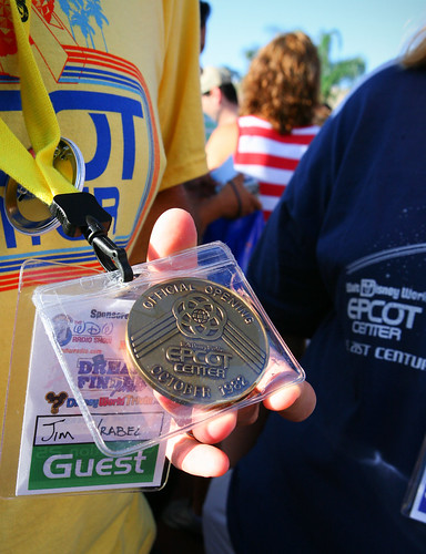
EPCOT - 25 Years of photographic memories thread!

SirNim

Well-Known Member
Ask someone who collects coins,check any coin collecting store or contact companies that sell collectible coins.:wave:
The general rule about cleaning coins is: DON'T.

There are some tips here for coins or medallions which have little value. Generally, as long as the tarnish is even throughout the surface, that's attractive in its own way and should be left alone. If the tarnish is uneven, and you don't have any concern about the value, then you may try to clean it.
 

EPCOT Explorer

New Member
The general rule about cleaning coins is: DON'T.

There are some tips here for coins or medallions which have little value. Generally, as long as the tarnish is even throughout the surface, that's attractive in its own way and should be left alone. If the tarnish is uneven, and you don't have any concern about the value, then you may try to clean it.

Hmm...It is uneven. I'll try to post a pic.
 

brkgnews

Well-Known Member
Model of the proposed EPCOT Center, circa October 1978.

Of note...
- Monorail Station in the horseshoe-shaped building north of Spaceship Earth (bottom of pic).
- Spaceship Earth is not yet a Sphere, but a Dome
- Spaceship Earth is gold, not silver, and has flat "faces" rather than pointy ones.
- American Adventure at front of World Showcase rather than at the rear. It's the "donut" with sharp pointy things on top in the middle of the picture.
- Only the Energy pavilion looks "right" -- the rest were preliminary designs which were later changed. I believe the one to the above-left of energy is actually the Land.
- All the parking is off to the left side of the picture, rather than in front of the entance.
- A more-circular design for World Showcase, with remnants of the pie-shaped buildings that were originally planned.

This pic, by the way, came from an October 1978 issue of "The WED Way" (an Imagineering newsletter), which I picked up at D23. :king:
 

Attachments

  • epcot78sized.jpg
    epcot78sized.jpg
    808.7 KB · Views: 93

EPCOT Explorer

New Member
Model of the proposed EPCOT Center, circa October 1978.

Of note...
- Monorail Station in the horseshoe-shaped building north of Spaceship Earth (bottom of pic).
- Spaceship Earth is not yet a Sphere, but a Dome
- Spaceship Earth is gold, not silver, and has flat "faces" rather than pointy ones.
- American Adventure at front of World Showcase rather than at the rear. It's the "donut" with sharp pointy things on top in the middle of the picture.
- Only the Energy pavilion looks "right" -- the rest were preliminary designs which were later changed. I believe the one to the above-left of energy is actually the Land.
- All the parking is off to the left side of the picture, rather than in front of the entance.
- A more-circular design for World Showcase, with remnants of the pie-shaped buildings that were originally planned.

This pic, by the way, came from an October 1978 issue of "The WED Way" (an Imagineering newsletter), which I picked up at D23. :king:

Awesome stuff, Jackie! :D:D


That's actually the Geology, I think. They wanted that rahter than the land....Starting with Energy and going clockwise, it's
  1. Energy
  2. Geology
  3. Motion
  4. ? I have no idea. The Land was the Biozone at that point? That doesn't look like it. Or JII. Or Space.
  5. Seas
  6. Future Probe AKA Horizons. The roof looks odd, though...I've seen it with a vertical thing, not a dome.
 

vonpluto

Well-Known Member
Awesome stuff, Jackie! :D:D


That's actually the Geology, I think. They wanted that rahter than the land....Starting with Energy and going clockwise, it's
  1. Energy
  2. Geology
  3. Motion
  4. ? I have no idea. The Land was the Biozone at that point? That doesn't look like it. Or JII. Or Space.
  5. Seas
  6. Future Probe AKA Horizons. The roof looks odd, though...I've seen it with a vertical thing, not a dome.

Number 2 looks a lot like Herb Ryman's concept for a Science & Invention pavilion.

Future Probe, name for Horizons before or after Century 3?

:shrug:
 

Victoria

Not old, just vintage.
Model of the proposed EPCOT Center, circa October 1978.

Of note...
- Monorail Station in the horseshoe-shaped building north of Spaceship Earth (bottom of pic).
- Spaceship Earth is not yet a Sphere, but a Dome
- Spaceship Earth is gold, not silver, and has flat "faces" rather than pointy ones.
- American Adventure at front of World Showcase rather than at the rear. It's the "donut" with sharp pointy things on top in the middle of the picture.
- Only the Energy pavilion looks "right" -- the rest were preliminary designs which were later changed. I believe the one to the above-left of energy is actually the Land.
- All the parking is off to the left side of the picture, rather than in front of the entance.
- A more-circular design for World Showcase, with remnants of the pie-shaped buildings that were originally planned.

This pic, by the way, came from an October 1978 issue of "The WED Way" (an Imagineering newsletter), which I picked up at D23. :king:

What a great find Jackie. That proposed building for AA is really quite ugly. I am glad someone fixed that idea. I do like that rendition of the Communicore buildings though. Oh, and I am exceptionally happy we ended up with a spherical SSE rather than that dome. I am sure the dome would have been easier to build (and subsequently put an attraction in), but it wouldn't have been nearly as cool. :lol:
 

EPCOT Explorer

New Member
Number 2 looks a lot like Herb Ryman's concept for a Science & Invention pavilion.

Future Probe, name for Horizons before or after Century 3?

:shrug:
Ooooh! That too! :D The precursor for today's Innoventions!:D

What a great find Jackie. That proposed building for AA is really quite ugly. I am glad someone fixed that idea. I do like that rendition of the Communicore buildings though. Oh, and I am exceptionally happy we ended up with a spherical SSE rather than that dome. I am sure the dome would have been easier to build (and subsequently put an attraction in), but it wouldn't have been nearly as cool. :lol:

Yeah....AA part of FW made it less of a host. I agree. It's ugly, and would have blocked SSE. It would have been a ride, though, then.

I like the triangular Communicore, too. More visually pleasing.

and, that's exactly why they did it!:D It became a integral part of the story to walk UP into SSE. :D Like you were actually entering a Spaceship. And, it made it more identifiable to WS, too. It's a globe/earth...something all nations are a part of. It would be hard to have the park's icon, a dome fit in with both future and culture...The sphere is almost universal for both.


I love EPCOT. :D:eek::lol:
 

EPCOTPluto

Well-Known Member
Well, it was really based off these concept designs for Innoventions. Probably shouldn't have exaggerated:

picture.php


picture.php


The first design certainly is more whimsical in an artistic way and really deviated from Communicore.

The second is more of what we had before, though this is more inspiring than what was executed.
 

EPCOT Explorer

New Member
Well, it was really based off these concept designs for Innoventions. Probably shouldn't have exaggerated:

picture.php


picture.php


The first design certainly is more whimsical in an artistic way and really deviated from Communicore.

The second is more of what we had before, though this is more inspiring than what was executed.

Oh...That first one is a interior, though...Not exterior.:wave:


And yeah, the last one looks more sleek. Still don't like the colors, though.
 

hpyhnt 1000

Well-Known Member
^^Most interesting designs. So Innoventions could have been "The Archway to New Ideas." Eh, kinda glad that one never happend. And the second one looks pretty much like what we got, so we know that didn't exactly work out aesthetically.

I still think a return to the openness of Communicore mixed with the sleekness of Project Tomorrow is what needs to be done. These cartoony designs and cutout sets really don't inspire me. :shrug:
 

EPCOT Explorer

New Member
^^Most interesting designs. So Innoventions could have been "The Archway to New Ideas." Eh, kinda glad that one never happend. And the second one looks pretty much like what we got, so we know that didn't exactly work out aesthetically.

I still think a return to the openness of Communicore mixed with the sleekness of Project Tomorrow is what needs to be done. These cartoony designs and cutout sets really don't inspire me. :shrug:

Agreed in full. Hopefully with this new exterior, the interior will match it.


I would watch that Kuka area as an indicator.
 

Hoop Raeb

Formerly known as...
So YOU own the mystery coin! :D Cool....I have one too.


Do you ever clean it? Mine is kinda dirty, like I said.

I've always kept it in the original foam lined plastic box with cardboard outer covering. Kept it in pretty good condition expect the foam is deteriorating and is sticking to the coin now.

I wish I had some cool story like I bought it at opening day. Sadly, I found it at Mouse Surplus a number of years ago. They probably had 100 of them for sale. If I would have been smarter, I should have snatched up a couple more.
 

brkgnews

Well-Known Member
I've always kept it in the original foam lined plastic box with cardboard outer covering. Kept it in pretty good condition expect the foam is deteriorating and is sticking to the coin now.

I wish I had some cool story like I bought it at opening day. Sadly, I found it at Mouse Surplus a number of years ago. They probably had 100 of them for sale. If I would have been smarter, I should have snatched up a couple more.
Got mine at MS, and same deal... funky blue foam junk sticking to it. Ick.
 

Register on WDWMAGIC. This sidebar will go away, and you'll see fewer ads.

Back
Top Bottom