Disneyland has classic logo, why not WDW?

TheBeatles

Well-Known Member
I think we should get a new logo for the 40th incorporating the original 'D' with the micket ears in the middle, however with different font as I think the 'old' font is now very dated and very 70's (which it was!!)

These are 2 logos I have done for an example:

WDWLogo2.jpg


WDWLogo1.jpg


We are on the right track with these two.
 

cblodg

Member
I think we should get a new logo for the 40th incorporating the original 'D' with the micket ears in the middle, however with different font as I think the 'old' font is now very dated and very 70's (which it was!!)

These are 2 logos I have done for an example:

WDWLogo2.jpg


WDWLogo1.jpg

:cry: They're so beautiful :cry:

:sohappy::sohappy::sohappy::sohappy::sohappy:

I really do love that first one more though. With the star whoosh thing.
 

MarkTwain

Well-Known Member
I think we should get a new logo for the 40th incorporating the original 'D' with the micket ears in the middle, however with different font as I think the 'old' font is now very dated and very 70's (which it was!!)

These are 2 logos I have done for an example:

WDWLogo2.jpg


WDWLogo1.jpg

Brilliant!! :sohappy:

Except... I like the color and stylization of the first, but the more 70-styled font of the second. I think if were you to combine those two attributes you would have marketing perfection! Do you think you could whip that up, or would that be too much trouble? :veryconfu

[/Over-opinionated design snob]
 

unkadug

Follower of "Saget"The Cult
Brilliant!! :sohappy:

Except... I like the color and stylization of the first, but the more 70-styled font of the second. I think if were you to combine those two attributes you would have marketing perfection! Do you think you could whip that up, or would that be too much trouble? :veryconfu

[/Over-opinionated design snob]

Kinda like this? :D

wdwlogo.gif
 

WDW Vacationer

Active Member
I think we should get a new logo for the 40th incorporating the original 'D' with the micket ears in the middle, however with different font as I think the 'old' font is now very dated and very 70's (which it was!!)

These are 2 logos I have done for an example:

WDWLogo2.jpg


WDWLogo1.jpg

:eek::sohappy:

YOU NEED TO BE AT DISNEY MARKETING!:sohappy:
Those blow me away! Fantastic!
 

greggo1988

Member
Brilliant!! :sohappy:

Except... I like the color and stylization of the first, but the more 70-styled font of the second. I think if were you to combine those two attributes you would have marketing perfection! Do you think you could whip that up, or would that be too much trouble? :veryconfu

[/Over-opinionated design snob]

Like this?

WDWLogo3.jpg
 

kingdaniel97

New Member
Honestly, I feel like the original logo was a little too sterile. I like how it looks but I just feel that it's better suited for your typeface on an inter-department memo then on the sign of an amusement park. I can understand where you're all coming from. I felt the same way when the changed the Nickelodeon logo, it was a part of my childhood, and it was Nickelodeon for me.

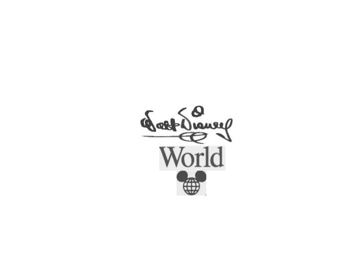
I also having had never seen the original logo in the parks don't quite sympathize with you. I agree that it shouldn't be homogenized into the "Disney Parks" branding but I also think that the oh so integral "Waltograph" font should be on it's own line. Disneyland was a land built by Disney whereas WDW is a World that was formed around Walt's hopes and dreams. His aspirations and passions and nothing shows that this is the cumulative showing of his vision, IMO at least, then his signature.

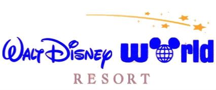
I agree wholeheartedly that if they're going to make a new logo for the park that the D with the Mickey globe should stay because that's unequivocally part of the experience. It's there no matter where you are, on manholes and garbage cans, Monorails and flags. I see that as a large part of the Disney World experience. It makes it so that ordinary things can be magical. How many people consider sewage magical? I don't. When I'm at Disney though I see the manholes and I know that I'm there, I know that I'm there anyway but even if I can tell what a picture is from having half of it, I never quite get the full effect unless it's all there. Picking a place to put it in is a very hard thing to do, I personally love this one.


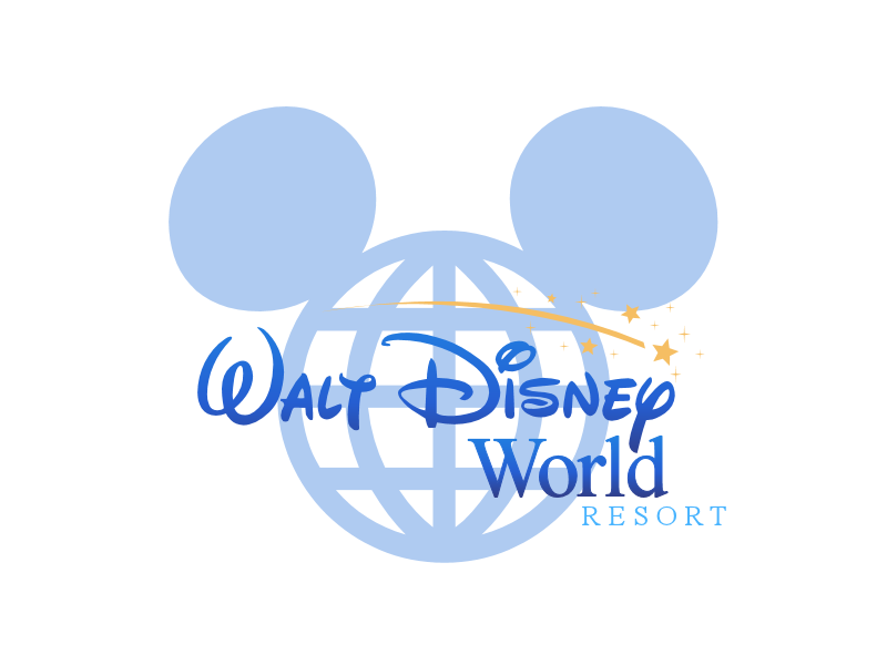
I feel it incorporates enough of the old and the new logos to make a unique feel that kids can get excited about and that adults can feel the nostalgia of. It also ensures that they have a small scale icon for most anything, backs of T-shirts of whatever they need can just use the Mickey globe and cups, napkins and dishes can use the full scale one. It's also similar enough to the current day logo that they don't need to do any drastic changes to the area of the parks(e.g. changing gates).

You can agree or disagree with me but those are my feelings and to be honest, I do feel that the old font at least for the original logo is well beyond dated, it brings nostalgia but I can't see it forging new attachment now a days, which was likely an important factor in bringing back the old, simpler Disneyland logo.
 

JWG

Well-Known Member
I'm tired of the faux "Walt Disney" signature font that isn't close to Walt's signature. Though, I get that it's close to Mickey's. Still, I too like the original Walt Disney World font and D with ears.

Though, I'm not one who appreciates when companies change their logos significantly. It's messing with brand recognition.
 

unkadug

Follower of "Saget"The Cult
I'm tired of the faux "Walt Disney" signature font that isn't close to Walt's signature. Though, I get that it's close to Mickey's. Still, I too like the original Walt Disney World font and D with ears.

Though, I'm not one who appreciates when companies change their logos significantly. It's messing with brand recognition.
agreed
This is the one I fooled around with for awhile.

Disneylogo.jpg


Honestly, I like the old style the best though. :shrug:

agreed

Why change just to change? It makes no sense.
 

Register on WDWMAGIC. This sidebar will go away, and you'll see fewer ads.

Back
Top Bottom