Disneyland has classic logo, why not WDW?

SMRT-1

Active Member
Original Poster
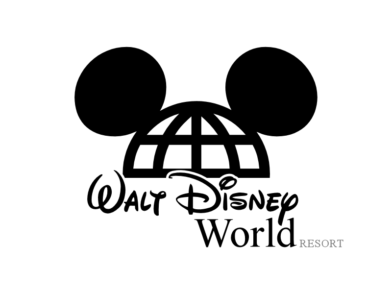
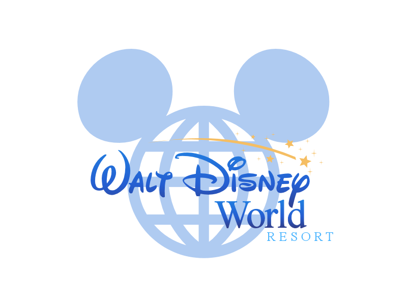
Any good logo should try to graphically convey the product it represents. The classic logo is big and bold, suggesting the broad scope of the property and offerings, and also has plenty of curves, softening it to bring fun and relaxtion to mind. And, of course, the big D with the Mickey globe, very easily and obviously conveying 'Disney World.' It's unique, not similar to anything else the company has ever put out, yet at the same time is still blatantly Disney. The current logo doesn't convey anything other than this is just another division of the Disney media megaconglomerate. Just take the Walt Disney script and slap it together with some Times New Roman. Totally uncreative and boring. Whether the classic one is 'hideous' or 'outdated' is pure opinion. And since I seem to see just as many people in the parks wearing shirts and such with the old logo as the new one, it doesn't seem like it's a popular one, either.

And way to completely group all Disney enthusiasts in one stereotype. :rolleyes:

agree in full... even if they took the idea of the old logo and came up with something new I think that would be a step in the right direction. problem with the current logo is it is not symbolic. the mickey globe icon needs to be in there for sure. other corporate entities are going with their classic logos now too..KFC :eek:(i know, i know)... for one is using their old logo on many of their establishments...mixing it with a modern twist which I think WDW needs to do.
 

janoimagine

Well-Known Member
Seriously, you people need to stop living in the past. The original WDW logo is hideous. Just because it was the original doesn't make it good. And the original Disneyland logo is very dated. You guys constantly whine about attractions like Star Tours being modernized...well it was modern when it opened, so why not keep it that way? If the logo shouldn't be updated, why should attractions? Will some fail? Of course. And then they'll do something else.

In marketing it is called brand identity, their are hundreds of studies and factual real world proof that would go against everything your saying. If the brand has failed and is in need of a new image, then you could explore ways to re-invent the brand, but IMHO Disney World as a brand has not failed, it is still among the top 5 vacation destinations in the world.
 

Sutter Bestwick

New Member
I would love a return of the classic logo. The globe with mouse ears is WDW imo. If they have to have a new logo, the globe should be retained. There is nothing dated about it.
 

EPCOT Explorer

New Member
They seem so tentative to rebrand things these days, though. Things stick, now.


Back in the 80's there were so many different logos for the lands and attractions, it was actually hard to tell which one was concurrent.


Hopefully for the 40th, though, we will get a new logo again, much like we did with the 25th.
 

scottnj1966

Well-Known Member
07-Disneyland-logo.jpg


wdwlogo.gif


It would be nice if they brought it back for the 40th... :D


I still see things around the resort with the old logo.
I should take pictures of them when I come across them.
 

MrX8991

New Member
Personally, I like Disneyland's old logo because it seems classic and timeless. WDW's old logo, on the other hand, just looks like a relic from the 70's. It's fine for retro shirts, but the current logo is much better.
 

mightynine

Well-Known Member
I am kind of on the fence on this one. On one side, I love the old logo, it's what I grew up with, and love seeing it on retro merch.

On the other side, it IS a product of its time, and doesn't have as timeless of a look as the old Epcot logo (which I think still stands up well to this day, as opposed to the current logo, which had never quite looked right to me, and seems very dated).

If you were to update the logo, but had to incorporate something from the original, it would be the Mickey Globe - maybe even keep it in the same D. That by itself is a symbol that still works, in my opinion.
 

CDavid

Well-Known Member
MANY of the older rides were lame and tired and needed to be removed so WDW can stay current with society.


At the risk of being slightly off-topic, it is a mistaken assumption that Disney needs to "stay current with society". That's the sort of thinking that helped put Disney characters into A Small World at Disneyland. Nor does it justify the removal of classic omnimover (Future World) attractions so that they may be replaced with extreme thrill rides.

Walt Disney World doesn't need to be keeping up with society - it instead needs to be setting the standard, exceeding expectations, and delivering experiences which can only be achieved by Disney imagineering.

The original WDW logo is hideous

Could someone please explain, other than personal opinion, exactly how the original WDW logo is hideous?
 

Wilt Dasney

Well-Known Member
Could someone please explain, other than personal opinion, exactly how the original WDW logo is hideous?
I don't see how that's possible. Isn't the whole concept of hideous based on personal opinion?

I've explained earlier why I think it looks dated and clunky, which are the most extreme pejoratives I would apply myself. :shrug:
 

Wilt Dasney

Well-Known Member
RAXIP said:
I also think integrating the park icons would be neat, provided it didn't busy the whole thing up too much. I could see minimalist, stylized versions of CC ("A"), ToL ("T"), Earful Tower ("I") and SSE ("O") integrated into the text.

Alternately, the castle could join the Mickey globe in the background and the Contemporary could become an "A" (since it literally is). :lol:
 

Register on WDWMAGIC. This sidebar will go away, and you'll see fewer ads.

Back
Top Bottom