EPCOT Explorer
New Member
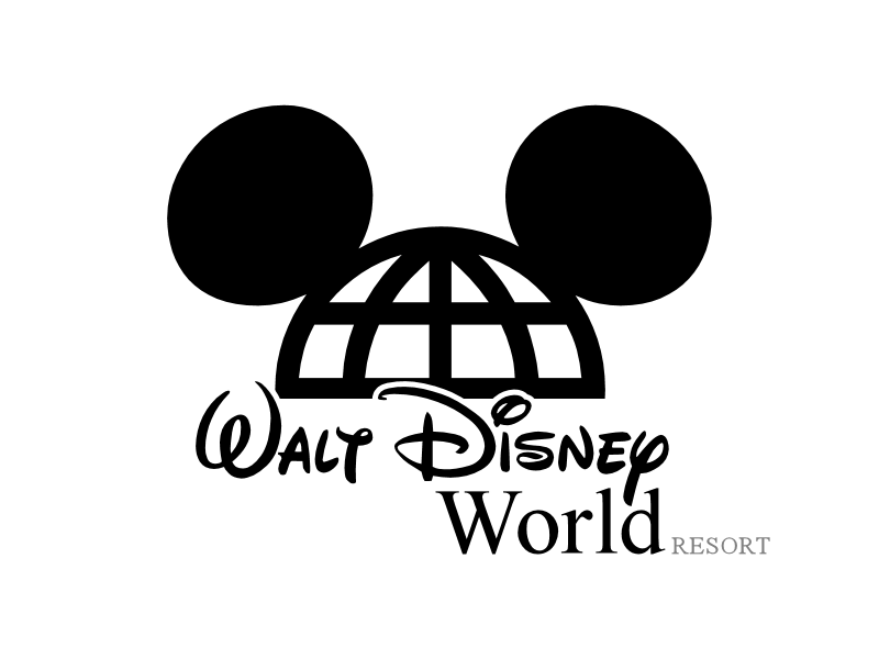
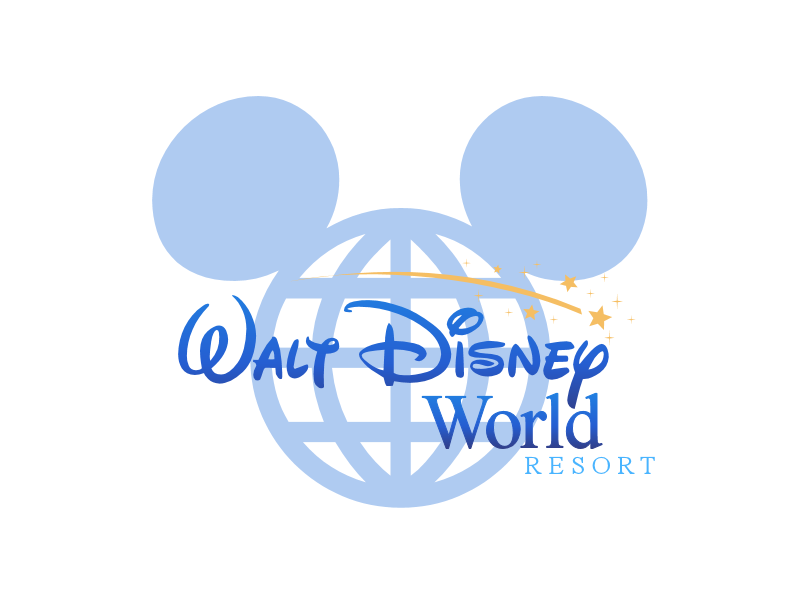
Excellent work! I'd like to see the first one use the colors and "look" of the second.
Could be worse.The biggest problem I have with the current logo is that the Disney script became far too ubiquitous. It robbed the individual offerings of their identities, and made them all a bit more visually bland in their graphic identities.
That is probably why they stopped using it.'mostly.For some reason, I always associate the Mickey globe with Epcot. Was it always around?

Seriously, you people need to stop living in the past. The original WDW logo is hideous. Just because it was the original doesn't make it good. And the original Disneyland logo is very dated. You guys constantly whine about attractions like Star Tours being modernized...well it was modern when it opened, so why not keep it that way? If the logo shouldn't be updated, why should attractions? Will some fail? Of course. And then they'll do something else.


Not really, from 1982-1996 they existed together. It was just phased out then when we got the new logo on 96 for the 25th. It no longer matched.That is probably why they stopped using it.'mostly.
What a fun topic!
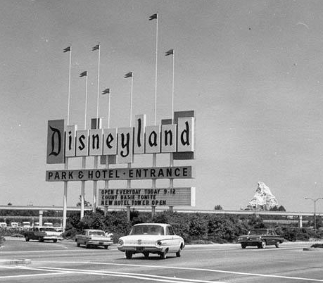
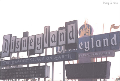
Yes, Disneyland used to have a more stylized version of the logo, with that "classic Disneyland" font appearing more slender and narrow. Here's the Disneyland marquee that used that more slender script from the 1950's and 60's. Judging by the 1960 Ford and '61 Pontiac, the Midnight closing time, the monorail beam extended out through the parking lot, and the "new hotel tower" that opened in '61, I peg this picture as the Summer of 1961. Count Basie was performing that night too, likely on the bandstand of the Plaza Gardens!
From the same era, there's also the title and tagline Disneyland carried... Disneyland U.S.A. That title is still found today on many 1950's era Disneyland attractions and facades, like the Mark Twain Riverboat or Sailing Ship Columbia.
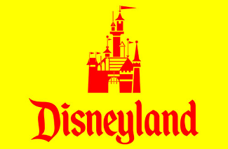
In the 1970's the Disneyland logo got a bit blockier and the font became thicker. That's also the time the stylized Castle showed up above the word, like this.
Here's a picture of the changing eras, when the late 1960's Disneyland marquee was being replaced with a larger marquee in the 1980's. A changing of the font gaurds, if you will.
Today that Castle part of the logo has gone away, with a small RESORT tag added on the bottom. The logo mentioned earlier with the Disney Parks Castle and "Where Dreams Come True" actually isn't used much on Disneyland property. This is the simpler logo you see most frequently today on signs, shopping bags, t-shirts, CM nametags, and such...
Personally, I love that old Vacation Kingdom Of The World slogan. The Disney font WDW uses today is the same font used to sell plush toys in malls, Caribbean cruises, Hannah Montana TV shows, time share condos, and every other commodity that Disney Co. now sells to people.
If Disneyland gets to keep their classic 20th century look and logo, you would think WDW could too. Or at least an updated take on the 1971 logo.
Sadly, the Monorails are beginning to lose their "D"s. Silver was the first to lose them, then Black lost its D's from the Cab 1 end, then Teal came out freshly painted and did not have them, and now Black has lost them from its Cab 6 end as well. Three out of eleven trains don't have them anymore
POST OF THE YEAR! :sohappy:
What a fun topic!
Yes, Disneyland used to have a more stylized version of the logo, with that "classic Disneyland" font appearing more slender and narrow. Here's the Disneyland marquee that used that more slender script from the 1950's and 60's. Judging by the 1960 Ford and '61 Pontiac, the Midnight closing time, the monorail beam extended out through the parking lot, and the "new hotel tower" that opened in '61, I peg this picture as the Summer of 1961. Count Basie was performing that night too, likely on the bandstand of the Plaza Gardens!
From the same era, there's also the title and tagline Disneyland carried... Disneyland U.S.A. That title is still found today on many 1950's era Disneyland attractions and facades, like the Mark Twain Riverboat or Sailing Ship Columbia.
In the 1970's the Disneyland logo got a bit blockier and the font became thicker. That's also the time the stylized Castle showed up above the word, like this.
Here's a picture of the changing eras, when the late 1960's Disneyland marquee was being replaced with a larger marquee in the 1980's. A changing of the font gaurds, if you will.
Today that Castle part of the logo has gone away, with a small RESORT tag added on the bottom. The logo mentioned earlier with the Disney Parks Castle and "Where Dreams Come True" actually isn't used much on Disneyland property. This is the simpler logo you see most frequently today on signs, shopping bags, t-shirts, CM nametags, and such...
Personally, I love that old Vacation Kingdom Of The World slogan. The Disney font WDW uses today is the same font used to sell plush toys in malls, Caribbean cruises, Hannah Montana TV shows, time share condos, and every other commodity that Disney Co. now sells to people.
If Disneyland gets to keep their classic 20th century look and logo, you would think WDW could too. Or at least an updated take on the 1971 logo.
A
I've said it before, I'll say it again, it's so sad that some are so quick to bash other posters. If you have reasoning to counter the very rational arguments made for the classic logo other than personal opinion, then share it and most of us will hear it out with an open mind and respect. Without that, you just come off as dense and mean-spirited. It even further seems like a baseless accusation when most in favor of the classic logo are interested in updating it. It also helps to not support a sentiment that devolves into a nonsensical tirade about rides for some strange reason. Last time I checked, logos and rides were two very different things. So would you like to join us in respectful, intelligent debate, or continue to attack other posters?
One more note, Disney has moved to make just about everything 'corporate' now. The bags, napkins etc. all have "Disney Parks" on them rather than the specialized ones they had in the past. I still have a napkin from each of the parks that is in full color and adorned with the park's name and logo. They don't even do this anymore.
As I understand it, those were all mistakes, though. When they repainted Yellow just a year or two ago they put the 'D's back on. :shrug:
I've said it before, I'll say it again, it's so sad that some are so quick to bash other posters. If you have reasoning to counter the very rational arguments made for the classic logo other than personal opinion, then share it and most of us will hear it out with an open mind and respect. Without that, you just come off as dense and mean-spirited. It even further seems like a baseless accusation when most in favor of the classic logo are interested in updating it. It also helps to not support a sentiment that devolves into a nonsensical tirade about rides for some strange reason. Last time I checked, logos and rides were two very different things. So would you like to join us in respectful, intelligent debate, or continue to attack other posters?
Personally, I like Disneyland's old logo because it seems classic and timeless. WDW's old logo, on the other hand, just looks like a relic from the 70's. It's fine for retro shirts, but the current logo is much better.
I totally agree with this. The original Disneyland logo/font is a good design. It has a flourish that speaks to both the classic, original Disney theme park, and makes it seem special and fun.
The 1970s WDW logo is very bold and blocky and feels cold to me. I think that although using the same "Disney" script font in the current logo is sort of unoriginal, it does have much more of a flourish and fun, dreamy style to it than the big blocky letters from the 70s logo. It also makes it seem more inviting.
And yes, the old logo looks great on vintage style t-shirts, but that's why that stuff sells, its retro and "out-dated".
^ I agree, that looks odd.
Why not have it all script?
Walt Disney World
Register on WDWMAGIC. This sidebar will go away, and you'll see fewer ads.