EPCOT Explorer
New Member
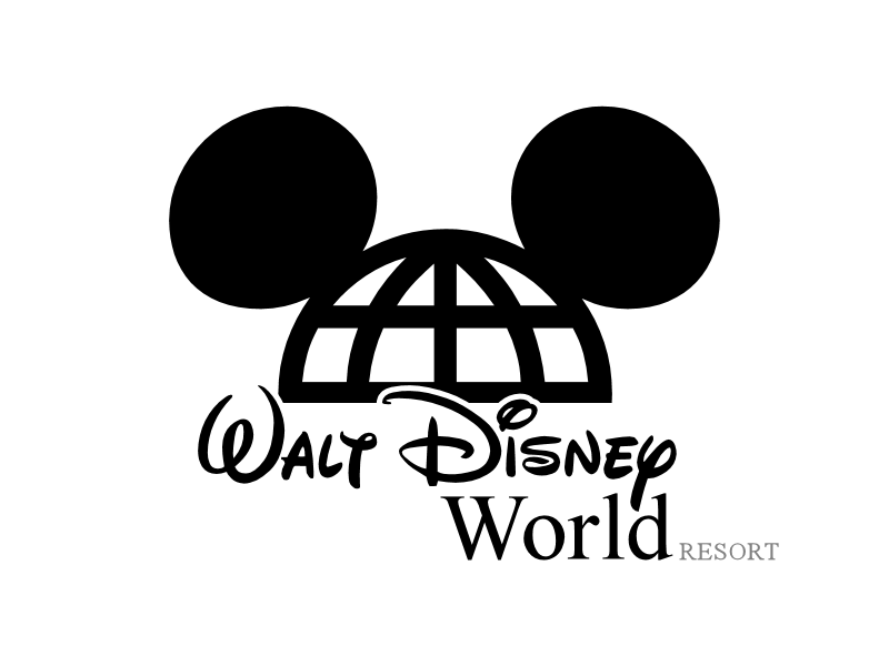
A VERY rough version I did:
Not bad. :shrug:
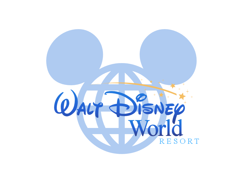
A VERY rough version I did:
Not bad. :shrug:
Like this?


Those look pretty nice!
I like how it looks but I just feel that it's better suited for your typeface on an inter-department memo then on the sign of an amusement park.

This isn't a logo for a theme (not amusement) park, this is a logo for an entire vacation destination. Believe it or not, some people come to Walt Disney World for stuff other than the parks!
I still like the old logo...
How about a little of the old and a little of the new?

This is the best fan logo I have seen mocked up so far. I understand the association of humanist fonts with Microsoft Word, but I think the rounded corners help match the large D. Simplicity is the true key to a good logo for Walt Disney World. The name itself has become a symbol that evokes different feelings, sentiments, images, memories, etc. in each person. Trying to capture the scope of Walt Disney World in an image would always fall short. The old logotype, and this mock up, provide a simplicity that allows for the reader to make their own interpretations.
I would rather have DL go back to this.

and WDW use this

Register on WDWMAGIC. This sidebar will go away, and you'll see fewer ads.