Two Spirited Quickees...Imagination closing

Figments Friend

Well-Known Member
-

Martin's excellent and informative 'Journey Into Imagination - Ultimate Tribute' video also shows a good example of what the interior of the Pavilion used to look like..including that fantastic mural.
Be sure to check it out... starting at about the 8 minute mark.
He has captured some excellent footage here...even zooming in on the surreal ceiling and getting shots of the entire mural in the loading area.

Seeing the video images of it helps give the mural a sense of scale in relation to the interior of the Pavilion, for those that missed it.
Enjoy!


some guy

Active Member
This here potted plant building

edouard-flowertower.jpg
I thought the Imagination Potted Plant building was on hold until John Morgan got that thing passed. :)
 

BobConnor

Active Member
Figments Friend, the murals you show are beautiful and it is sad that they were destroyed. If Disney did not want to use the murals in the revamped ride why couldn't they cover them with black plastic or white paper and then paint over that surface? Who knows what people might want to see in the future. Oh, and I have a suit like Dr. Channing's and I am better looking in it.

Which brings up that the whole Honey I Shrunk and Flubber franchises are really, really, really dated. When I went there last week, I had to think before I knew what the characters were related to.
 

Bairstow

Well-Known Member
Figments Friend, the murals you show are beautiful and it is sad that they were destroyed. If Disney did not want to use the murals in the revamped ride why couldn't they cover them with black plastic or white paper and then paint over that surface? Who knows what people might want to see in the future. Oh, and I have a suit like Dr. Channing's and I am better looking in it.

Which brings up that the whole Honey I Shrunk and Flubber franchises are really, really, really dated. When I went there last week, I had to think before I knew what the characters were related to.

Don't forget The Computer Wore Tennis Shoes.

img1F10.jpg
 

Figments Friend

Well-Known Member
Figments Friend, the murals you show are beautiful and it is sad that they were destroyed. If Disney did not want to use the murals in the revamped ride why couldn't they cover them with black plastic or white paper and then paint over that surface? Who knows what people might want to see in the future. Oh, and I have a suit like Dr. Channing's and I am better looking in it.

Which brings up that the whole Honey I Shrunk and Flubber franchises are really, really, really dated. When I went there last week, I had to think before I knew what the characters were related to.

That would have been nice...to have somehow preserved the mural.
Like the famous 'Promise of Tomorrow' Horizons mural that was eventually removed and saved.
But like i had touched on in a earlier post, there was a real sense of urgency to 'destroy and erase' what was there for devious reasons.

I would LIKE to think there are some elements left behind of the creation process of this mural in the WED/WDI archives.
Surely there is a color layout for it showing the graphics and all paint choices.
I always thought that in today's market for Disney nostalgia/collector's art a print made of this design would sell phenomenally well.
It really was a stunning work of design, that mural.


Regarding the 'dated' nature of the IPs included in the current JIIwF ride...yeah, i completely agree.
It just goes to show you the 'crazed' state of mind Disney was in at that time in the mid to late 90s.
Becoming 'revelant' and 'hip and edgy' were the new catch phrases being sent around to all departments of the Disney Company, WDI included.
It was the new mantra...and almost all projects done during that time period reflect this in some manner.
The Universe of Energy re-do is another example of the '90s Complex' taking over a once great attraction.
I so miss the Radok Screen that used to be there.
Something cool and unique was replaced with something 'contemporary and relevant'....which today is seen as terribly dated and showing it.
I can guarantee that if the Radok Screen was still there today turning ( with a updated film presentation ) it would still be wowing Guests.

That is the problem with using currant trends and incorporating it heavily into a attraction.
It creates a time stamp that in the coming years becomes a problem.


But the dated feel the currant Imagination Pavilion has today has more to do with the '90's-ness' of it all from a design standpoint then the IPs in my opinion.
The loud color scheme, shrill audio overload when you first enter the Pavilion, and the cheesy early CGI animation of Figment himself make one roll their eyes.
Once on the ride, it is not as bad...but the entrance is a jumbled mess.

The ONE redeeming feature however ( depending on how you look at it..) is the caged shelving to your right as you head up to the loading area of the current ride.
If you stop and take a look, you will see various parts from the Original ride. Mostly old lighting equiptment, dimmers, a few scenic dials and set props from the fabled Dreamport, and some other small hidden gems.

Next time you pass through, bow your head and pay your respects.
These relics of the past are what little remain from the Original.
 
Last edited:

Figments Friend

Well-Known Member
Yep kinda a shame, and now another slot for a new country will go to a princess meetngreet, real nice. :banghead:

Yeah, but look at it this way:
At least a Princess M&G is a temporary thing...or CAN be.

Like a certain play area that used to exsist.
Once something bigger and better came long it was history.

;)

I consider it a 'place filler' until something better is slated for the spot.

Not agreeing that having this in EPCOT is a good thing.
It seems idiotic to me..go to MK if ya want to meet the Princesses.
 

Goofyernmost

Well-Known Member
The Universe of Energy re-do is another example of the '90s Complex' taking over a once great attraction.
I so miss the Radok Screen that used to be there.
Something cool and unique was replaced with something 'contemporary and relevant'....which today is seen as terribly dated and showing it.
I can guarantee that if the Radok Screen was still there today turning ( with a updated film presentation ) it would still be wowing Guests.
The reason that something cool and unique was replaced with something contemporary and relevant, is because that cool and unique thing had become dated and showing it. Not to mention that the show itself sucked so bad that it was causing a vacuum in space and a 45 minute infomercial for Exxon is not something that I think I should have had to pay admission to see.

I also believe that your thought about how much the guests were "wowed" by the Radok Screen is a bit exaggerated. Personally, I liked the Ellen preshow better by huge proportions to the old revolving screens. The message was boring and therefore took the "wow" right out of it. I know that obviously you thought it was great and I am both happy that you got something special out of it and also sad that it is no longer there for you to see. Just don't put all of us in the category of depressed that it is no longer there. The only thing that is dated about the current show is that the actors were all younger then they are currently. The message hasn't really changed at all. It is as current and as relevant as it was when the door opened.
 

Beholder

Well-Known Member
I think the problem with Disney's efforts to be "edgy" or "trendy" in the nineties is a bit like Hollywood in a few of its soundtrack/scoring decisions. Young Guns with an electric guitar track. Lady Hawk with the 80's keyboard score. It forever remains in the era in which it was made, not the era it's meant to depict. Even though the message of UoE may be relevant, the dated look creates a disconnect with some people. Younger audiences especially have that "and who are these people?" Updating the technology to tell the story, in this context, seems to work better than making things contemporary, especially true when trying to incorporate trends.

Nobody wants to see Minnie Mouse twerking.
 

Cosmic Commando

Well-Known Member
The reason that something cool and unique was replaced with something contemporary and relevant, is because that cool and unique thing had become dated and showing it. Not to mention that the show itself sucked so bad that it was causing a vacuum in space and a 45 minute infomercial for Exxon is not something that I think I should have had to pay admission to see.

I also believe that your thought about how much the guests were "wowed" by the Radok Screen is a bit exaggerated. Personally, I liked the Ellen preshow better by huge proportions to the old revolving screens. The message was boring and therefore took the "wow" right out of it. I know that obviously you thought it was great and I am both happy that you got something special out of it and also sad that it is no longer there for you to see. Just don't put all of us in the category of depressed that it is no longer there. The only thing that is dated about the current show is that the actors were all younger then they are currently. The message hasn't really changed at all. It is as current and as relevant as it was when the door opened.
I written about this more verbosely somewhere on these boards, but here's my quick rundown of the dated-ness of the current UoE:

1. Alex Trebek's mustache
2. Gigantic cell phone in the preshow
3. Percentage of renewable energy that Bill references has probably gone up
4. Gung ho attitude towards deep sea drilling

The basic ideas of the show: that we're stuck using fossil fuels to some degree for a while, renewable resources are going to play a bigger part in the future, and we need to use our brain power to think our way out of our own "energy nightmare"... sound pretty relevant today. It's like when people complain about the voice recognition oven in CoP; with Siri on iPhones and autocomplete everywhere, has that joke ever been more relevant than it is today? But don't get me started on CoP... :arghh:
 

Figments Friend

Well-Known Member
The reason that something cool and unique was replaced with something contemporary and relevant, is because that cool and unique thing had become dated and showing it. Not to mention that the show itself sucked so bad that it was causing a vacuum in space and a 45 minute infomercial for Exxon is not something that I think I should have had to pay admission to see.

I also believe that your thought about how much the guests were "wowed" by the Radok Screen is a bit exaggerated. Personally, I liked the Ellen preshow better by huge proportions to the old revolving screens. The message was boring and therefore took the "wow" right out of it. I know that obviously you thought it was great and I am both happy that you got something special out of it and also sad that it is no longer there for you to see. Just don't put all of us in the category of depressed that it is no longer there. The only thing that is dated about the current show is that the actors were all younger then they are currently. The message hasn't really changed at all. It is as current and as relevant as it was when the door opened.

My intended point was more in the way the original pre-show was presented at UoE, in that it was once a unique concept ( the Radok Screen ) compared to the now stationary widescreen.
I was looking at it from that perspective, not from just the film itself.

Perhaps i should have made my intent clearer in the post you were responding to.
I had brought up the old original UoE pre-show as an example of how a creatively presented attraction concept is replaced with a more simplified form of presentation.
In some opinions, instead of 'plussing' the experience and bringing it to a higher creative level, it is instead viewed as a step down.

Much like comparisons fans often make to the Original JII and what followed.

I agree that the original UoE pre-show was something that would likely not fly with today's Guests from a film standpoint, but the concept of the moveable kinetic screen i see continued potential for.
Absolutely.
It is certainly much more visually exciting and unique when compared to a standard wide screen...especially for a theme park.
Having some physical elements enhance the projected image seems more in line for that type of setting.

It would be more visually interesting, in my opinion, to have a new film presentation over the 'old' Radok concept.
Combine the two elements, then you would have a great 'updated' pre-show but retain some of the unique elements in the physical presentation.
 
Last edited:

Figments Friend

Well-Known Member
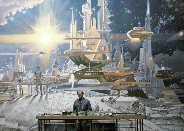
Just checking. Prologue and Promise is one of my favorite McCall works. I am always thrilled when others remember it.

It is a stunning piece.

How can one not remember it...?
I may embarrassingly keep forgetting it's actual title, but i definitely remember the design itself.


'work in progress' photos....giving a excellent sense of scale.


Admiral, you might enjoy this article on McCall's works related to this piece here :
http://progresscityusa.com/2011/07/27/the-horizons-story-part-ii-robert-mccall/

:)
 

wdwfan22

Well-Known Member
My intended point was more in the way the original pre-show was presented at UoE, in that it was once a unique concept ( the Radok Screen ) compared to the now stationary widescreen.
I was looking at it from that perspective, not from just the film itself.

Perhaps i should have made my intent clearer in the post you were responding to.
I had brought up the old original UoE pre-show as an example of how a creatively presented attraction concept is replaced with a more simplified form of presentation.
In some opinions, instead of 'plussing' the experience and bringing it to a higher creative level, it is instead viewed as a step down.

Much like comparisons fans often make to the Original JII and what followed.

I agree that the original UoE pre-show was something that would likely not fly with today's Guests from a film standpoint, but the concept of the moveable kinetic screen i see continued potential for.
Absolutely.
It is certainly much more visually exciting and unique when compared to a standard wide screen...especially for a theme park.
Having some physical elements enhance the projected image seems more in line for that type of setting.

It would be more visually interesting, in my opinion, to have a new film presentation over the 'old' Radok concept.
Combine the two elements, then you would have a great 'updated' pre-show but retain some of the unique elements in the physical presentation.

While the radok screen was neat the presentation was downright boring, and not sure what they could have done with it to make it not so boring. So with that being said I don't think it was a downgrade when they went to a regular screen. Besides the few diehard Epcot fans on here I've yet to meet anymore that found the original Universe of Energy entertaining.
 

Register on WDWMAGIC. This sidebar will go away, and you'll see fewer ads.

Back
Top Bottom