-
Welcome to the WDWMAGIC.COM Forums!
Please take a look around, and feel free to sign up and join the community.
You are using an out of date browser. It may not display this or other websites correctly.
You should upgrade or use an alternative browser.
You should upgrade or use an alternative browser.
Tropical Hideaway Construction - Tiki Room Refurbishment - Adventureland Entry Remodel
- Thread starter TP2000
- Start date
Phroobar
Well-Known Member
mickEblu
Well-Known Member
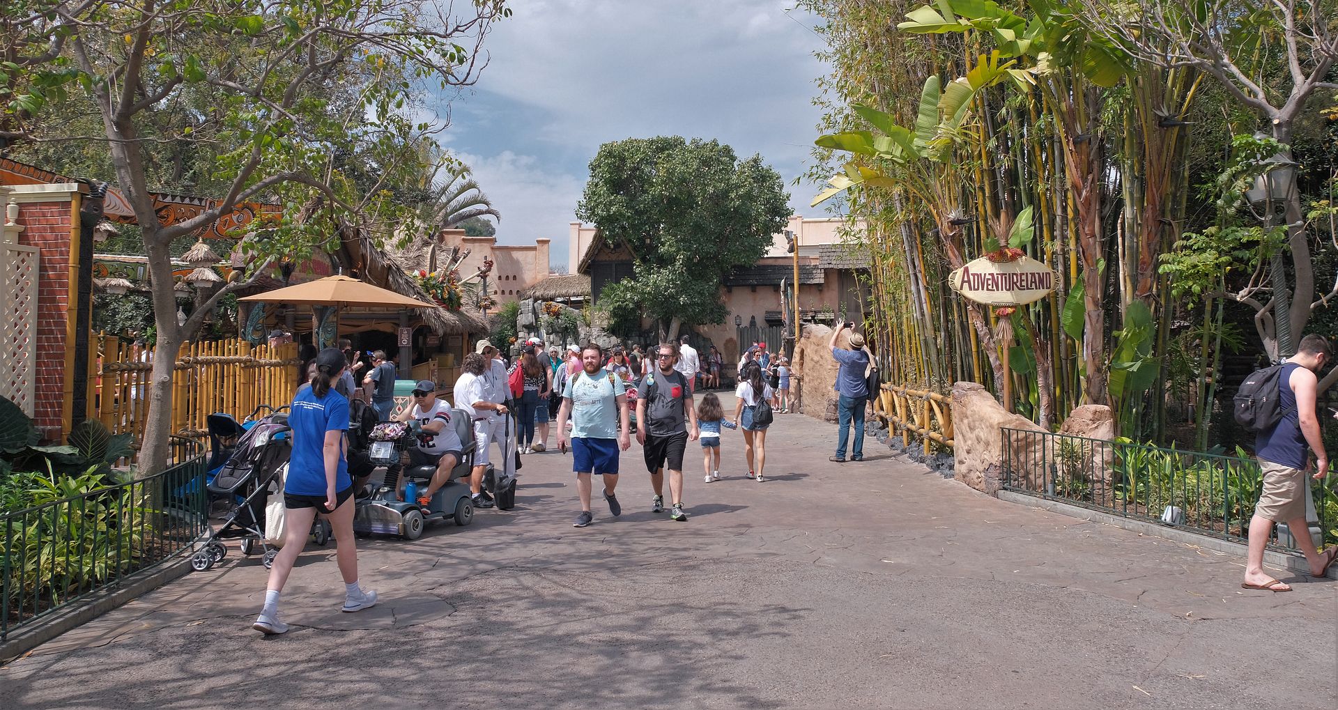
I disagree. It is too open. It needs the sign back
And there is nothing to look at but bathrooms and a tree
chadwpalm
Well-Known Member
- In the Parks
- No
I have mixed feelings. I like the open walkway which reduces bottlenecks, but I also liked the intimacy of the entrance. I think it will look much better when the overhead sign is back.
Daannzzz
Well-Known Member
Disney Analyst
Well-Known Member
Sign has started to go up!
britain
Well-Known Member
Disneysea05
Well-Known Member
- In the Parks
- Yes
I was about to say the same thing. It seems apparent that all the ornamentation will be installed.
Sharon&Susan
Well-Known Member
The ornamentation will have to be replaced due to its offensiveness. May I propose lollipops to replace the shocking elephant tusks and a smiley face to replace that tiki face that scared many children?
Phroobar
Well-Known Member
The ornamentation will have to be replaced due to its offensiveness. May I propose lollipops to replace the shocking elephant tusks and a smiley face to replace that tiki face that scared many children?

TROR
Well-Known Member
Sign has started to go up!
You can really see how much wider that walkway is now. Makes me wish Adventureland actually had a weenie to pull in guests instead of greeting them with two restrooms.
Mac Tonight
Well-Known Member
There's a joke in there somewhere...You can really see how much wider that walkway is now. Makes me wish Adventureland actually had a weenie to pull in guests instead of greeting them with two restrooms.
Disney Analyst
Well-Known Member
Decor missing aside, I love it. I love the nice tall rounded arch, really feels grand.
Now about weenies...
Now about weenies...
mickEblu
Well-Known Member
Decor missing aside, I love it. I love the nice tall rounded arch, really feels grand.
Now about weenies...
Yeah that’s why that little side sign would never work (I think a few people said they preferred it) and why the real sign needs that ornamentation.
Disney Analyst
Well-Known Member
Are those boxes on the left going to make it even more difficult to order from the doll whip stand? All the more reason to shut it down and make you go to tropical hideaway.
Speaking of boxes, are those tikis holding the torches new?
I would be offended by that. As lollipops are primarily targeted at children and greatly contribute toward cavities.The ornamentation will have to be replaced due to its offensiveness. May I propose lollipops to replace the shocking elephant tusks and a smiley face to replace that tiki face that scared many children?
Register on WDWMAGIC. This sidebar will go away, and you'll see fewer ads.

