News Tomorrowland love

mergatroid

Well-Known Member
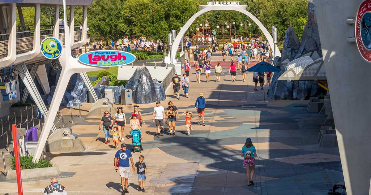
All that comes to mind is Liberty Square's streak, but I don't know if I would call that a pattern. I think Adventureland also has a streak that follows the red pavement.
Strangely though it suddenly appears to be a problem to some that TL is having a change. Suess Landing has a patterned floor but much of the rest seems one colour per land really like most theme parks.
 

Bocabear

Well-Known Member
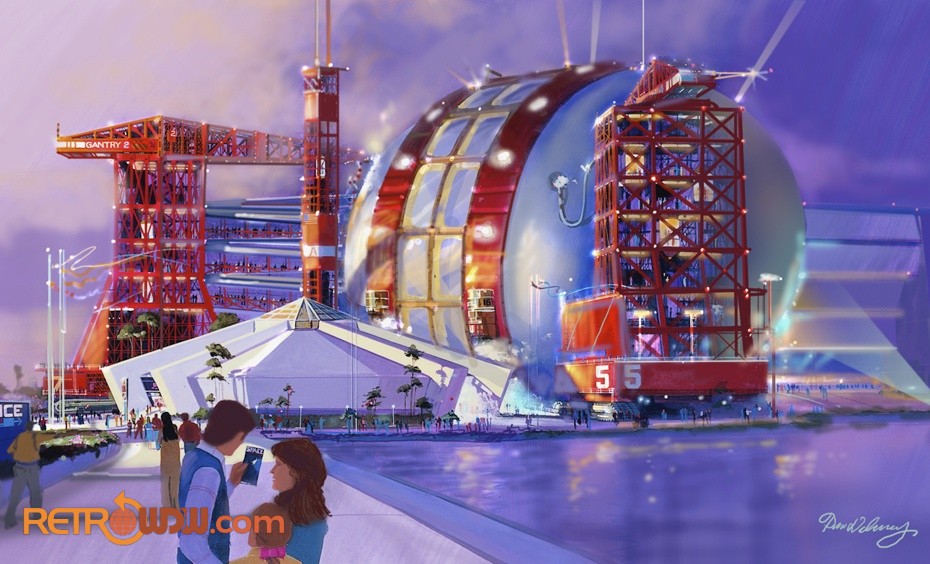
Mission Space forecourt
1620916697188.png
1620916800284.png
 

The Rocketeer

Well-Known Member
They should bring back play old Tomorrowland 1989-2003 BGM Area Music for new Tomorrowland look at WDW. I want to hear Bubble Shuffle, Elsewhere, Night Fire Dance and Sea Space again. :)
I mean, I would love that, but I doubt a bunch of late 80's new age/jazz fusion music is exactly what Disney is looking to implement again. If they could mix a few of those tracks, Bubble Shuffle and Night Fire Dance are probably the best choices, with songs like End of Line and Flynn Lives from the Tron Legacy soundtrack I would be a happy man. I'm not a betting man, but if I were, I'd bet the current loop will stay and just the Tron entrance plaza will have any sort of new area music.
 

The Rocketeer

Well-Known Member
I know Mission Space gets a rough reception but as a outer space fan I love everything about it from its exterior forecourt to the ride itself. Here's hoping that maybe a SpaceX redo could happen in the future!
I love it too! I think it lost a little charm with the 2017 refurbishment, but that's just me. I can't wait for Space 220 when it finally opens on February 31st, 2075...
 

brihow

Well-Known Member
I love it too! I think it lost a little charm with the 2017 refurbishment, but that's just me. I can't wait for Space 220 when it finally opens on February 31st, 2075...
Not to go too off-topic, but what exactly did they change in the 2017 refurb? I've been on before and after that year and didn't notice anything.
 

trainplane3

Well-Known Member
Not to go too off-topic, but what exactly did they change in the 2017 refurb? I've been on before and after that year and didn't notice anything.

The CGI was massively updated. It looks like it's actually modern vs looking like a PS1 pre-rendered cutscene. The lighting and shadows are actually realistic looking now. Of course these Youtube comparisons aren't fair but it is a big difference if you remembered how bad the original looked.
Old:
old1.JPG


new1.JPG


Old:
old3.JPG

New:
new3.JPG

Old:
old2.JPG

New:
new2.JPG
 

Captain Barbossa

Well-Known Member
The horribly-aged CGI from 2003 was also updated.

The CGI was massively updated. It looks like it's actually modern vs looking like a PS1 pre-rendered cutscene. The lighting and shadows are actually realistic looking now. Of course these Youtube comparisons aren't fair but it is a big difference if you remembered how bad the original looked.
Old:
View attachment 557696

View attachment 557697

Old:
View attachment 557698
New:
View attachment 557699
Old:
View attachment 557700
New:
View attachment 557701
Ah, forgot they updated orange. I honestly don’t think I’ve ridden orange since the refurb though. The new (I guess old now lol) green film is pretty cool imo.
 

tparris

Well-Known Member
The CGI was massively updated. It looks like it's actually modern vs looking like a PS1 pre-rendered cutscene. The lighting and shadows are actually realistic looking now. Of course these Youtube comparisons aren't fair but it is a big difference if you remembered how bad the original looked.
Old:
View attachment 557696

View attachment 557697

Old:
View attachment 557698
New:
View attachment 557699
Old:
View attachment 557700
New:
View attachment 557701
Wow. I’m one of the few people I know who actually rides M:S every time I visit EPCOT, and I still never realized just how drastic the CGI improvements were. Thanks for the comparison.
 

lazyboy97o

Well-Known Member
Not to go too off-topic, but what exactly did they change in the 2017 refurb? I've been on before and after that year and didn't notice anything.
Gary Sinise is gone and the green mission is now an orbit around the Earth. Not sure if I’m forgetting anything.
The horribly-aged CGI from 2003 was also updated.
The queue was reconfigured to add a fourth lane so that there are dedicated FastPass+ queues for Green and Orange. Part of the entrance sphere was removed to accommodate the new lane on the Orange side and the entrance area was redone with new show sets and signage. Walls were also added before the merge point to physically separate the standby and FastPass+ queues.
 

RSoxNo1

Well-Known Member
I know Mission Space gets a rough reception but as a outer space fan I love everything about it from its exterior forecourt to the ride itself. Here's hoping that maybe a SpaceX redo could happen in the future!
Mission: SPACE isn't the problem with EPCOT right now. I too enjoy the facade but do find the ride underwhelming. A point of note on the new Green version, it seems the faux interactivity wasn't as well executed as the original.

Having said that, if Disney wanted to revisit the original Space Pavilion concept or do something else next to Mission: SPACE that would otherwise block the view of the Guardians building from inside the park, I'd welcome it.

tumblr_mizqufnUqO1r1pz1eo5_1280.jpg
 

Movielover

Well-Known Member
Mission: SPACE isn't the problem with EPCOT right now. I too enjoy the facade but do find the ride underwhelming. A point of note on the new Green version, it seems the faux interactivity wasn't as well executed as the original.

Having said that, if Disney wanted to revisit the original Space Pavilion concept or do something else next to Mission: SPACE that would otherwise block the view of the Guardians building from inside the park, I'd welcome it.

tumblr_mizqufnUqO1r1pz1eo5_1280.jpg

100 percent agree. With the explosion of renewed interest in space flight and the incredible things SpaceX and (eventually... Hopefully...) Blue Origin and others are creating. It would be fun to see what could be done. Will anything else space actually be added? Probably not but we can dream.
 

jt04

Well-Known Member
It dawned on me today of what is a major thematic 'faux pas' in Tomorrowland. The light rigging in front of the Tomorrowland Stage ruins the theming in that section entirely. 😵

I know they won't be doing anything with it soon but it should be on someone's 'to do' list. It is as bad as The Hulk nets at IoA. But worse because it is a Disney park. 😒

Ideally they should copy the design of the land's new entrance marquee. That would be simple, inexpensive (relatively) and epic looking. Just my unsolicited 2 cents. 💰

I'm right on this one. Take it to the 🏦
 

Register on WDWMAGIC. This sidebar will go away, and you'll see fewer ads.

Back
Top Bottom