News Tiana's Bayou Adventure - latest details and construction progress

Bocabear

Well-Known Member
my critique on the ride is a lack of staging... Old guard created dark rides with an amazing send of staging and space...Little Mermaid seems to be everything thrown right up to the track...Old Disney did some amazing placemaking, beautiful illusions of space... The VOTLM seems to be less creative in the way the scenes are laid out and staged... But it is a sweet ride ... yes.
 

JD80

Well-Known Member
my critique on the ride is a lack of staging... Old guard created dark rides with an amazing send of staging and space...Little Mermaid seems to be everything thrown right up to the track...Old Disney did some amazing placemaking, beautiful illusions of space... The VOTLM seems to be less creative in the way the scenes are laid out and staged... But it is a sweet ride ... yes.

While I won't defend VOTLM, but rides like Rise and Remy would fly in the face of that statement. Not to mention some of the newer rides in the Asian parks as well from over the last decade. But I have not been on them so I can't comment to be sure.
 

Bocabear

Well-Known Member
While I won't defend VOTLM, but rides like Rise and Remy would fly in the face of that statement. Not to mention some of the newer rides in the Asian parks as well from over the last decade. But I have not been on them so I can't comment to be sure.
I was referring specifically to the old school Disney dark rides... There was a real art to the scenic design and staging...
 

Epcot82Guy

Well-Known Member
While I won't defend VOTLM, but rides like Rise and Remy would fly in the face of that statement. Not to mention some of the newer rides in the Asian parks as well from over the last decade. But I have not been on them so I can't comment to be sure.

I agree on Rise. I disagree on Remy, though. It fails when compared it to any of the old school masterpieces - meaning HM, PotC, Horizons, JII, etc. When compared to the Fantasyland rides, I think there is a better argument. But, the sets and screens of Remy just don't hold a candle to the immersion of the others. And, that is by design and budget.

I would argue that's VOTLM's issue as well. Other than the weird ending, it's issue is that it feels cheap. If it had the detail of something like Navi (or even close to it), I think it could be in that category. But, that's not what Disney is building these days.
 

JD80

Well-Known Member
I have a lot of fun on Remy's. I enjoy the queue and the music/theme outside and inside. It's a pretty chill vibe all around.

Personal preference.

HM and PotC are my two favorite rides of all time, so you won't get an argument from me.
 

MerlinTheGoat

Well-Known Member
The 1983 rebuilds of the classic Disneyland Fantasyland rides are a good reference for where Little Mermaid falters. Despite their extremely tiny buildings and simplicity, there was a masterful use of forced perspective trickery to make rooms seem like they extended far beyond their true boundaries, accompanied by gorgeous painted detail on otherwise flat surfaces and walls. Even rides like Mr Toad with its flat wooden cutout has a wonderful amount of multi layered artistic detail. WDW's Snow White ride also received an overhaul in 1994 that achieved similar results, its painted murals were gorgeously detailed (though it wasn't without its flaws and some people preferred the scarier 1971 original).

The Little Mermaid ride by comparison has a serious scenery problem. There's a lot of blurred or blank empty voids on the walls. Outside of the mural at the loading platform, the painted detail is extremely disappointing. Forced perspective effects are also almost nonexistent, so even some of the larger rooms seem rather cramped. And there's also a ton of exposed backstage elements (especially on the ceiling of the Under the Sea scene). I'd argue it's even worse than WDW's ancient Peter Pan ride, which just has black curtains in place of the beautifully painted wall murals of DL 83. But ironically, even Pan has less visible backstage elements than TLM.
 

Dranth

Well-Known Member
I never thought it was bad. I know its old now, but I always thought of it a classic dark ride with more modern technology when it first opened.
The creepy plastic Ariel did me in. That and it seems to stop more than any other ride.

If they redid the Under the Sea section and somehow extended the moving walk way where you get on/off so it didn't stop so much it would be MUCH better.
 

MerlinTheGoat

Well-Known Member
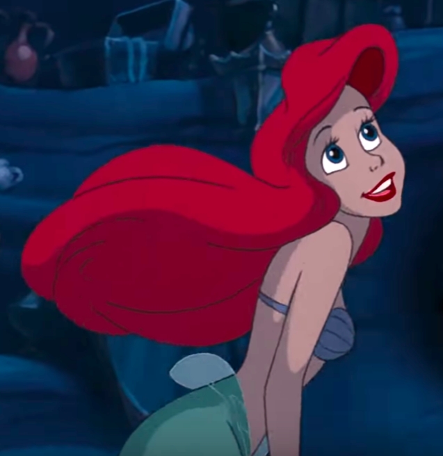
The Ariel figures wouldn't take a lot to fix, but it's sad that they messed up on such simple details. A huge amount of the issue is incorrect/nonexistent makeup on the face. No eyelashes or lipstick. Eyebrows are the wrong color (they're supposed to be black, not red). The irises/pupils are way too large. And while she doesn't have any cheek blush in the film, the AA being a physical 3-dimensional would probably benefit from it to give the face more depth and fit better with the dark contrasty lighting. They should also at least have added actual texture to the hair for the same reason. They added an actual wig on the above water figures in an early renovation and it looks tremendously better than the rubbery/plastic texture still present on the underwater variants. There are probably some other tweaks that could stand to be made as well. Overall though, a very poor and off model figure.

Profile_-_Ariel.jpg


cp40azt.png


Some of the problems are also the result of the lighting and skin texture. The skin looks far too shiny and orange, and the lighting is way too bright (especially in this scene which is otherwise lit with a subdued dark bluish hue). So either give it more of a matte finish, or (and this is the better solution IMO) use old school black lighting. Lighting the entire ride with dark light would also help hide some of the backstage elements (if they're painted pure black) and keep the lighting as a whole much more uniform and controlled. They did add SOME black light in the Under the Sea scene in the early renovation (also revising Ariel's hair in the scene), but it's very awkward as it still switches back and forth between regular and dark light.
 

James Alucobond

Well-Known Member
The Ariel figures wouldn't take a lot to fix, but it's sad that they messed up on such simple details. A huge amount of the issue is incorrect/nonexistent makeup on the face. No eyelashes or lipstick. Eyebrows are the wrong color (they're supposed to be black, not red). The irises/pupils are way too large. And while she doesn't have any cheek blush in the film, the AA being a physical 3-dimensional would probably benefit from it to give the face more depth and fit better with the dark contrasty lighting. They should also at least have added actual texture to the hair for the same reason. They added an actual wig on the above water figures in an early renovation and it looks tremendously better than the rubbery/plastic texture still present on the underwater variants. There are probably some other tweaks that could stand to be made as well. Overall though, a very poor and off model figure.

Profile_-_Ariel.jpg


cp40azt.png


Some of the problems are also the result of the lighting and skin texture. The skin looks far too shiny and orange, and the lighting is way too bright (especially in this scene which is otherwise lit with a subdued dark bluish hue). So either give it more of a matte finish, or (and this is the better solution IMO) use old school black lighting. Lighting the entire ride with dark light would also help hide some of the backstage elements (if they're painted pure black) and keep the lighting as a whole much more uniform and controlled. They did add SOME black light in the Under the Sea scene in the early renovation (also revising Ariel's hair in the scene), but it's very awkward as it still switches back and forth between regular and dark light.
While I think everything you mentioned is an issue, I think the biggest problem with the first two Ariel animatronics is actually the positioning relative to the viewing angle of guests. Just as selfies are unflattering when taken from under the chin, so too is it awkward to look up an animatronic’s nose.
 

MisterPenguin

President of Animal Kingdom
Premium Member
I think it is about the best queue in the Magic Kingdom... Beautifully and thoughtfully designed... I wish the ride matched the effort.
The outdoor water and the size and length of the rock work is impressive.

But, last time there, the roof was leaking in quite a few places.

Also, the interactive screen weren't well thought out. They're up high where children can't see. They're small. And they are speedbumps in the queue, like most stationary interactive queue elements that keep people from moving up in line when space opens up.
 
Last edited:

BrerFoxesBayouAdventure

Well-Known Member
Please, you know full well most of the people who are in here complaining all the time would call Disney cheap and use it against them if they didn't redo the queue.
I think keeping the queue as is wouldn't have been a problem BUT at the same time where would they put all this new crap? Splash's queue once you get inside the barn is pretty narrow and has nowhere near enough room for them to show stuff.
 

Register on WDWMAGIC. This sidebar will go away, and you'll see fewer ads.

Back
Top Bottom