-
The new WDWMAGIC iOS app is here!
Stay up to date with the latest Disney news, photos, and discussions right from your iPhone. The app is free to download and gives you quick access to news articles, forums, photo galleries, park hours, weather and Lightning Lane pricing. Learn More -
Welcome to the WDWMAGIC.COM Forums!
Please take a look around, and feel free to sign up and join the community.
You are using an out of date browser. It may not display this or other websites correctly.
You should upgrade or use an alternative browser.
You should upgrade or use an alternative browser.
MK Tiana's Bayou Adventure - latest details and construction progress
- Thread starter wdwmagic
- Start date
- Status
- Not open for further replies.
My theory is it's supposed to draw riders eyes away from the drop as you make the first two loops around the mountain
That you'll never, ever lose sight of whatâs really important.
The Princess and the Frog (2009) Family clip with quote That you'll never, ever lose sight of what’s really important. Yarn is the best search for video clips by quote. Find the exact moment in a TV show, movie, or music video you want to share. Easily move forward or backward to get...getyarn.io
Related - it seems like the quote is meant to be visble to guests as the logs float around the corner on the upper level of the flume.
Incomudro
Well-Known Member
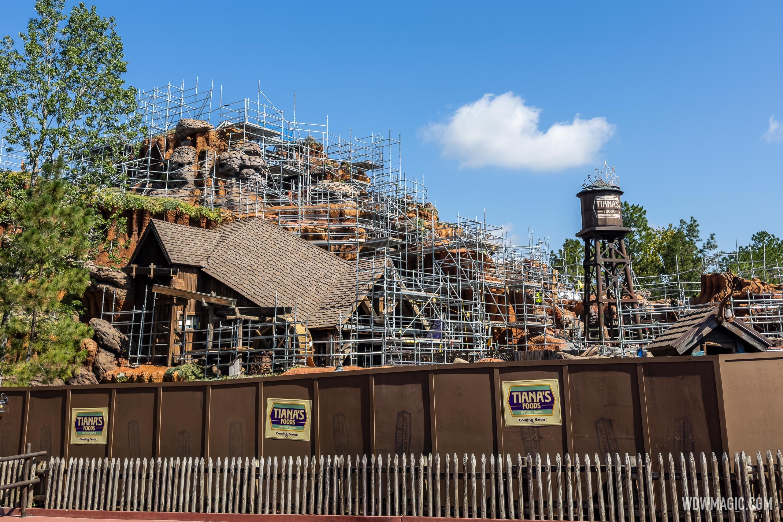
The tiara-topped water tower was installed overnight.
That's pretty terrible.
matt9112
Well-Known Member
Tiana has a pretty obvious affinity for Art Nouveau style, which affords some some fun interplay with more traditional New Orleans wrought iron work. Plenty won't like the implementation, but from an art direction perspective it's quite appropriate.
If the surrounding area was New Orleans I would agree. If the tiara did not seem to wreck forced prospective. Granted I guess this is any easy way to make the mountain small and accessible. But that doesn’t really justify the decision. The surrounding area is not New Orleans and even if they did redo the general area (from pico bills to big thunder) than big thunder would be a massive incoherence. Granted you might argue that big thunder isn’t long for this world. I would say that’s a possibility with the beyond thunder mountain talk HOWEVER Disney's track record of redoing things and retrheming them isn’t great in my opinion.
There’s a lush Polynesian water/trail thing in the center of Epcot center for example.
splah
Well-Known Member
I like the logo on this water tower better than cold one we gotThe name ght time concept art seems to indicate some sort of flood lights on it
View attachment 726764
Incomudro
Well-Known Member
"Foods" is just awful.The whole thing is terrible...especially the "Tiana's Foods" logo. Whoever dreamed up this backstory for the ride should have been sacked.
It sounds unimaginative and joyless. No one wants to visit an "Employee Owned Foods Factory" ride. Visiting her beautiful dream restaurant after the ride would have been a must-do, but this corporatization twist in the storyline for the ride makes no sense and really ruins the simple sweetness of the story and characters. Maybe it will be like Tokyo Disney Sea's Sinbad attraction...and after a year, they will go back and make it a sweet magical adventure without the contorted food factory storyline.
I can't wait for Cinderella's Employee Owned Shoe Factory & Sweatshop ride!
It sounds bad.
It would have been better had they skipped the food conglomerate thing and stuck with the restaurant.
"Tiana's Place" would have been nice.
Last edited:
matt9112
Well-Known Member
My theory is it's supposed to draw riders eyes away from the drop as you make the first two loops around the mountain
Possible however I don’t buy the demographic shift in the rides appeal that has been talked about…. A ride filled with cute cartoon like animals and a catchy song doesn’t seem to be any less for kids than a princess is. The height requirement already is low enough and is unlikely to change. The drop will still be there. In fact splash mountain made a point of having signs and such indicating the large drop from a transparency as well as marketing prospective. Not sure if guests being utterly surprised and upset the drop exists is a better option. IF you somehow made the drop ignorable when approaching and waiting for the attraction.
Maybe they can hide the screams too?
Incomudro
Well-Known Member
Reducing the visual size perspective of the mountain is a terrible route.Really like it!
Out front, away from the hill a bit more than I was expecting - as mentioned I think it helps reduce the size of the mountain
Nice to see progress and this didn't sit backstage for a month or anything
Part of the fun of Splash - and it should be the fun of Tiana's - is the slight sense of intimidation, and big sense of fun that the structure implies.
Just like space Mountain, just like Big Thunder, just like Expedition Everest.
Sir_Cliff
Well-Known Member
Just for comparison, I'm kind of interested to look at how they handled painted text in the original Splash. Interesting to know whether they look more authentic and, if so, why that is:I have no problem with the words or sentiment; it's the look of the inscription I object to. It has the same stencil-generated-from-a-Word-printout aesthetic as the spice-cart inscriptions at the Morocco pavilion.
PREMiERdrum
Well-Known Member
This is correct.If the surrounding area was New Orleans I would agree. If the tiara did not seem to wreck forced prospective. Granted I guess this is any easy way to make the mountain small and accessible. But that doesn’t really justify the decision. The surrounding area is not New Orleans and even if they did redo the general area (from pico bills to big thunder) than big thunder would be a massive incoherence. Granted you might argue that big thunder isn’t long for this world. I would say that’s a possibility with the beyond thunder mountain talk HOWEVER Disney's track record of redoing things and retrheming them isn’t great in my opinion.
There’s a lush Polynesian water/trail thing in the center of Epcot center for example.
However, the same issue existed with Splash as well - the deep south is a far cry from the old west. We just didn't care because we grew up with it that way. If all goes as I think it will, the ride will fit its surroundings much better in the near future.
TheMaxRebo
Well-Known Member
I get that and agree from a ride experience perspective.... But also seen a lot of chatter about how no mountains in Louisiana so then making the hill look lower makes sense thematicallyReducing the visual size perspective of the mountain is a terrible route.
Part of the fun of Splash - and it should be the fun of Tiana's - is the slight sense of intimidation, and big sense of fun that the structure implies.
Just like space Mountain, just like Big Thunder, just like Expedition Everest.
retr0gate
Well-Known Member
I like the Tiara more than I thought I would. Initially I was disappointed that we didn't get the one depicted in the WDW render, as I think it would've added some distinction between this one + the Disneyland one, but ultimately, I think the simplicity of this design works. Forgetting it's a tiara entirely, the lotus design is a nice embellishment and compliments the whimsy of the Splash structure nicely. I'd imagine it'll look even better once more "natural" elements are added to the facade.
LittleBuford
Well-Known Member
Those don’t look original to me. The second one is fine, but the first suffers from the “Word stencil” issue.Just for comparison, I'm kind of interested to look at how they handled painted text in the original Splash. Interesting to know whether they look more authentic and, if so, why that is:
View attachment 726771
View attachment 726772
Smiley/OCD
Well-Known Member
As soon as the yeti gets fixed, they’re bringing the strobe over…Looks quite nice though perhaps it needed a weathering pass. I get that it's a princess thing and we don't want it to look worn out and old either, but it could do with looking like it wasn't just made yesterday.
I also semi-expected the tiara to light up, even if it was just the sparkles, so I'm a bit surprised it seems like it doesn't.
LittleBuford
Well-Known Member
It’s difficult to tell from photographs and with all the scaffolding up, but the tower doesn’t make the mountain look smaller to me.
Some more photos

 www.wdwmagic.com
Water Tower installed at Tiana's Bayou Adventure in Magic Kingdom

Water Tower installed at Tiana's Bayou Adventure in Magic Kingdom
Water Tower installed at Tiana's Bayou Adventure in Magic Kingdom
Weather_Lady
Well-Known Member
I agree! Why couldn't they have done this in a style and font that matched the theme (as was done with the front of the tower)? This is pure laziness.I have no problem with the words or sentiment; it's the look of the inscription I object to. It has the same stencil-generated-from-a-Word-printout aesthetic as the spice-cart inscriptions at the Morocco pavilion.
Smiley/OCD
Well-Known Member
The same Apex Tech art school grad that designed the CFTOD logo designed this…I agree! Why couldn't they have done this in a style and font that matched the theme (as was done with the front of the tower)? This is pure laziness.
- Status
- Not open for further replies.
Register on WDWMAGIC. This sidebar will go away, and you'll see fewer ads.
