
-
Welcome to the WDWMAGIC.COM Forums!
Please take a look around, and feel free to sign up and join the community.
You are using an out of date browser. It may not display this or other websites correctly.
You should upgrade or use an alternative browser.
You should upgrade or use an alternative browser.
The World's Most Magical Celebration - Walt Disney World's 50th anniversary
- Thread starter wdwmagic
- Start date
skypilot2922
Well-Known Member
Those are about the laziest celebration banners I have ever seen, my hometown chamber of commerce does a better job. are there NO creatives left in the company and you turned a graphic design intern loose on the project.
ImperfectPixie
Well-Known Member
Not to mention that whoever okayed the bottom pole going behind text should be fired. You can do a funky banner shape, but the way they did these is shamefully bad. (I have been in the sign business for many years)Those are about the laziest celebration banners I have ever seen, my hometown chamber of commerce does a better job. are there NO creatives left in the company and you turned a graphic design intern loose on the project.
TTA94
Well-Known Member
Those are about the laziest celebration banners I have ever seen, my hometown chamber of commerce does a better job. are there NO creatives left in the company and you turned a graphic design intern loose on the project.
Was going to say the same thing lol.
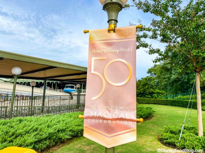
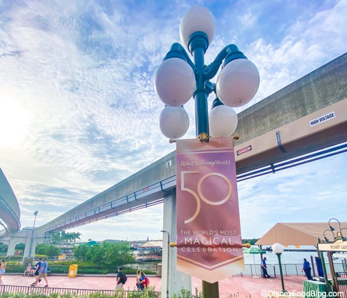
Photos of the 50th banners outside Magic Kingdom main entrance
 www.wdwmagic.com
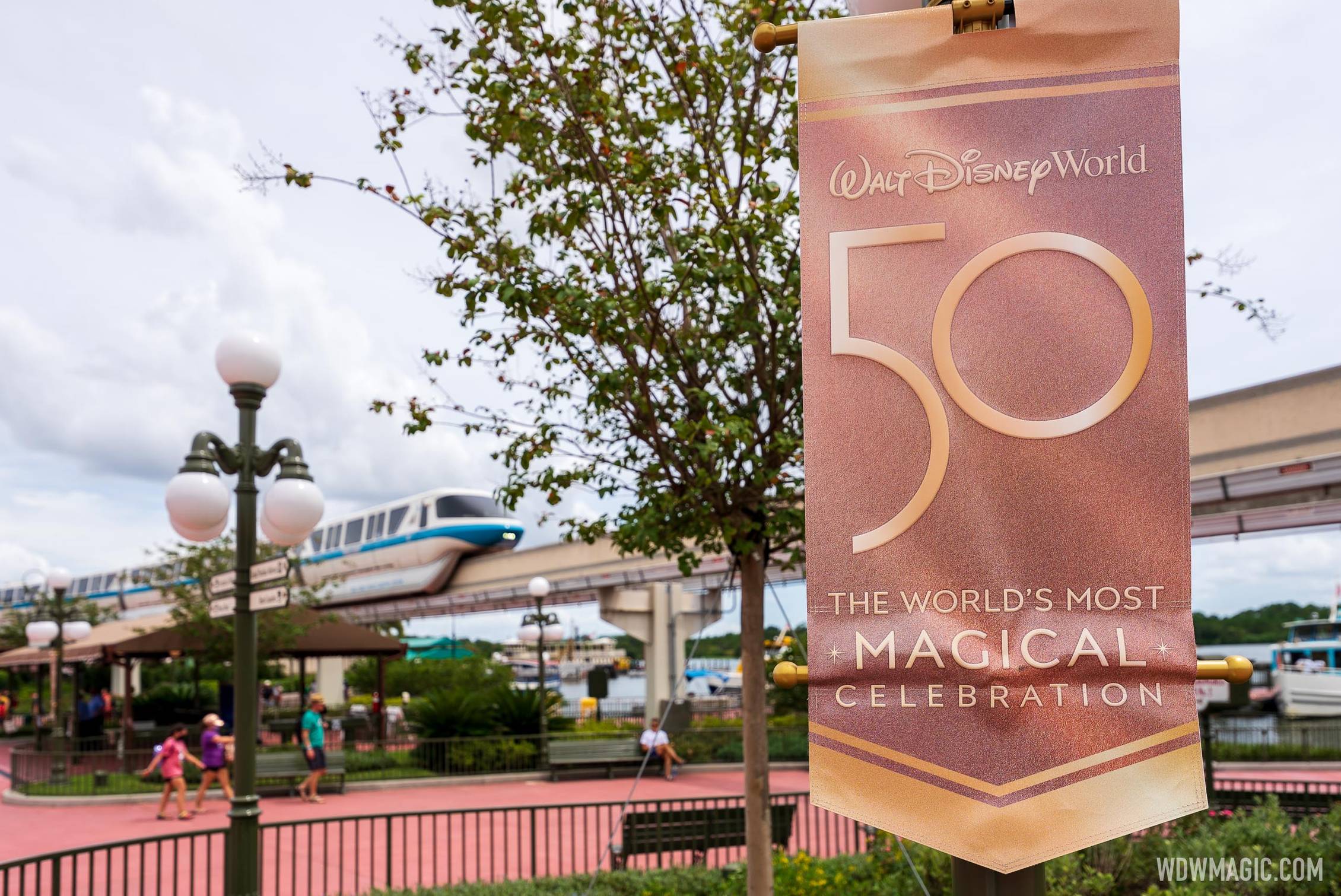
The World's Most Magical Celebration banners outside Magic Kingdom main entrance
The World's Most Magical Celebration banners outside Magic Kingdom main entrance
www.wdwmagic.com
UNCgolf
Well-Known Member
Not to mention that whoever okayed the bottom pole going behind text should be fired. You can do a funky banner shape, but the way they did these is shamefully bad. (I have been in the sign business for many years)
Having it all crumpled right in the middle of the text there does look pretty bad.
ImperfectPixie
Well-Known Member
Never put any graphics or text on a banner where a pole will go - EVER. They should have made the banners taller to avoid that...it really gives me the impression that the design department knows absolutely zero about fabrication and mounting requirements. (I'm not saying that's definitely what's happening, but having experience in the field, that's sure what it looks like.)Having it all crumpled right in the middle of the text there does look pretty bad.
And I'll never understand why they went with pink and gold...there isn't enough contrast. One of the first things you learn in graphic design is that if something doesn't look good in greyscale, it's not going to look good in color.
skypilot2922
Well-Known Member
Never put any graphics or text on a banner where a pole will go - EVER. They should have made the banners taller to avoid that...it really gives me the impression that the design department knows absolutely zero about fabrication and mounting requirements. (I'm not saying that's definitely what's happening, but having experience in the field, that's sure what it looks like.)
And I'll never understand why they went with pink and gold...there isn't enough contrast. One of the first things you learn in graphic design is that if something doesn't look good in greyscale, it's not going to look good in color.
skypilot2922
Well-Known Member
I'm a photographer (hobby) and that kind of low contrast doesn't lend itself to photos that pop. A banner should be designed to POP! it's not an instruction placard in the cockpit of an aircraft which tend to be clear but non visually distracting. Once again was this done by a first year intern in graphic design ??? instead of supposedly by the worlds leading media company!!!!
ImperfectPixie
Well-Known Member
And even an intern should know the above.I'm a photographer (hobby) and that kind of low contrast doesn't lend itself to photos that pop. A banner should be designed to POP! it's not an instruction placard in the cockpit of an aircraft which tend to be clear but non visually distracting. Once again was this done by a first year intern in graphic design ??? instead of supposedly by the worlds leading media company!!!!
 I had that drilled into my head my first 3 months...in classes, we weren't allowed to print in color without proofing in grayscale first.
Casper Gutman
Well-Known Member
I honestly thought the washed-out effect was the result of bad photographs. I'm genuinely shocked that the banners look like that.
Disney has been greedy for a long time. Incompetence seems like a worrying addition to this that is more and more in evidence.
Disney has been greedy for a long time. Incompetence seems like a worrying addition to this that is more and more in evidence.
aliceismad
Well-Known Member
Not to mention how hard it is to read from a distance. It kind of fails in all the things a sign should do.Never put any graphics or text on a banner where a pole will go - EVER. They should have made the banners taller to avoid that...it really gives me the impression that the design department knows absolutely zero about fabrication and mounting requirements. (I'm not saying that's definitely what's happening, but having experience in the field, that's sure what it looks like.)
And I'll never understand why they went with pink and gold...there isn't enough contrast. One of the first things you learn in graphic design is that if something doesn't look good in greyscale, it's not going to look good in color.
Figments Friend
Well-Known Member
Yeah, I am also a bit puzzled as to why they went with a gold/ rust / salmon color scheme.
'Rose Gold' trend rearing its head again...?
I was under the impression that the marketing color palette for the 50th was blue and gold, along with the blue/light blue/purple ' EARidescent' color touches.
These banners would be more eye catching and easier to decern from a distance if they had blue backgrounds and gold lettering.
A slight head scratcher, indeed.
But hey!
We are getting a statue of 'Abu'...the hairy little theif from Agrabah!


-
'Rose Gold' trend rearing its head again...?
I was under the impression that the marketing color palette for the 50th was blue and gold, along with the blue/light blue/purple ' EARidescent' color touches.
These banners would be more eye catching and easier to decern from a distance if they had blue backgrounds and gold lettering.
A slight head scratcher, indeed.
But hey!
We are getting a statue of 'Abu'...the hairy little theif from Agrabah!
-
DisneyDodo
Well-Known Member
Not even. We will get golden statues of 50 characters. There will be much fewer than 50 statues.Well at least we will get 50 golden statues. I agree lazy, underwhelming, is what it is.
Animaniac93-98
Well-Known Member
Odd how merchandising continues to use the 1971 WDW logo (including the Halloween merch released online today), but these banners and other WDW 50th iconography use the bland corporate logo that was introduced in 1996.
skypilot2922
Well-Known Member
I honestly thought the washed-out effect was the result of bad photographs. I'm genuinely shocked that the banners look like that.
Disney has been greedy for a long time. Incompetence seems like a worrying addition to this that is more and more in evidence.
Always happens like this, Grade A people only hire Grade A people, Grade B people hire Grade C people and so it goes down the line.
Lora Baines Bradley
Well-Known Member
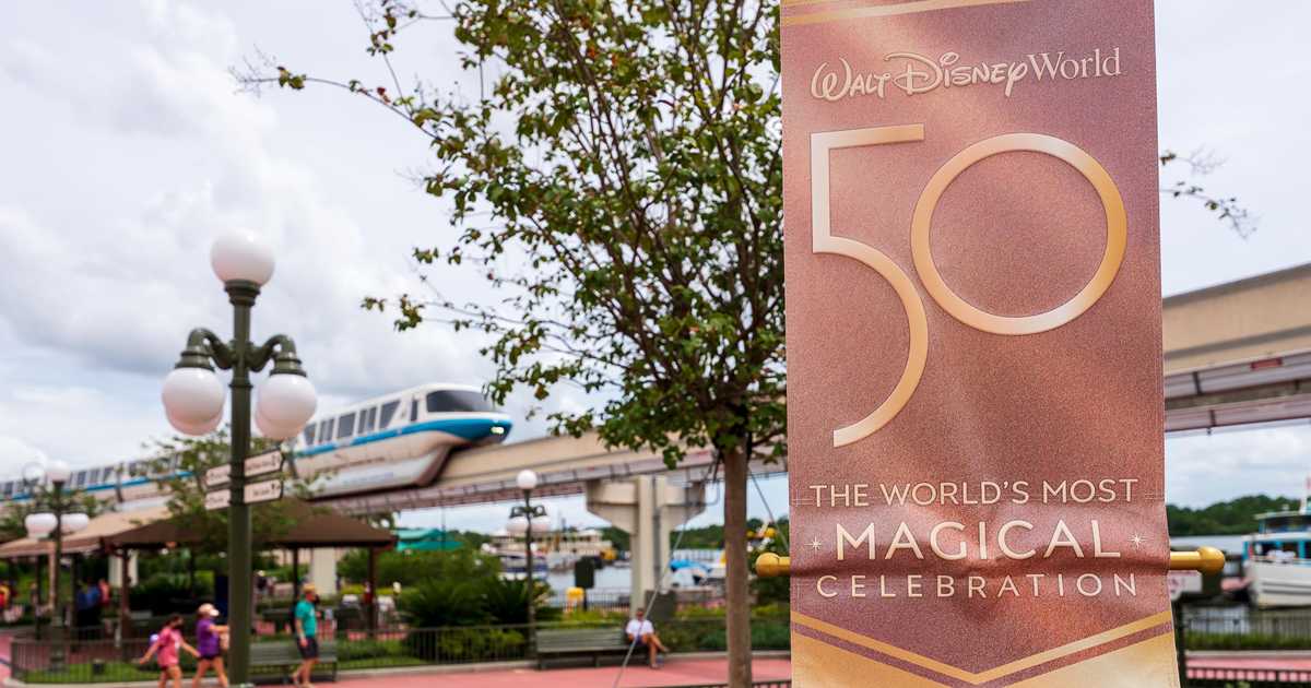
Up close of the sign. I think it looks nice and matches the new castle paint job. It has a nice sheen to it IMO that isn’t captured by photos.
vikescaper
Well-Known Member
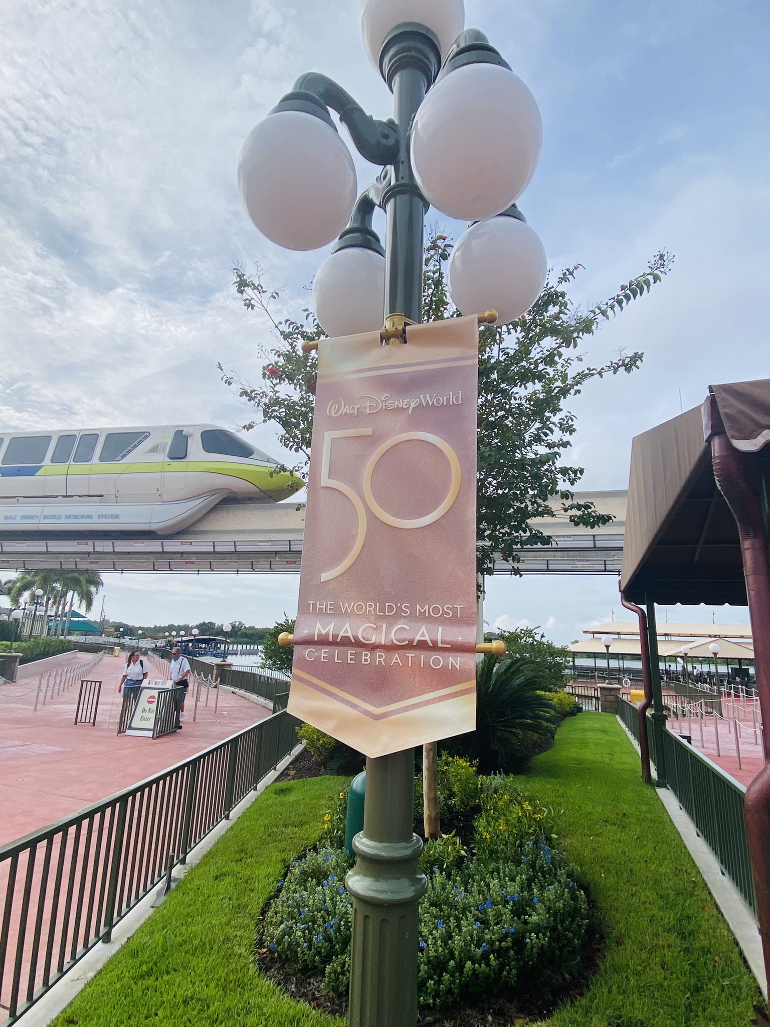
They look like they have been out in the Florida sun for too long.Photos of the 50th banners outside Magic Kingdom main entrance
The World's Most Magical Celebration banners outside Magic Kingdom main entrance
The World's Most Magical Celebration banners outside Magic Kingdom main entrance
Register on WDWMAGIC. This sidebar will go away, and you'll see fewer ads.