-
The new WDWMAGIC iOS app is here!
Stay up to date with the latest Disney news, photos, and discussions right from your iPhone. The app is free to download and gives you quick access to news articles, forums, photo galleries, park hours, weather and Lightning Lane pricing. Learn More -
Welcome to the WDWMAGIC.COM Forums!
Please take a look around, and feel free to sign up and join the community.
You are using an out of date browser. It may not display this or other websites correctly.
You should upgrade or use an alternative browser.
You should upgrade or use an alternative browser.
EPCOT Test Track to be reimagined
- Thread starter wdwmagic
- Start date
splah
Well-Known Member
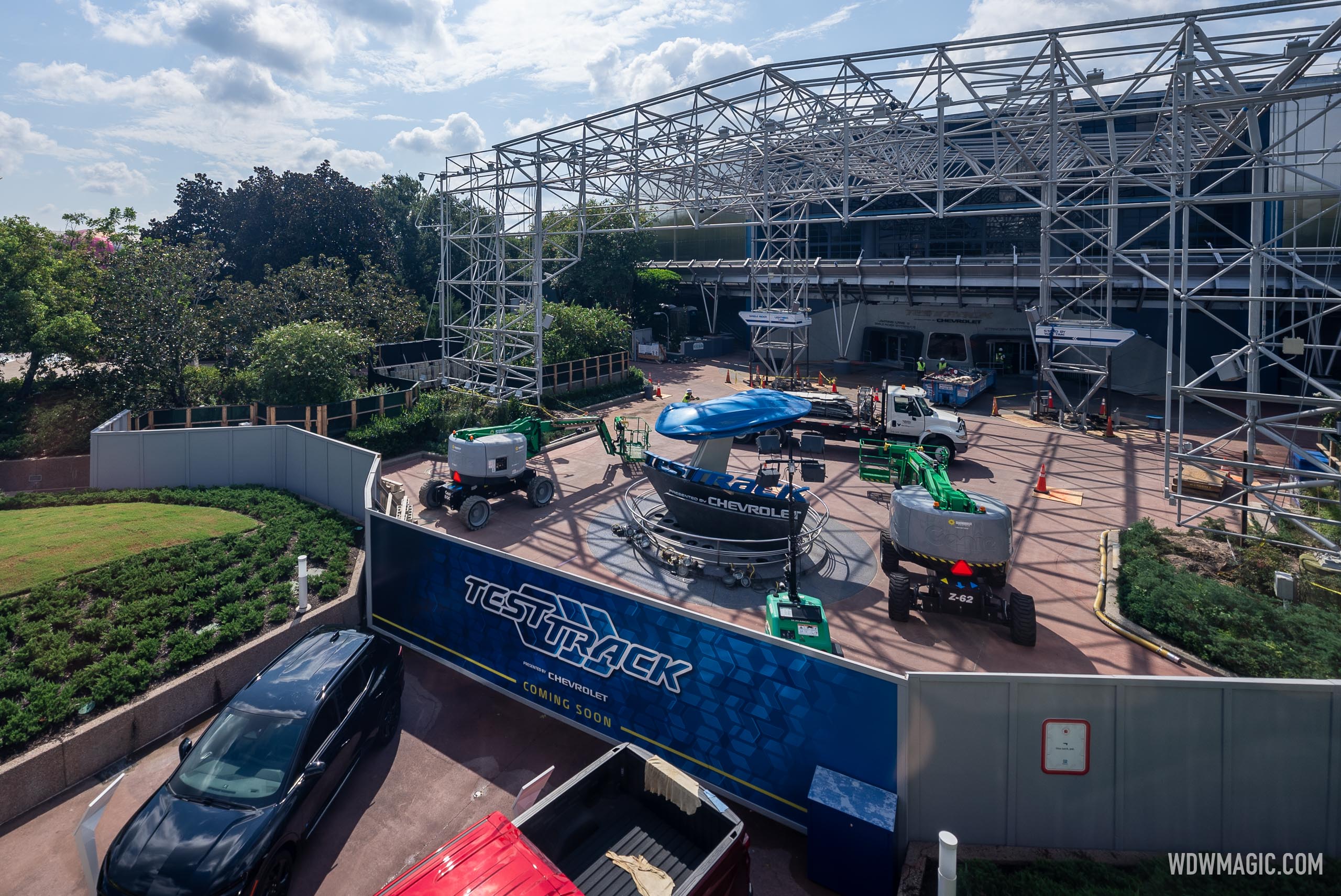
Wonder why thy need these additional supports in the back?
Attachments
danlb_2000
Premium Member
Wonder why thy need these additional supports in the back?
I think they are holding up the track. They go all the way around the building.
trainplane3
Well-Known Member
I'd say you're spot on. There's jacks in those temp supports.Most likely placed to carry the load of the overhead track temporarily while they replace the permanent supports that are there. Would guess it's being replaced to support new canopy construction
danlb_2000
Premium Member
Most likely placed to carry the load of the overhead track temporarily while they replace the permanent supports that are there. Would guess it's being replaced to support new canopy construction
I didn't notice the black ones when I first looked at the picture. I agree, these are temporary supports so the can re-configure the permanent supports.
doctornick
Well-Known Member
I'm very happy the canopy is going, but I think my most unpopular opinion about the parks is that the architecture of the Future World pavilions wasn't quite as amazing as people imagine looking back from the present. Some were more successful than others and most of the additions over the years have made them worse (e.g. the canopy or the fish stuck all over The Seas). The park itself was also incredible.
I think, though, in the design of the pavilions this sort of concept:
View attachment 806005
mostly ended up looking more like this in reality:
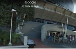
View attachment 806006
I am fully ready to get a lot of comments about how beautiful the building in the second image looks, though!
I'm with you as well. I greatly enjoyed classic Future World, but I'll admit that when people wax poetic around here about the architecture of the area I... don't get it. It mean, it was fine, but I certainly didn't look at the different shaped buildings and get inspired or anything. They just were there. Unlike say MK/DL where the different lands with different themes are pretty awesome just to absorb and appreciate the details.
I get that it was very ambitious to house the entire rides and other showpieces in "themed" buildings and have them basically "hidden in plain sight". But outside of SSE they didn't strike me as interesting - generally they were just geometric shapes. I know a lot of thought and effort went into the details (especially the differences between East and West) and I can appreciate that but I don't know if I really cared.
Ironically, I do find your choice of Imagination to be odd as it was probably IMHO the next most interesting building in FW after SSE. All the rest I would probably just lump together as just being there.
Mickeynerd17
Well-Known Member
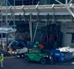
All of the canopy fabric is gone now.

Photo from that other site.
Photo from that other site.
Mickeynerd17
Well-Known Member
Piggybacking on this post, I'd expect the canopy structure to start coming down next week at the rate they're currently going.
It's going to be surreal seeing Test Track without this canopy for the first time since 1996.
Bocabear
Well-Known Member
Well not everyone cares about or gets the details... The architecture to me was inspirational. Forward thinking, beautiful buildings housing attractions. It has always been a beautiful park... The park had something for those of us that loved the design details as well as those that just wanted a ride or a cocktail... I am glad there are others that see the beauty and appreciate what was created to make this such a special place. I think overall more people cared about what they built and appreciate it.I'm with you as well. I greatly enjoyed classic Future World, but I'll admit that when people wax poetic around here about the architecture of the area I... don't get it. It mean, it was fine, but I certainly didn't look at the different shaped buildings and get inspired or anything. They just were there. Unlike say MK/DL where the different lands with different themes are pretty awesome just to absorb and appreciate the details.
I get that it was very ambitious to house the entire rides and other showpieces in "themed" buildings and have them basically "hidden in plain sight". But outside of SSE they didn't strike me as interesting - generally they were just geometric shapes. I know a lot of thought and effort went into the details (especially the differences between East and West) and I can appreciate that but I don't know if I really cared.
Ironically, I do find your choice of Imagination to be odd as it was probably IMHO the next most interesting building in FW after SSE. All the rest I would probably just lump together as just being there.
Test Track Transformation at EPCOT: Canopy Removal and Set Pieces Arrive

Test Track Transformation at EPCOT: Canopy Removal and Set Pieces Arrive
Test Track Transformation at EPCOT: Canopy Removal and Set Pieces Arrive


Smiley/OCD
Well-Known Member
Yes, the early Corvettes, 1970 Chevelle SS, the early Camaros…PLENTY of classic Chevys…Is there any vehicle more iconic and "Americana" than the '57 Chevy?
SingleRider
Well-Known Member
Is there any estimated timeline for Test Track reopening?
DisneyLee74
Member
You probably never went to a Worlds Fair. The show buildings in future world were inspired by Worlds Fairs. Having been to. Worlds Fair I have always been impressed with the original show building and the futuristic look they had in 82.I'm with you as well. I greatly enjoyed classic Future World, but I'll admit that when people wax poetic around here about the architecture of the area I... don't get it. It mean, it was fine, but I certainly didn't look at the different shaped buildings and get inspired or anything. They just were there. Unlike say MK/DL where the different lands with different themes are pretty awesome just to absorb and appreciate the details.
I get that it was very ambitious to house the entire rides and other showpieces in "themed" buildings and have them basically "hidden in plain sight". But outside of SSE they didn't strike me as interesting - generally they were just geometric shapes. I know a lot of thought and effort went into the details (especially the differences between East and West) and I can appreciate that but I don't know if I really cared.
Ironically, I do find your choice of Imagination to be odd as it was probably IMHO the next most interesting building in FW after SSE. All the rest I would probably just lump together as just being there.
Rhinocerous
Premium Member
My parents' house was built on the rubble from a World's Fair. Does that count?You probably never went to a Worlds Fair. The show buildings in future world were inspired by Worlds Fairs. Having been to. Worlds Fair I have always been impressed with the original show building and the futuristic look they had in 82.
Haymarket2008
Well-Known Member
Is there any estimated timeline for Test Track reopening?
I have no inside information, but I would imagine that they'd want it open for Summer 2025. Especially to promote while Epic Universe is in the spotlight.
My guess? June 2025.
osian
Well-Known Member
Futuroscope says hold my pavilion...You probably never went to a Worlds Fair. The show buildings in future world were inspired by Worlds Fairs. Having been to. Worlds Fair I have always been impressed with the original show building and the futuristic look they had in 82.
Yes.Is there any vehicle more iconic and "Americana" than the '57 Chevy?
The Mustang and the Corvette.
*the C8 Corvette and Chevrolet SS Sedan have entered the chat*You literally have to go back more than half a century to find their good cars.
Register on WDWMAGIC. This sidebar will go away, and you'll see fewer ads.


