Yeah, I know it sounds fishy.Well, that is certainly one take
Tuna can you say?
-
The new WDWMAGIC iOS app is here!
Stay up to date with the latest Disney news, photos, and discussions right from your iPhone. The app is free to download and gives you quick access to news articles, forums, photo galleries, park hours, weather and Lightning Lane pricing. Learn More -
Welcome to the WDWMAGIC.COM Forums!
Please take a look around, and feel free to sign up and join the community.
You are using an out of date browser. It may not display this or other websites correctly.
You should upgrade or use an alternative browser.
You should upgrade or use an alternative browser.
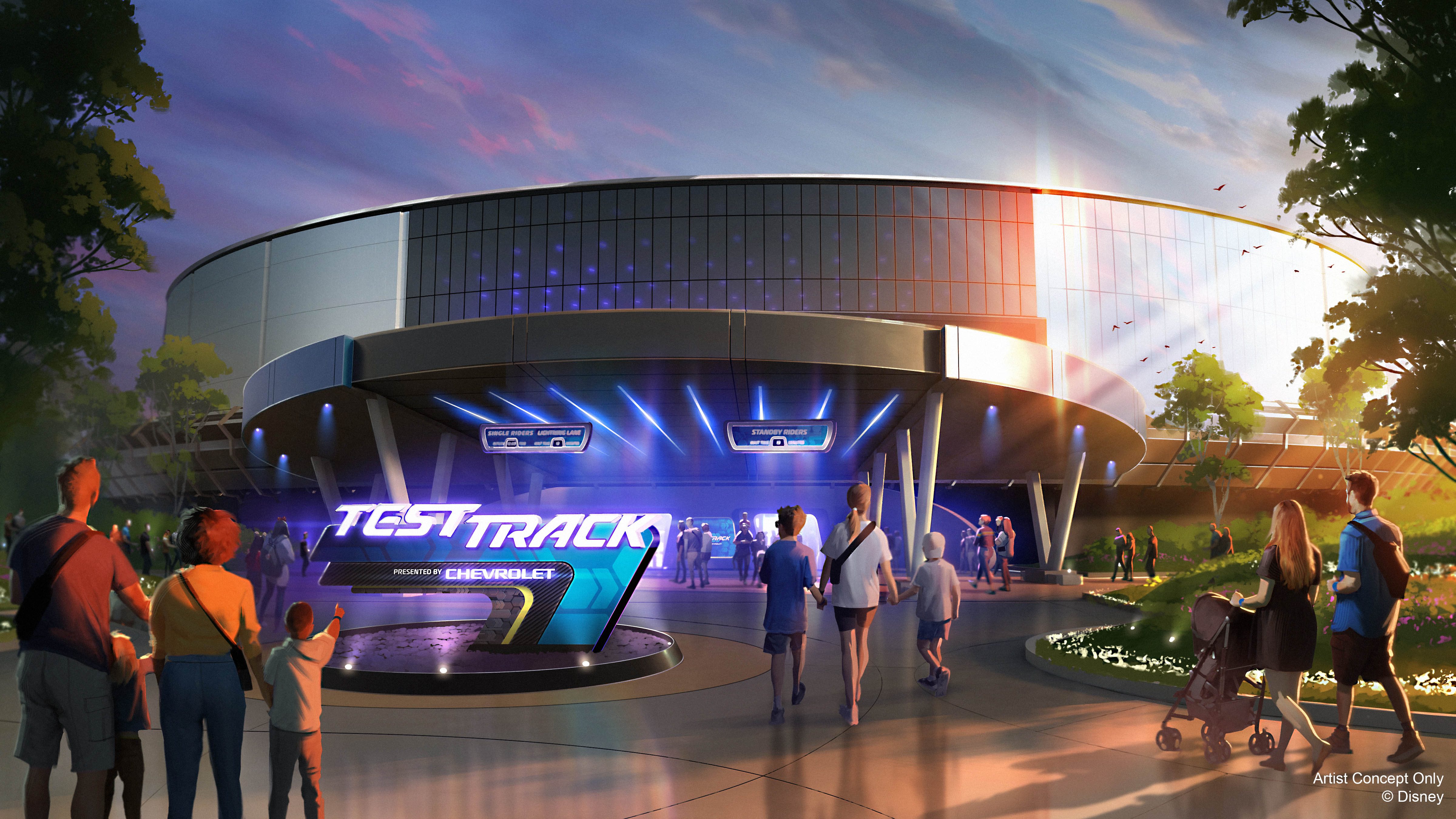
EPCOT Test Track to be reimagined
- Thread starter wdwmagic
- Start date
ChrisFL
Premium Member
I agree. Pretty disappointing that they are "reaching into the past" for inspiration.
Did you ever ride World of Motion?
Horizons '83
Well-Known Member
- In the Parks
- No
I certainly hope so...Did you ever ride World of Motion?
Mickeynerd17
Well-Known Member
Both buildings are themed, guest-facing structures. I consider that pretty equivalent.So wait, your comparison is about something blocking the view of a ride building, and having zero effect on the actual ride itself, Vs. something blocking the view of the castle, the main purpose of which is to be viewed, have pictures taken in front of, and view projection mapped shows during fire works? You think there anywhere close to an equivalency there?
Which goes to the main point Alya and I have been making. Even opinions/thoughts need to have some context. I like a certain type of ketcup, and Disney doesn't offer that type in the park. It bothers me (likely more than it should) but i would never bring it up and complaint about it on a board because its unique to me, and such a minor thing, that its just not worth discussion. I am not saying people aren't free to discuss what they want, and of course i can always just scroll right by, but its still just nick picking about irrelevant things.
Here, lets take the Haunted Mansion and say we slapped a big fat canopy over the entrance to the point it blocked 75% of the mansion facade. Would you like that? It has zero effect on the ride itself, but that doesn't make it visually pleasing.
I could do this all day with other attractions. If you're going to have some covering over the front entrance, it needs to be themed and a permanent installation. The canopy at Test Track was simply just a cover for display GM cars and a big poster while test track was built.
This 90's concept art shows more of what the attraction should have always looked like:
As for those "irrelevent" things, taking time to address those "irrelevent" aspects is what elevates Disney above Six Flags. For example, you could argue that area music is irrelevent to park operations, but having seriously plusses the experience.
The only reason I would be so nitpicky over something simple like this is 1. I really want these parks to look the best they possibly can, and 2. There has been to much disregard for the "irrelevant" things in some areas lately in my honest opinion.
JMcMahonEsq
Well-Known Member
One building the outside of the structure is almost the point of the structure. The other is simply a box where the ride is located. To me they are very different things.Both buildings are themed, guest-facing structures. I consider that pretty equivalent.
Here, lets take the Haunted Mansion and say we slapped a big fat canopy over the entrance to the point it blocked 75% of the mansion facade. Would you like that? It has zero effect on the ride itself, but that doesn't make it visually pleasing.
I could do this all day with other attractions. If you're going to have some covering over the front entrance, it needs to be themed and a permanent installation. The canopy at Test Track was simply just a cover for display GM cars and a big poster while test track was built.
This 90's concept art shows more of what the attraction should have always looked like:
View attachment 805366
As for those "irrelevent" things, taking time to address those "irrelevent" aspects is what elevates Disney above Six Flags. For example, you could argue that area music is irrelevent to park operations, but having seriously plusses the experience.
The only reason I would be so nitpicky over something simple like this is 1. I really want these parks to look the best they possibly can, and 2. There has been to much disregard for the "irrelevant" things in some areas lately in my honest opinion.
To your point on Haunted Mansion, go a ahead and put something up outside if you want. It doesn't effect the ride, and I am not going to get worked up over it. You want to talk about it, sure go ahead. But if your making statements like the original poster that Alya responded to that every guest needs to care about this as its some dramatic Architectual failure that's critical to everyone's enjoyment of the park, then I am calling that statement silly and the discussion irrelevant.
As to your point about wanting the parks to look the best they possibly can.....that sounds great in theory, and where money is no object. But we know that's not the world we live in. I want Disney to be a great experience, that I enjoyed when i was a kid, and that we are enjoying now with our kids. But there is always something else that could be done. There is always more money that can be put into maintenance, repairs, new rides, new facades, ect. So do I want every ride to have amazing facades, great interors and exteriors, yes. But realizing that perfection isn't going to happen, I have to "pick" my battles, (well really Disney's spending battles) on what gets done and what doesn't. So to this specific point, some delays in getting the temp structure down isn't a material fundamental problem detrimental to the park.
iamgroot61
Active Member
- In the Parks
- No
Nope. My first visit to WDW was in 2005. I see WoM closed in 1996.Did you ever ride World of Motion?
Twirlnhurl
Well-Known Member
I couldn't agree more. World of Motion was definitely the least architecturally successful building at Epcot until maybe the Festival Center.Might as well add my hot take:
I don't care about the canopy.
Because I never cared for the building's architecture and aesthetic.
Yes, I recognize that there was architectural intent in order to portray a theme. I see that.
I just don't think they did it well, or even pleasing to look at.
From across the lagoon, WoM looks like a tuna can without the paper label.
Round, shiny, and cylindrical. That's "motion"? Maybe part way there by being round.
But 'part way' doesn't make me love it. So, canopize away!!
But what do I know? I'm just a pixie dusting shill who defends everything Disney does.
I am glad the Test Track '97 canopy will be replaced by something better. But I will say that I am glad there was a canopy over the entrance to Test Track all these years (since the indoor queue is not big enough to have the entrance take up space indoors).
Future world is brutally hot in the summer. I spent enough of the summer of 2012 standing in front of Mission: Space to know that shade is precious.
Last edited:
Disgruntled Walt
Well-Known Member
- In the Parks
- No
Looks likely my family will be making our return to WDW during mid-July of next summer...any chances this is open by then?
Horizons '83
Well-Known Member
- In the Parks
- No
I'd say a chance for sure. With this being a sponsor funded project, they tend to have their ducks in a row ahead of time and move faster IMHO because no business is going to drop millions of dollars on an attraction update if they don't.Looks likely my family will be making our return to WDW during mid-July of next summer...any chances this is open by then?
DreamfinderGuy
Well-Known Member
I totally get what you’re saying and all but this is a funny quote considering we’re talking about Test Track, the sponsored attraction that was delayed by two years originallyI'd say a chance for sure. With this being a sponsor funded project, they tend to have their ducks in a row ahead of time and move faster IMHO because no business is going to drop millions of dollars on an attraction update if they don't.
Brer Oswald
Well-Known Member
Counterpoint: the canopy is objectively ugly. Even if you don’t care for the base building, at worst it’s still fine looking.Might as well add my hot take:
I don't care about the canopy.
Because I never cared for the building's architecture and aesthetic.
Yes, I recognize that there was architectural intent in order to portray a theme. I see that.
I just don't think they did it well, or even pleasing to look at.
From across the lagoon, WoM looks like a tuna can without the paper label.
Round, shiny, and cylindrical. That's "motion"? Maybe part way there by being round.
But 'part way' doesn't make me love it. So, canopize away!!
But what do I know? I'm just a pixie dusting shill who defends everything Disney does.
Disney Files New Permit with Projection Dome Supplier for EPCOT's Test Track 3.0
Disney Files New Permit with Projection Dome Supplier for EPCOT's Test Track 3.0
Disney Files New Permit with Projection Dome Supplier for EPCOT's Test Track 3.0
Thanks @DCBaker
Big_Shakalaka
Well-Known Member
Ok, you have my attention.Disney Files New Permit with Projection Dome Supplier for EPCOT's Test Track 3.0

Disney Files New Permit with Projection Dome Supplier for EPCOT's Test Track 3.0
Disney Files New Permit with Projection Dome Supplier for EPCOT's Test Track 3.0www.wdwmagic.com
Thanks @DCBaker
Captain Barbossa
Well-Known Member
Moth
Well-Known Member
SPEED TUNNEL!!!!Disney Files New Permit with Projection Dome Supplier for EPCOT's Test Track 3.0

Disney Files New Permit with Projection Dome Supplier for EPCOT's Test Track 3.0
Disney Files New Permit with Projection Dome Supplier for EPCOT's Test Track 3.0www.wdwmagic.com
Thanks @DCBaker
Test & Trackious!SPEED TUNNEL!!!!
DreamfinderGuy
Well-Known Member
The secondary marquee on the building itself has been removed.
Really want them to have a section where you watch clips from Tron surround your vehicle again, if anything just to make people who hated TT 2.0 madDisney Files New Permit with Projection Dome Supplier for EPCOT's Test Track 3.0

Disney Files New Permit with Projection Dome Supplier for EPCOT's Test Track 3.0
Disney Files New Permit with Projection Dome Supplier for EPCOT's Test Track 3.0www.wdwmagic.com
Thanks @DCBaker
DCLcruiser
Well-Known Member
The secondary marquee on the building itself has been removed.
Really want them to have a section where you watch clips from Tron surround your vehicle again, if anything just to make people who hated TT 2.0 mad
Please take Chevy with it.
danlb_2000
Premium Member
Disney Files New Permit with Projection Dome Supplier for EPCOT's Test Track 3.0

Disney Files New Permit with Projection Dome Supplier for EPCOT's Test Track 3.0
Disney Files New Permit with Projection Dome Supplier for EPCOT's Test Track 3.0www.wdwmagic.com
Thanks @DCBaker
1440 AVENUE OF THE STARS(GM TEST TRACK) - Spitz Inc - Install Set Elements
Register on WDWMAGIC. This sidebar will go away, and you'll see fewer ads.
