Donald96
Well-Known Member
Just glad I could help!Fan Service 101
Just glad I could help!Fan Service 101
This thing reminds me of the old Body Wars "vehicle" you were supposedly riding in. Flying cars!The other image

The canopy itself is controversial not the WoM logo.How is it controversial? Is it any more controversial than the logo to Horizons being found at Misson: SPACE? The 20k Sub at The Little Mermaid? Toad in Winnie the Pooh and Haunted Mansion?
Anybody with half a brain can clearly see that it's not being made out to look like a permanent "icon" for the pavilion, as it's very subtle and is among many other obviously different but similar looking icons.
It looks to me like it's just a simple nod to World of Motion like every other easter egg in WDW, and a little something for older fans to notice. It's controversial because you're making it out to be that way.
Exactly! I thought they were going in that direction with Spaceship Earth 2007 with it's logo. Unfortunately they decided not to continue the aesthetic started by SSE in the new Test Track.However, I do agree on the notion that bringing back pavilion logos would be a lot more meaningful if it was across the board and not just a nod to the past.
Yes ... just look at the Red Globe of Mission SpaceThe thing that boggles me about the canopy is that it costs money to maintain, and we know how much TDO loves maintaining things!!
It actually reflects the attraction pretty well. 2007's Spaceship Earth has halfbaked narration and never finished the descent, they design a new logo icon for the pavilion and never finished the rest of the Future World set.Exactly! I thought they were going in that direction with Spaceship Earth 2007 with it's logo. Unfortunately they decided not to continue the aesthetic started by SSE in the new Test Track.
Disney has done enough empty pandering that I am not convinced that the presence of the symbol represents anything of substance. It's like the retro merchandise. A shallow use of images that end up getting people excited instead of follow the methods and substance that gave those images so much meaning that even after being killed off years ago, they continue to resonate.The World of Motion logo isn't meant to make us like it more but to be a symbol of the ride-changes that WILL make us like it more...
Larger image of the concept art:

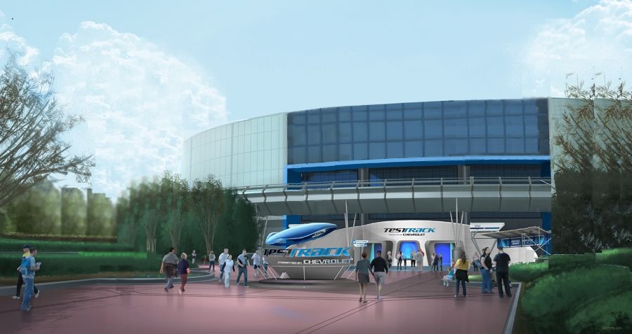
I think that looks SO much better. What benefits are there by keeping the canopy? Without the canopy, the entrance seems to fit the whole new sleek design much better.This is an admittedly bad photoshop job, but I was really curious to see how it looked in that setup without the overhang:

You know, if they did this, I wouldn't even mind if they put TEST TRACK in bold blue letters above the entrance of the building
Disney needs to fire some people and hire you. Seriously.This is an admittedly bad photoshop job, but I was really curious to see how it looked in that setup without the overhang:

You know, if they did this, I wouldn't even mind if they put TEST TRACK in bold blue letters above the entrance of the building
I'm curious what you would think would make this a better photoshop job? Great job with the visual representation.This is an admittedly bad photoshop job, but I was really curious to see how it looked in that setup without the overhang:

You know, if they did this, I wouldn't even mind if they put TEST TRACK in bold blue letters above the entrance of the building
I'm curious what you would think would make this a better photoshop job? Great job with the visual representation.
I'm curious what you would think would make this a better photoshop job? Great job with the visual representation.
This is an admittedly bad photoshop job, but I was really curious to see how it looked in that setup without the overhang:

You know, if they did this, I wouldn't even mind if they put TEST TRACK in bold blue letters above the entrance of the building
Register on WDWMAGIC. This sidebar will go away, and you'll see fewer ads.
