News Remy's Ratatouille Adventure coming to Epcot

Mickeyboof

Well-Known Member
How much do you think it was?

Far less than what it needed to be to create an immersive ride-worthy experience.

It’s an AMC movie theatre where you’re stuck in the front row, but the front row keeps moving from theatre to theatre seemingly without reason.

But, hey, it has a gorgeous courtyard and reasturant!
 

RSoxNo1

Well-Known Member
There is historical precedent for a flat façade:

IMG_2241b.jpg
That's a great photo? Where did it come? May I use it?
 

Sir_Cliff

Well-Known Member
They’ve done a very good job with the Manor. I’d be nit picking to complain about a few small things. I also shot it multiple times in 4K for a little edit ;)

Indeed, like I’ve said in both parks I was very impressed with show quality and effects both in and out of the attractions. DLP has never looked so good. There’s still some issues (no Discoveryland entry lighting for example) but overall it was years ahead of what I expected. Down to smoking teepees, Thundermountain smoking chimneys and oodles of neon on the exterior of Buzz. But I digress. Rat surprised me with the amount of detail you can miss in one or two rides, both physical effects and onscreen. And physical effects (temperature, water) were working.

Speaking of Rat, and the dreaded shiny floor and screen edges, I was surprised how little it bothered me. I tried sitting in both front and back rows and each time found the frame of the glasses (Dolby 3D style) sat on the lower edge of the screen and more or less hid the join between it and the floor. The screens are huge, curved and very much Transformers in feel. The cars sit inside of the curve so it’s easy for them to exceed your peripheral vision. Add in physical dressing around the sides and sometimes above too and the screens seem to blend well into the surroundings. Squinching had a few small issues if you looked back at the wrong time but again didn’t distract (and I’m picky as you know). Shiny floors didn’t bother me either. I’d call it more a matte finish than gloss. Michelle says she didn’t even notice it.

The RV is smooth, quite quick, and has plenty of pitch when needed as well as full yaw. Watching them dance around each other at load and unload is like a ballet show in itself. Like MMRR and Rise of the Resistance, the groups of cars (three here) don’t always take the same route, they sometimes share the same screen and sometimes drive into individual screen “rooms” and then reverse out to rejoin the pack. Now I understand the Parisian design and layout I can reiterate this is what is coming to Orlando minus the restaurant. Design tweaks I don’t know about.

As you see I found the attraction to be very well done. I enjoyed it more than I expected to and would class it IMHO as a high D / low E.

I also shot it multiple times in 4K and will have a little edit showing the whole facility in the near future.
Thanks for your report!

Glad to hear I'm not the only one who doesn't find the floor and screen edges distracting. My experience is that the floor is physically visible (particularly from certain seats), but it's not distracting nor does it take you out of the attraction. I guess if you went in thinking about the floor it might jump out at you. If you just go with the flow of the attraction, though, it's very fun and immersive.

I also like the way the vehicles move and weave around the attraction!
 

peter11435

Well-Known Member
Far less than what it needed to be to create an immersive ride-worthy experience.

It’s an AMC movie theatre where you’re stuck in the front row, but the front row keeps moving from theatre to theatre seemingly without reason.

But, hey, it has a gorgeous courtyard and reasturant!
The issue then (for you) is not how much was spent but how it was spent. The budget for the project was more than sufficient and it was anything but cheap.
 
Last edited:

ᗩLᘿᑕ ✨ ᗩζᗩᗰ

HOUSE OF MAGIC
Premium Member
Thanks for your report!

Glad to hear I'm not the only one who doesn't find the floor and screen edges distracting. My experience is that the floor is physically visible (particularly from certain seats), but it's not distracting nor does it take you out of the attraction. I guess if you went in thinking about the floor it might jump out at you. If you just go with the flow of the attraction, though, it's very fun and immersive.

I also like the way the vehicles move and weave around the attraction!

Re: Gloss vs Matte flooring debate on Remy's
I can only theorize but wouldn't a gloss-finished floor be better than matte? Nitpick maybe but I would think a glossy surface, one that reflects the screen's image into the flooring would thereby extended the screenspace better hiding the seam where the screen edge joins the floor. I'd assume a flat or matte surface would be more abrupt, more obvious where screen ends and flooring begins, fwiw. But, I'm sure they've considered all this already. Still... looks like a fun attraction.
 
Last edited:

justintheharris

Well-Known Member
Perhaps the building facade is pricy, but I assure you this ride was built cheap.

I never denied there were others being built. I’m hoping Rise of the Resistance blows us out of the water. But Remy’s Adventure is a cheap cheap cheap ride with very expensive packaging.
Have you even BEEN ON the ride? I have. And I loved it. And so have most people who have. Ratatouille was not a cheap ride.
 

Mickeyboof

Well-Known Member
According to wikipedia, an estimated 270 million USD to build the Ratatouille attraction in Disneyland Paris.

They shoulda spent 280 million then.

Spider man on Broadway cost almost $80 million. Still looked cheap.

Does Wikipedia state if this lump sum is just the attraction, or does it include the attraction area?
 

The Empress Lilly

Well-Known Member
france_model.jpg


1979%20-%2008%20-%20August%20-%20Epcot%20Models%20%20-%20019.jpg


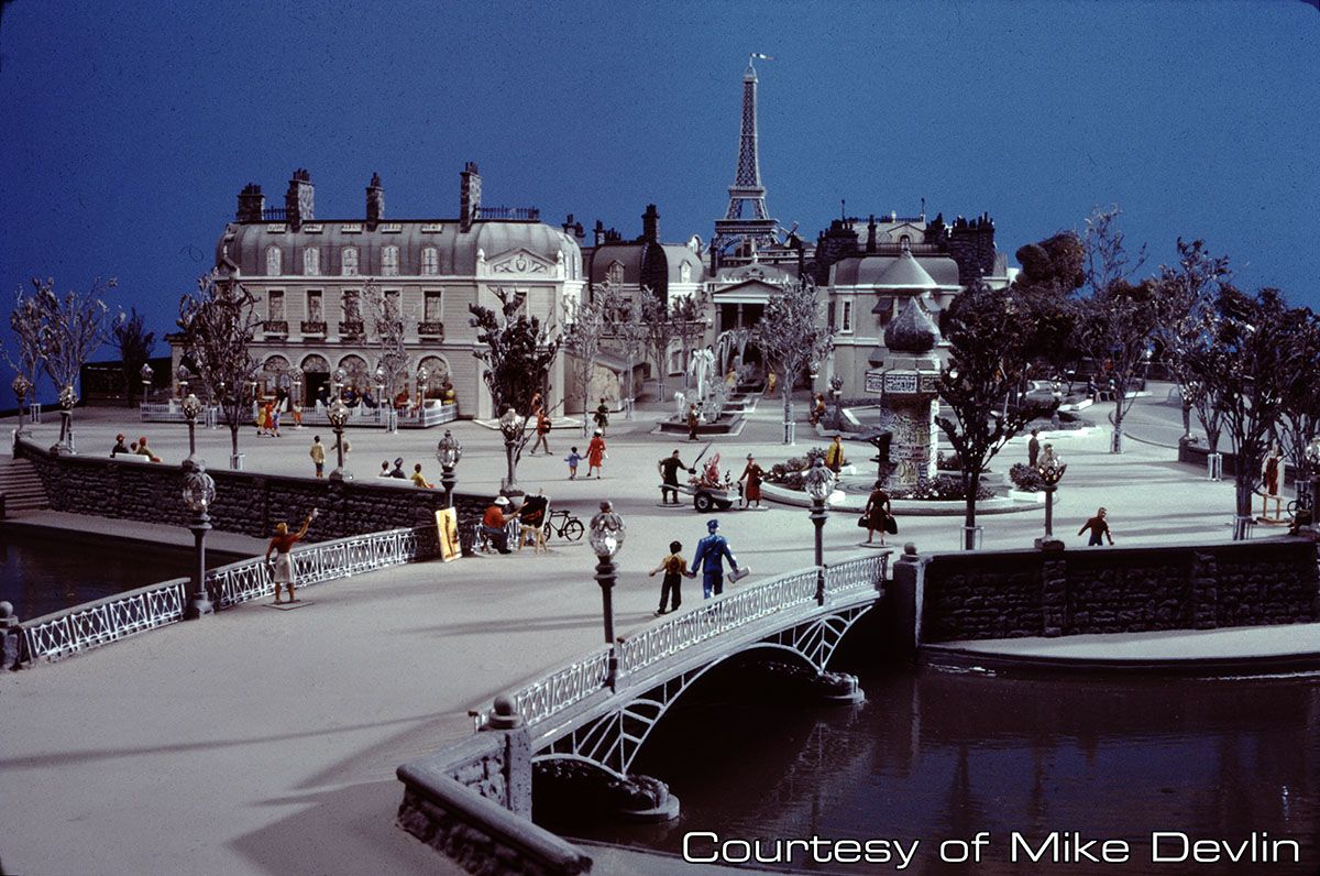
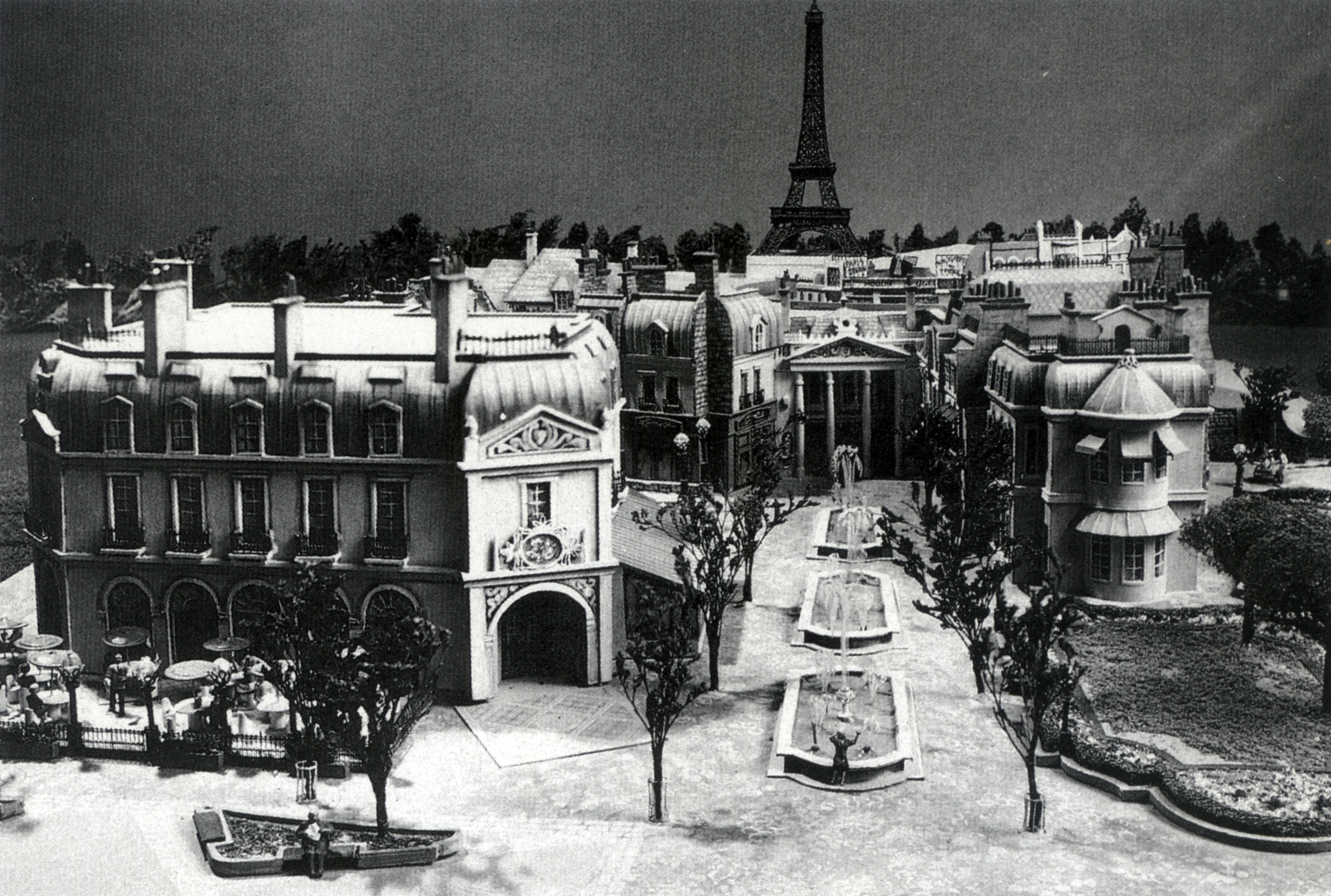
A front view. When there was still a third circle vision planned. (Repetition is one of the few flaws of EPCOT. Although repetition is also elegance!) One can see why ultimately the designers decided against the flat façade. The Moulin Rouge in particular just looks off scale. The roof simply clashes with the forced perspective of the miniature boulevard and Eiffel Tower - itself not a masterpiece of prespective and sense of depth, but likely much better than having the tower at the front rather than the back of the building as planned before.

The flat façade at Ratland however has different sightlines, less to no forced perspective to keep in mind, and different surrounding aesthetics. I'll be curious to see the final effect. And of the Eiffel Tower. This time at the front of the building, so after 37 years we can judge if the Imagineers were right to overrule the architect!
 
Last edited:

Kman101

Well-Known Member
Perhaps the building facade is pricy, but I assure you this ride was built cheap.

I never denied there were others being built. I’m hoping Rise of the Resistance blows us out of the water. But Remy’s Adventure is a cheap cheap cheap ride with very expensive packaging.

There's a difference between "this feels cheap" and "this really was cheap". You know how much the attraction cost? (And no, not defending the ride, I've never experienced it)
 

Register on WDWMAGIC. This sidebar will go away, and you'll see fewer ads.

Back
Top Bottom