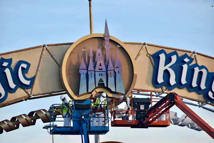
News PHOTOS - New look Magic Kingdom auto-plaza shares similar color scheme with Cinderella Castle

Disney Analyst

Well-Known Member
I don't like the new entry signs for the very reason some of you do, it's too similar scheme wise to Cinderella's castle. The entry signs should represent an entry to WDW as a whole and not "hey you are almost to the Magic Kingdom". An overarching problem with WDW is everything is still pointing to the MK, the other parks need a lot of attention and shouldn't remain second fiddle.

I would love a streamlined modern look for the WDW entrance. Something snazzy, modern, and beautifully lit at night.

Same with the TTC.
 

Jonathan D.

New Member
I feel the redesign is lacking "magic." They should have added a pixie dust effect behind the logo which would have be lit at night. Also, just thought about adding digital screens on each side cycling through different characters waiving to you as cars pass by but that would create a traffic jam lol. Just needs some Disney magic added :)
 

Movielover

Well-Known Member
1603873898495.png


Credit - imagineer2017 on Twitter
 

HauntedPirate

Park nostalgist
Premium Member
The problem isn’t so much the original Transportation and Ticket Center itself but the oversized clutter that was glued onto it to make it more “Disney.”

Absolutely. The look worked at the time, but it's at least 15 years past needing a fresh look. I updated my original post to clarify that. The TTC, functionally, still works.
 

tirian

Well-Known Member
Funny thing is the design for the entrances was done in the late 1980/early 1990s along with the rest of the resort wayfinding project. They just dragged their feet on installing them until about 1996. By the time they finally did they ended up looking very different (characters being added to the original and arguably better design). Even more interesting is the plan to change the logo had been kicking around for a very long time too. View attachment 508779
By the late ‘80s, the original WDW logo was outdated, not nostalgic. Now enough time has passed that the original is happily retro whereas the update is coldly corporate.
 

Skywise

Well-Known Member
Legitimately I'm not sure if they thought this through. White text on a blue background, surrounded by grey, with hints of yellow = literally Walmart storefronts.
Well... it matches what they're doing in the rest of their stores and resorts with "de-themeing" as well then :D
What is all this fun and whimsical stuff... WE'RE A BUSINESS!
 

Skywise

Well-Known Member
I feel the redesign is lacking "magic." They should have added a pixie dust effect behind the logo which would have be lit at night. Also, just thought about adding digital screens on each side cycling through different characters waiving to you as cars pass by but that would create a traffic jam lol. Just needs some Disney magic added :)
For all the other resdesigns Disney's been doing (which I almost all dislike) this one doesn't seem better or worse to me. If anything my feelings are why are they bothering when this change is almost the same except for the color change?

This would've been a perfect time to also rework the entrance to add a "rest area" to the side where guests could stop, park and take photos ala the Vegas strip sign.
 

gerarar

Premium Member
The castle on the MK toll plaza has finally been repainted a (shiny) gradient.
44C468FD-C951-4814-B52C-F1F8DCFA06AA.jpeg

D989834C-025A-420E-8600-FD090CE50405.jpeg

It closely resembles the 50th Anniversary logo released months ago.
CA0D1399-E2A4-441A-99BA-7E4B81B8B301.png


Just to comment, I especially do like the blue gradient above each toll booth/lane. Really blends nicely!


Pictures come from site that shall not be named..
 

rreading

Well-Known Member
I don't like the new entry signs for the very reason some of you do, it's too similar scheme wise to Cinderella's castle. The entry signs should represent an entry to WDW as a whole and not "hey you are almost to the Magic Kingdom". An overarching problem with WDW is everything is still pointing to the MK, the other parks need a lot of attention and shouldn't remain second fiddle.

I don't disagree...but really MK is the core of WDW. I feel that there are layers of the WDW experience. The resorts add a layer as do the other parks then the ancillary offerings of the water parks, golf courses and Disney Springs, all within the resort perimeter. But most everyone who visits knows what they're there to see. (and unless they are DVC or pass holders, then it's not Animal Kingdom)
 

Register on WDWMAGIC. This sidebar will go away, and you'll see fewer ads.

Back
Top Bottom