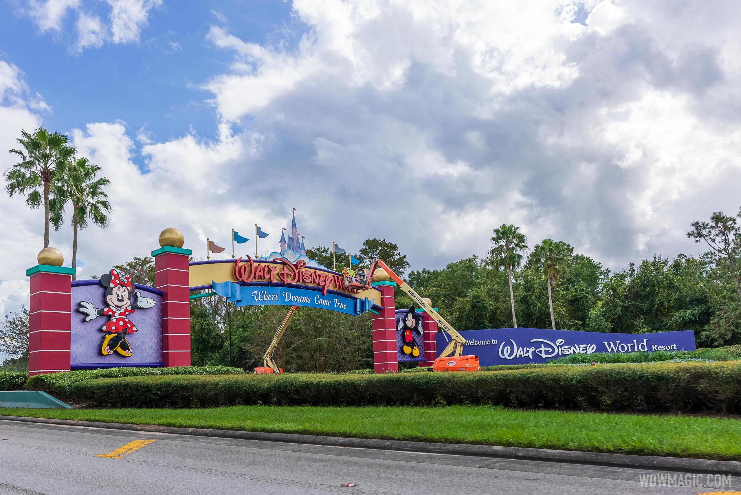
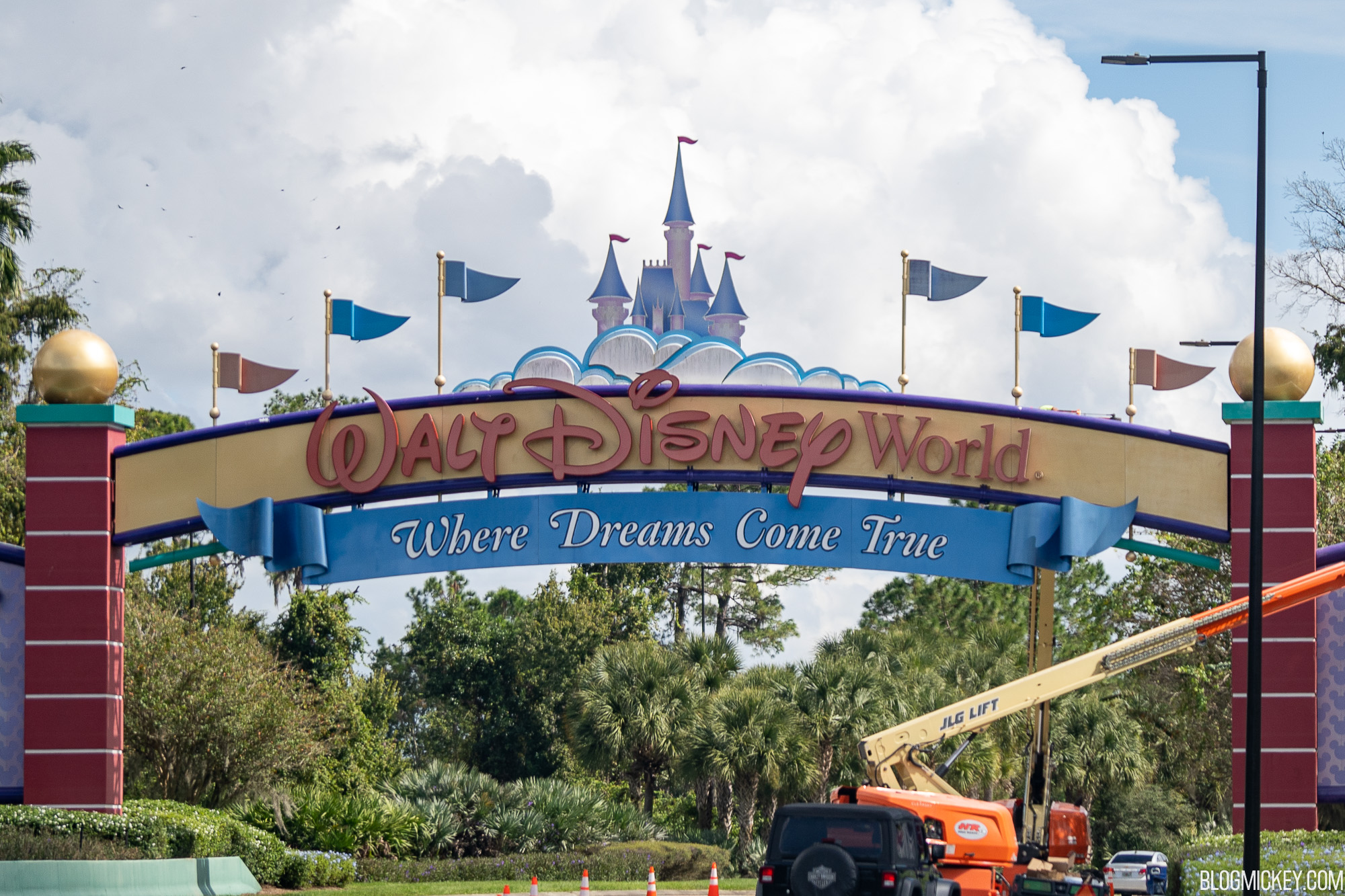
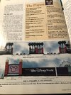
News PHOTOS - New look Magic Kingdom auto-plaza shares similar color scheme with Cinderella Castle

Mike730

Well-Known Member
Here are some maps to explain Buena Vista Blvd. and Center Dr better. Here you see Buena Vista Dr, north end near warehouses (DC) as well as Vista Dr. north entrance as it wraps west and heads towards Ft. Wilderness and TTC. Golden Oak visible bottom left of pic.
View attachment 508670


Here is where it gets tricky. If you are traveling east towards Disney Springs on Buena Vista Dr, it actually turns 90 degrees north at the edge of Disney Springs as you drive east past Disney Springs. If you continue straight, it turns into Hotel Plaza Blvd.
View attachment 508671

Lastly, Center Dr enters into MK CM parking (West Clock) it then continues into Floridian Way and World Dr northern ends behind MK. and then just to the west is the new Floridian Place which is the new main northern entrance.
View attachment 508669
Excellent. Thanks for the details.

Gated Entrances
1. Western Way: Mickey, Minnie, Donald
2. World Drive: Mickey, Minnie, Donald, Goofy
3. Osceola Parkway: Mickey, Minnie, Goofy
4. Epcot Center Drive: Mickey, Minnie
5. Hotel Plaza Boulevard: Mickey, Minnie

Ungated Entrances
1. Floridian Place
2. Center Drive
3. Vista Boulevard
4. Buena Vista Drive (North)
5. Sherberth Road
 

_caleb

Well-Known Member
I think what sticks out to me the most is that they want/need the other three parks to absorb people (well, pre-Covid, at least), yet they are focusing all of these color changes on one thing - MK. 🤔
The color changes at MK are part of that plan– people will be less impressed with MK and want to spend more time at the other parks!
 

brb1006

Well-Known Member

JohnD

Well-Known Member
Here are some maps to explain Buena Vista Blvd. and Center Dr better. Here you see Buena Vista Dr, north end near warehouses (DC) as well as Vista Dr. north entrance as it wraps west and heads towards Ft. Wilderness and TTC. Golden Oak visible bottom left of pic.
View attachment 508670


Here is where it gets tricky. If you are traveling east towards Disney Springs on Buena Vista Dr, it actually turns 90 degrees north at the edge of Disney Springs as you drive east past Disney Springs. If you continue straight, it turns into Hotel Plaza Blvd.
View attachment 508671

Lastly, Center Dr enters into MK CM parking (West Clock) it then continues into Floridian Way and World Dr northern ends behind MK. and then just to the west is the new Floridian Place which is the new main northern entrance.
View attachment 508669

Looks like those lakes and waterways are being bought by WalMart and Pepsi too. Too blue.
 

HauntedPirate

Park nostalgist
Premium Member
Those photos of the TTC from a few pages back... 😟

That needs an entire redo. Not paint. New design.

It’s so hideous. Like out of the 80’s. Give me modern, sleek, and new.

As someone who had many of my teenage years in the 80's (plus a few trips to WDW throughout that decade)... Reported. ;) The TTC design look is pure 90's, actually, early 90's if I'm remembering correctly. But even with some things from that decade coming back into style, the TTC is not one of them. It does look dated, even to my jaded and nostalgic eyes. Althought I will miss the monorail sign, whenever it gets redone.

(Edited to strike out 'design' and add 'look' for clarity)
 
Last edited:

brb1006

Well-Known Member
As someone who had many of my teenage years in the 80's (plus a few trips to WDW throughout that decade)... Reported. ;) The TTC design is pure 90's, actually, early 90's if I'm remembering correctly. But even with some things from that decade coming back into style, the TTC is not one of them. It does look dated, even to my jaded and nostalgic eyes. Althought I will miss the monorail sign, whenever it gets redone.
I think the current WDW Entrance Signs were added around 1996 (not counting the clouds and castle). Since 1996 was when Walt Disney World started phasing out the Retro WDW Logo and started using the current one.
 
Last edited:

trainplane3

Well-Known Member

PHOTOS - Work gets underway on the new look Walt Disney World gateways​

While it's kinda seen in your pictures, in BlogMickey's the castle looks...nasty:
disney-world-entrance-signs-construction-oct272020-6.jpg


On one hand, you shouldn't be staring at a sign while traveling 50mph+. On the other, Disney is (or was?) known for upkeep so regardless it should look great.
 

wdwmagic

Administrator
Moderator
Premium Member
Original Poster
While it's kinda seen in your pictures, in BlogMickey's the castle looks...nasty:
disney-world-entrance-signs-construction-oct272020-6.jpg


On one hand, you shouldn't be staring at a sign while traveling 50mph+. On the other, Disney is (or was?) known for upkeep so regardless it should look great.
They tend to let things go when they know they will be replacing them. The MK auto plaza was in very poor shape before the work.
 

lazyboy97o

Well-Known Member
Those photos of the TTC from a few pages back... 😟

That needs an entire redo. Not paint. New design.

It’s so hideous. Like out of the 80’s. Give me modern, sleek, and new.
As someone who had many of my teenage years in the 80's (plus a few trips to WDW throughout that decade)... Reported. ;) The TTC design is pure 90's, actually, early 90's if I'm remembering correctly. But even with some things from that decade coming back into style, the TTC is not one of them. It does look dated, even to my jaded and nostalgic eyes. Althought I will miss the monorail sign, whenever it gets redone.
The problem isn’t so much the original Transportation and Ticket Center itself but the oversized clutter that was glued onto it to make it more “Disney.”
 

drnilescrane

Well-Known Member
Funny thing is the design for the entrances was done in the late 1980/early 1990s along with the rest of the resort wayfinding project. They just dragged their feet on installing them until about 1996. By the time they finally did they ended up looking very different (characters being added to the original and arguably better design). Even more interesting is the plan to change the logo had been kicking around for a very long time too.
1603835597662.png
 

Walt d

Well-Known Member
Funny thing is the design for the entrances was done in the late 1980/early 1990s along with the rest of the resort wayfinding project. They just dragged their feet on installing them until about 1996. By the time they finally did they ended up looking very different (characters being added to the original and arguably better design). Even more interesting is the plan to change the logo had been kicking around for a very long time too. View attachment 508779
 

Attachments

  • 8D25CDDC-4B8F-4820-B401-D7FD8A1D8797.jpeg
    8D25CDDC-4B8F-4820-B401-D7FD8A1D8797.jpeg
    121 KB · Views: 267
  • FCAA49D7-750A-4A3B-858B-7754E2A10FDF.jpeg
    FCAA49D7-750A-4A3B-858B-7754E2A10FDF.jpeg
    135.5 KB · Views: 214
  • 781F3E05-C138-4019-8CC8-4D3D53DCD7DF.jpeg
    781F3E05-C138-4019-8CC8-4D3D53DCD7DF.jpeg
    121 KB · Views: 214
  • CEF1D1D9-62E7-4691-9E45-674578D927CF.jpeg
    CEF1D1D9-62E7-4691-9E45-674578D927CF.jpeg
    114.3 KB · Views: 217
  • FED7B35B-6B24-4C5A-8E4D-F893DA0C55AD.jpeg
    FED7B35B-6B24-4C5A-8E4D-F893DA0C55AD.jpeg
    78.2 KB · Views: 195
  • 96C07B2B-63CB-4D01-ABC0-908A51E5469F.jpeg
    96C07B2B-63CB-4D01-ABC0-908A51E5469F.jpeg
    78.3 KB · Views: 215
  • 49D8ACBD-4456-4E09-896D-B98B607A17FC.jpeg
    49D8ACBD-4456-4E09-896D-B98B607A17FC.jpeg
    122.2 KB · Views: 234
  • CED9E420-35BD-4BA3-A342-48B073EB4688.jpeg
    CED9E420-35BD-4BA3-A342-48B073EB4688.jpeg
    112.4 KB · Views: 283

phillip9698

Well-Known Member
I don't like the new entry signs for the very reason some of you do, it's too similar scheme wise to Cinderella's castle. The entry signs should represent an entry to WDW as a whole and not "hey you are almost to the Magic Kingdom". An overarching problem with WDW is everything is still pointing to the MK, the other parks need a lot of attention and shouldn't remain second fiddle.
 

Register on WDWMAGIC. This sidebar will go away, and you'll see fewer ads.

Back
Top Bottom