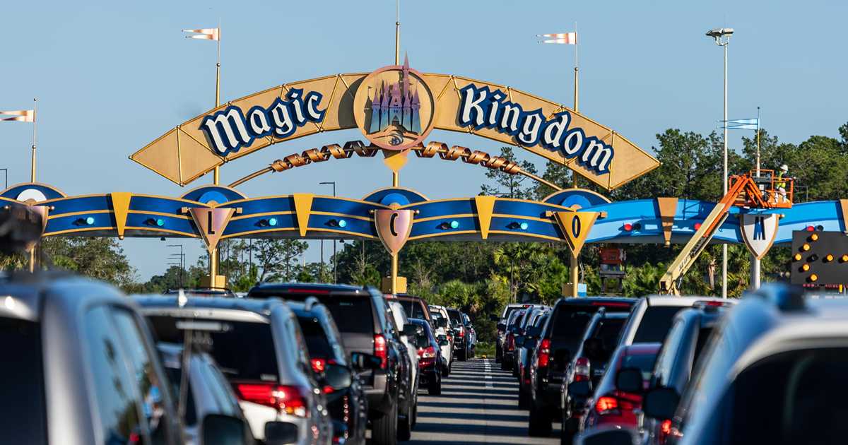
News PHOTOS - New look Magic Kingdom auto-plaza shares similar color scheme with Cinderella Castle

wdwmagic

Administrator
Moderator
Premium Member
Original Poster
Progress on the Western Way gateway today

DSC05601-1.jpg
 

hpyhnt 1000

Well-Known Member
I'm sure it matches the Photoshop® gradient they used in the concept art.
View attachment 510220

The 50th Anniversary logo for comparison. I guess there's some similarities? Probably matches the 50th logo concept better than the actual castle vs. its concept, though that's a pretty low bar to be honest...

1604430743132.png


Funny thing is, a castle paint scheme that mimicked the iridescent logo above could have been really cool, at least for ~18 months. Could have even used the projection system to give it a sparkle effect at night and project the big 50 on it after HEA. Alas, we know what direction they decided to go instead.
 

Horizons1

Well-Known Member
The 50th Anniversary logo for comparison. I guess there's some similarities? Probably matches the 50th logo concept better than the actual castle vs. its concept, though that's a pretty low bar to be honest...

View attachment 510288

Funny thing is, a castle paint scheme that mimicked the iridescent logo above could have been really cool, at least for ~18 months. Could have even used the projection system to give it a sparkle effect at night and project the big 50 on it after HEA. Alas, we know what direction they decided to go instead.
That’s such a bland and ugly logo.
 

Walt d

Well-Known Member
I'm curious to understand the rational behind this. Does making these changes increase guests to come to the parks? or was this money already earmarked and funds delivered before COVID hit? Seems like wasted money, but I guess during a time when there are less guests, why not capitalize on it and make changes to high trafficked/visible areas
Whats next Bobbyi time to Ruin another attraction
 

Register on WDWMAGIC. This sidebar will go away, and you'll see fewer ads.

Back
Top Bottom