News PHOTOS - New look Magic Kingdom auto-plaza shares similar color scheme with Cinderella Castle

Cmdr_Crimson

Well-Known Member
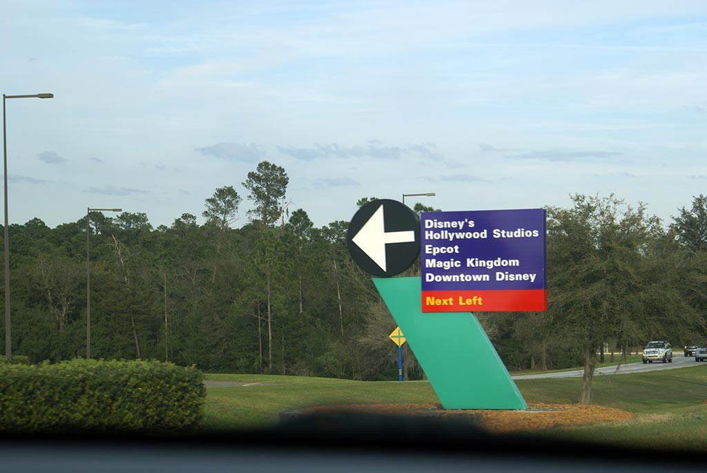
Not sure if I’m remembering this correctly, but I thought the purple road signs were colored that way purposely, possibly for visual clarity. I could be 100% wrong, though.

This could be... ok. I need to see the finished product, of course. I’m not getting my hopes up just yet.
If I remember the story right they tested various colors and the purpled signs were the ones that were most effective.

They do pop out very niceley, I like them.
Midway to Main Street explains why...
 

Cmdr_Crimson

Well-Known Member
View attachment 508616
Off topic a bit, but...
while we're talking about paint jobs - weren't we supposed to get characters for this, too?
Or would that be "too Disney" for today's Disney?
I know everyone loves the new "sleek" designs all over, even in hotels, but I kinda miss the "Disney" part of Disney.
It was cheerful, fun, & happy. Now it seems sophisticated & "too cool for school".
I guess it didn't look good what they saw on the concept art...
Disneys-Hollywood-Studios_Full_35139.jpg
 

MisterPenguin

President of Animal Kingdom
Premium Member
Legitimately I'm not sure if they thought this through. White text on a blue background, surrounded by grey, with hints of yellow = literally Walmart storefronts.

I'm not seeing it. Walmart blue is usually lighter. When it's dark blue, there's a red background. The brick is tan, not natural stone. Walmart uses yellow, the new Disney signs don't. Then there's a huge difference in typeface.
 
Last edited:

JoeCamel

Well-Known Member
Legitimately I'm not sure if they thought this through. White text on a blue background, surrounded by grey, with hints of yellow = literally Walmart storefronts.
Why not Walmart, they are building an IKEA in the park? Give the people what is familiar to them......

I'm not seeing it. Walmart blue is usually lighter. When it's dark blue, there's a read background. The brick is tan, not natural stone. Walmart uses yellow, the new Disney signs don't. Then there's a huge difference in typeface.
Walmart is in the middle of grinding/polishing the floors and repainting their stores around here. The paint colors look very much like what they are doing with the entrance signs.
 

Monorail_Red_77

Well-Known Member
Why not Walmart, they are building an IKEA in the park? Give the people what is familiar to them......


Walmart is in the middle of grinding/polishing the floors and repainting their stores around here. The paint colors look very much like what they are doing with the entrance signs.

yep our local Walmart just went through the similar remodel. grind and polished cement floors, exterior went to grey building with blue accents and blue and white logo. Oh, and a new IHOP in the walmart plaza has accents on the corners of the building that have hidden a few mickeys in them. Their colors are red white and blue and a bunch of various circle sizes, kinda gives a Pepsi vibe.

So that makes it official, Disney World is being bought by Walmart and Pepsi. In a 18 Kagillion dollar deal. LOL
 

MadTeacup

Well-Known Member
I think what sticks out to me the most is that they want/need the other three parks to absorb people (well, pre-Covid, at least), yet they are focusing all of these color changes on one thing - MK. 🤔
I highly doubt color changes are going to have any effect on which parks guests visit. The problem is that it takes more than 1 day to see everything at Magic Kingdom. That park is just too large for its own good while most of the others are too small. They still want to spread out the crowds. Disney is extremely disappointed with the current attendance at Animal Kingdom. Unfortunately, that park still needs a lot more love, but currently has 3 closed attractions. There's just not enough there.
 

Monorail_Red_77

Well-Known Member
LOL. So spot on.

But ... but ... think of the merch sales! [sarcasm]

Sidenote though, I actually don't mind the new castle colors ... lol. It looks nice in person (though I can see why most aren't sold on the pink). I'm not sure what they'll do to ruin it though with the 50th enhancements. They should just leave it be. You'd think money could be spent elsewhere rather than bedazzle the castle ...

I like the royal blue being used on the new parking entrance sign. That's about it. I was tired of the baby/light blue.

I have to say they're doing a decent job with the Epcot entrance, with the blues, etc. I don't even hate the random colors on the ticket booths. (Though I know it isn't likely a 'priority project', could the fountain re-do go any slower?)
As much as you don't link the baby blue on MK toll plaza, the pink before it was worse. Not to mention when they painted the baby blue back then, they never painted the interior of the toll booths. So you to this day can still see the pink from the previous refurb. I hope at least with this refurb that they paint the insides of the toll booths.
 

tirian

Well-Known Member
View attachment 508616
Off topic a bit, but...
while we're talking about paint jobs - weren't we supposed to get characters for this, too?
Or would that be "too Disney" for today's Disney?
I know everyone loves the new "sleek" designs all over, even in hotels, but I kinda miss the "Disney" part of Disney.
It was cheerful, fun, & happy. Now it seems sophisticated & "too cool for school".
It depends on whether we’re talking about Walt’s own Disney, MAPO/WDW/EPCOT Center-era Disney, DLP Disney, 1990s Plastic Toy Disney, or the new Corporate Conglomerate Disney.

;)

The ‘60s–early ‘90s struck a good balance between sophistication and fun characters. Cartoon IPs were included but balanced with new experiences to feel like a new world, not a giant infomercial for merchandise. I don’t know if the company is willing to strike that balance again. Things seem to be either completely stripped bare or overdone (Poly lobby vs. Cindy Castle 50th paint).
 

ImperfectPixie

Well-Known Member
It depends on whether we’re talking about Walt’s own Disney, MAPO/WDW/EPCOT Center-era Disney, DLP Disney, 1990s Plastic Toy Disney, or the new Corporate Conglomerate Disney.

;)

The ‘60s–early ‘90s struck a good balance between sophistication and fun characters. Cartoon IPs were included but balanced with new experiences to feel like a new world, not a giant infomercial for merchandise. I don’t know if the company is willing to strike that balance again. Things seem to be either completely stripped bare or overdone (Poly lobby vs. Cindy Castle 50th paint).
Disney is going to face a hard reality when people realize how closely that balance is swinging to Great Wolf Lodge on steroids.
 

lazyboy97o

Well-Known Member
The entrance arches, Magic Kingdom toll plaza and Transportation and Ticket Center all need more than paint. They were all “made magical” with loud clutter that’s “fun” because it’s oversized and over colored. Not an example of high postmodernism. The arches in particular look silly with grey as they were never intended to look like a real material.
 

Monorail_Red_77

Well-Known Member
I think these are #4 and #5?

1. Western Way: Mickey, Minnie, Donald
2. World Drive: Mickey, Minnie, Donald, Goofy
3. Osceola Parkway: Mickey, Minnie, Goofy
4. Epcot Center Drive: Mickey, Minnie
5. Hotel Plaza Boulevard: Mickey, Minnie

Seeing "ungated" entrances at Floridian Place, Sherberth Road, Vista Boulevard.
No hotel Plaza Blvd is different. Buena Vista turn north along disney springs and then goes back stage. If you continue straight it turns into hotel plaza blvd. I'll link a map in a minute.
 

Monorail_Red_77

Well-Known Member
I think these are #4 and #5?

1. Western Way: Mickey, Minnie, Donald
2. World Drive: Mickey, Minnie, Donald, Goofy
3. Osceola Parkway: Mickey, Minnie, Goofy
4. Epcot Center Drive: Mickey, Minnie
5. Hotel Plaza Boulevard: Mickey, Minnie

Seeing "ungated" entrances at Floridian Place, Sherberth Road, Vista Boulevard.
Here are some maps to explain Buena Vista Blvd. and Center Dr better. Here you see Buena Vista Dr, north end near warehouses (DC) as well as Vista Dr. north entrance as it wraps west and heads towards Ft. Wilderness and TTC. Golden Oak visible bottom left of pic.
n ds wdw.png


Here is where it gets tricky. If you are traveling east towards Disney Springs on Buena Vista Dr, it actually turns 90 degrees north at the edge of Disney Springs as you drive east past Disney Springs. If you continue straight, it turns into Hotel Plaza Blvd.
ds wdw.png


Lastly, Center Dr enters into MK CM parking (West Clock) it then continues into Floridian Way and World Dr northern ends behind MK. and then just to the west is the new Floridian Place which is the new main northern entrance.
n wdw.png
 

castlecake2.0

Well-Known Member
The previous entrance signs matched the roadway signage throughout property.

Compare:
disney-world-characters-inappropriate-touching.jpg


Disneys-Hollywood-Studios_Full_3073.jpg


I doubt they'll update all the roadway signs to this new color scheme. With that in mind, I'm a bit disappointed that they'll no longer match.
I feel the same, I like the new design but a little bothered it won’t match the overall look. They did this a few years ago when they started repainting the busses to no longer match the overall resort color scheme.
 

Register on WDWMAGIC. This sidebar will go away, and you'll see fewer ads.

Back
Top Bottom