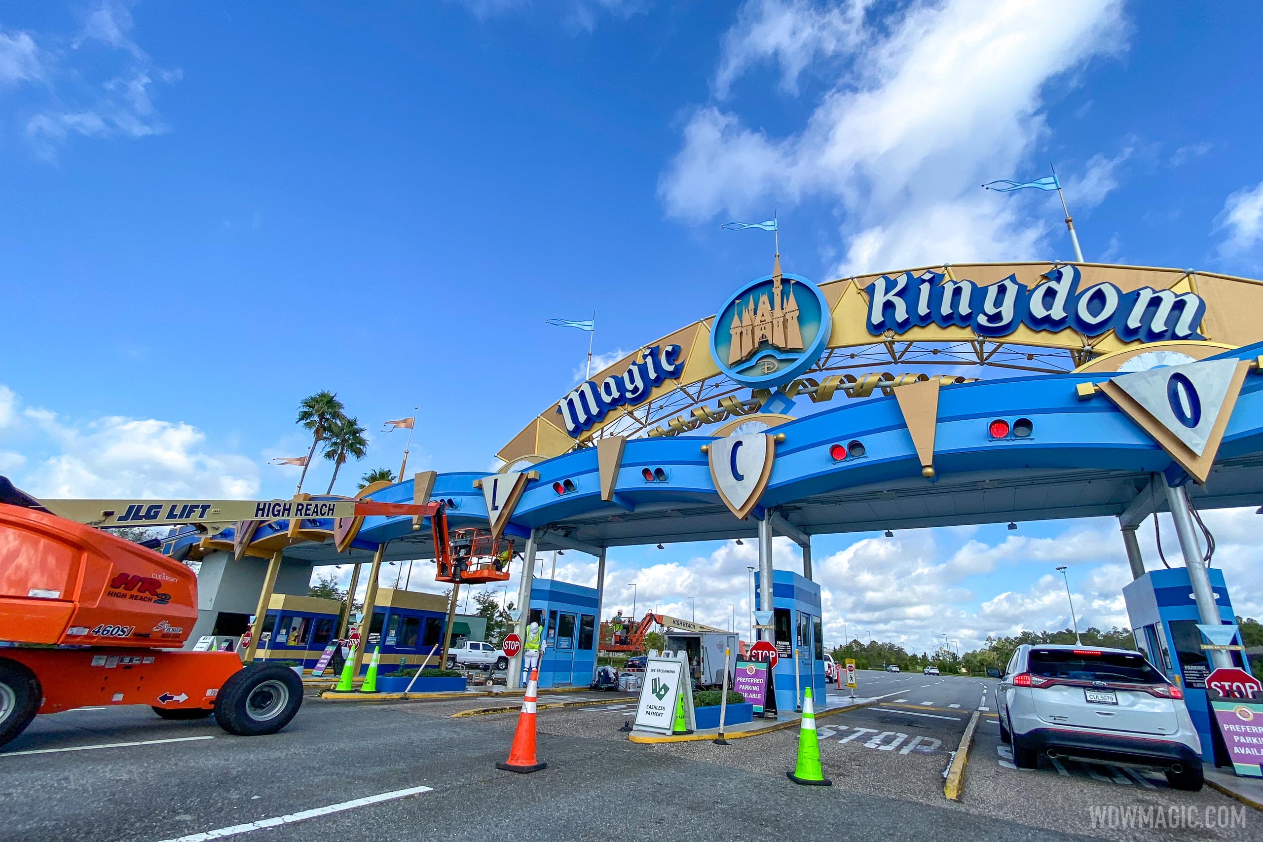
News PHOTOS - New look Magic Kingdom auto-plaza shares similar color scheme with Cinderella Castle

Disstevefan1

Well-Known Member

JohnD

Well-Known Member
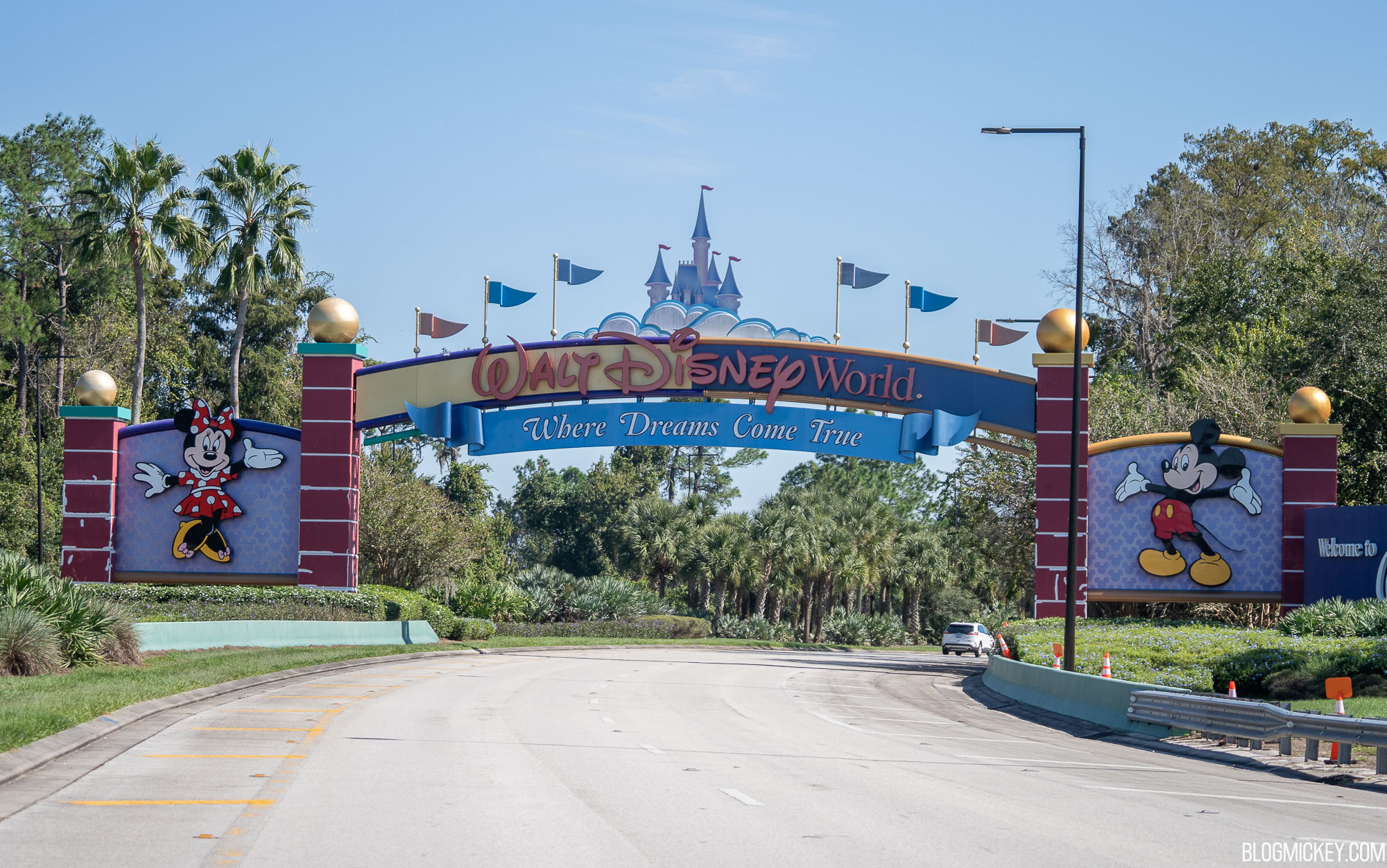
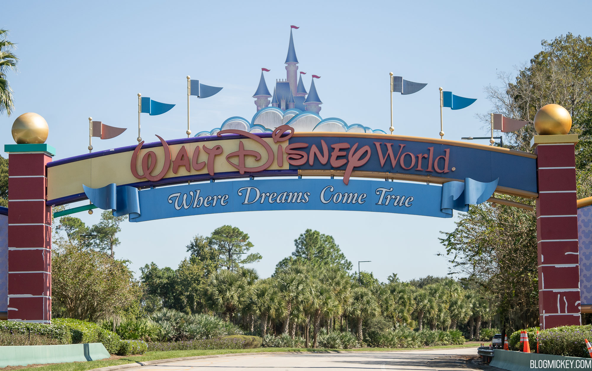
With the redesign of the entrances, leave it to another WDW blog (not that one that shall not be named but another one) to ask, "Is Walt Disney World no longer the place that dreams come true?" (The slogan "Where dreams come true" is being replaced with "The Most Magical Place on Earth"). Talk about a gag-filled clickbait headline.
 

lazyboy97o

Well-Known Member
With the redesign of the entrances, leave it to another WDW blog (not that one that shall not be named but another one) to ask, "Is Walt Disney World no longer the place that dreams come true?" (The slogan "Where dreams come true" is being replaced with "The Most Magical Place on Earth"). Talk about a gag-filled clickbait headline.
It should say “Vacation Kingdom of the World”.
 

trainplane3

Well-Known Member
western-way-disney-world-entrance-repainting-oct302020-6.jpg
 

DisneyTransport

Active Member
I'm curious to understand the rational behind this. Does making these changes increase guests to come to the parks? or was this money already earmarked and funds delivered before COVID hit? Seems like wasted money, but I guess during a time when there are less guests, why not capitalize on it and make changes to high trafficked/visible areas
 

JohnD

Well-Known Member
I'm curious to understand the rational behind this. Does making these changes increase guests to come to the parks? or was this money already earmarked and funds delivered before COVID hit? Seems like wasted money, but I guess during a time when there are less guests, why not capitalize on it and make changes to high trafficked/visible areas

The latter I think. Also, the monorail beams on the Epcot line are the best they have looked in 40 years. It's not currently being used so they've been pressure washing it. I noticed while in Epcot last week and also while on the bus to MK. The only part left was the ring right at the TTC. I think these signs were also planned to be replaced before the 50th anniversary.
 
Last edited:

kpilcher

Well-Known Member
By the late ‘80s, the original WDW logo was outdated, not nostalgic. Now enough time has passed that the original is happily retro whereas the update is coldly corporate.
The update was coldly corporate even when it debuted. I wasn’t necessarily gutted or anything when they decided to drop the beautifully thought out original logo. Change can be good. When the faux-Walt script went up however....
 

Register on WDWMAGIC. This sidebar will go away, and you'll see fewer ads.

Back
Top Bottom