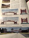
Here are some maps to explain Buena Vista Blvd. and Center Dr better. Here you see Buena Vista Dr, north end near warehouses (DC) as well as Vista Dr. north entrance as it wraps west and heads towards Ft. Wilderness and TTC. Golden Oak visible bottom left of pic.
View attachment 508670
Here is where it gets tricky. If you are traveling east towards Disney Springs on Buena Vista Dr, it actually turns 90 degrees north at the edge of Disney Springs as you drive east past Disney Springs. If you continue straight, it turns into Hotel Plaza Blvd.
View attachment 508671
Lastly, Center Dr enters into MK CM parking (West Clock) it then continues into Floridian Way and World Dr northern ends behind MK. and then just to the west is the new Floridian Place which is the new main northern entrance.
View attachment 508669


") The TTC
The TTC