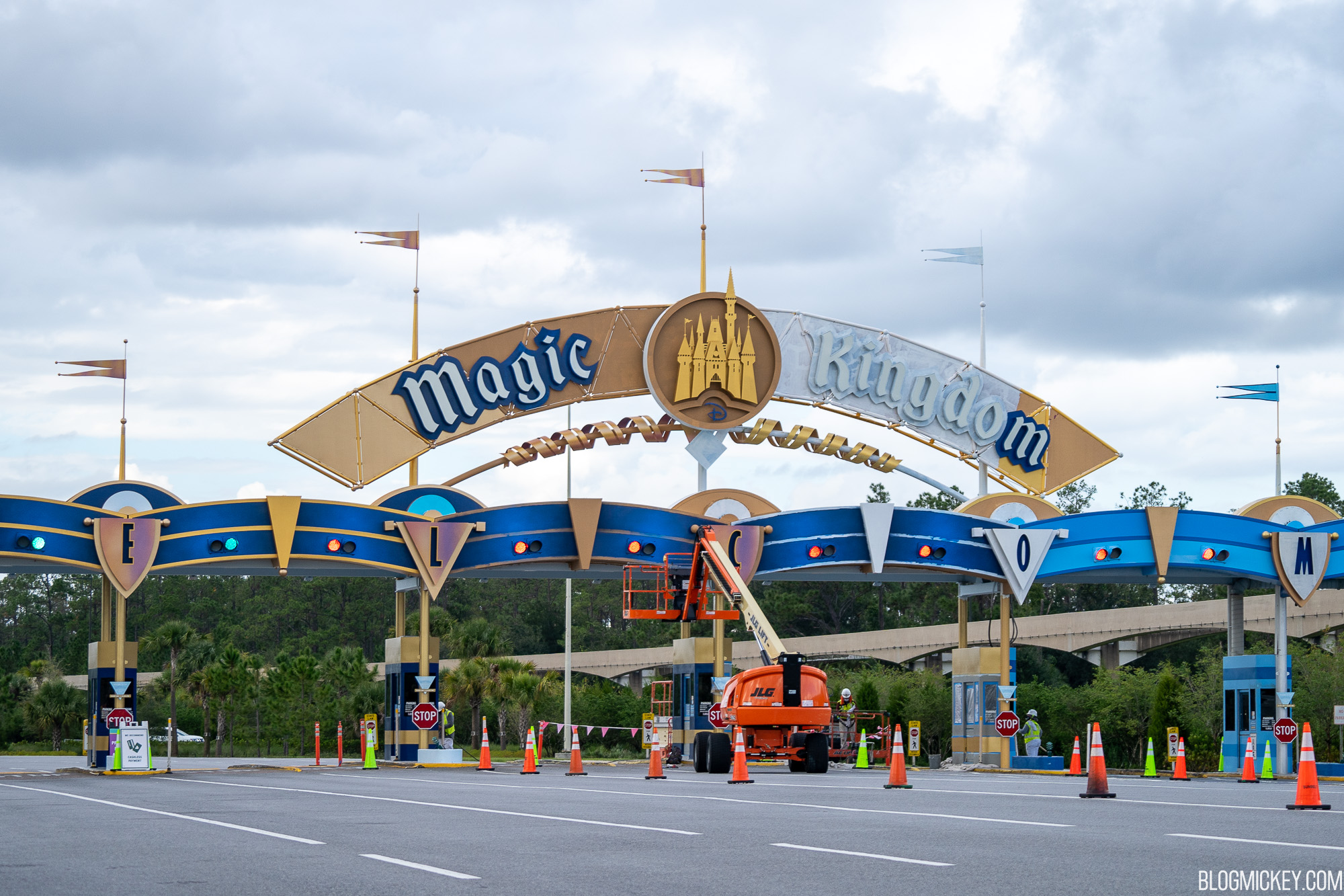
News PHOTOS - New look Magic Kingdom auto-plaza shares similar color scheme with Cinderella Castle

Magic Feather

Well-Known Member
So, the main entrance will complement the Magic Kingdom Toll Plaza refresh nicely. But, neither really complement Cinderella Castle. It seems like two out of three are on the same page and the Castle is a different color scheme.
It was designed separately. Now they appear to be trying to mesh the two together to make the Castle repaint appear to be done for the 50th
 

Tom Morrow

Well-Known Member
View attachment 508531

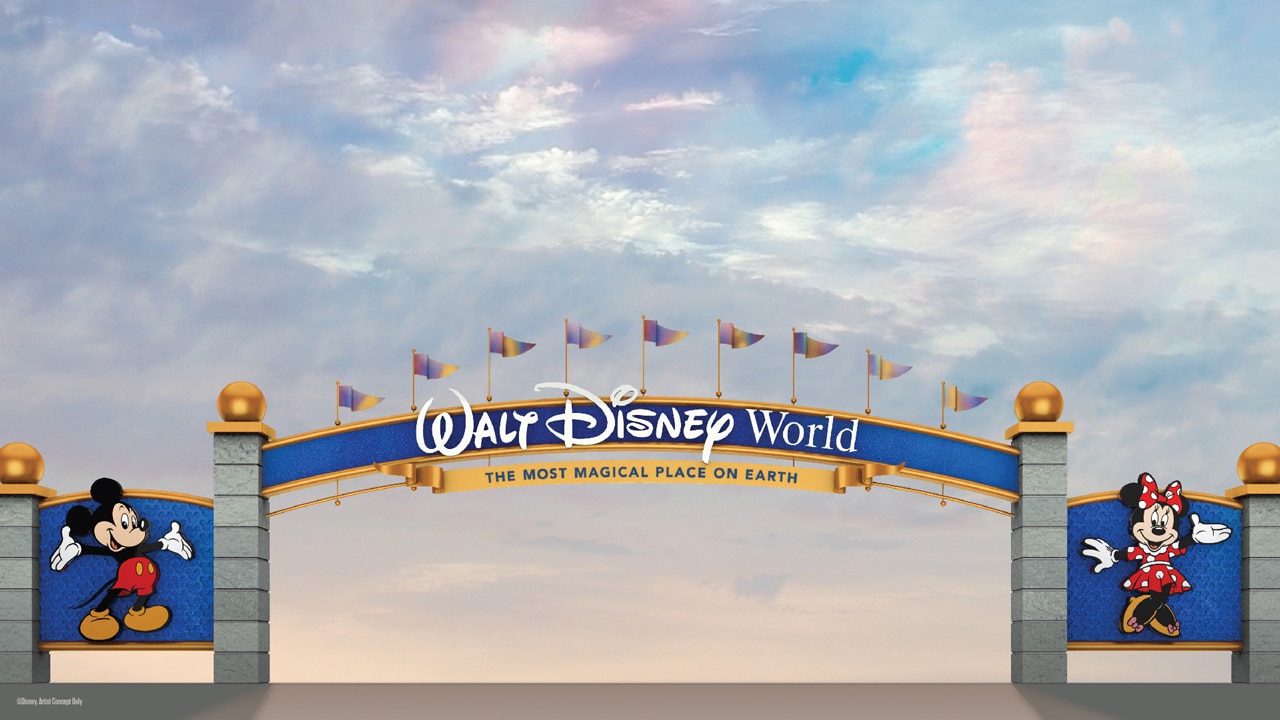
"Starting today, these gateways to a Disney vacation are about to get some pixie dust as we begin to adorn them with a new color palette that complements the recent royal makeover of Cinderella Castle at Magic Kingdom Park. The rendering above gives you a first glimpse at what the entrances will look like when they’re finished; in addition, you’ll see these colors appear on the Magic Kingdom Park Auto Plaza as we bring a new shimmer to that iconic entryway.

These refreshed gateways will continue to set the tone for all the stories you’ll tell and the memories you’ll cherish long after your visit. They’re also part of the broad tapestry of new experiences happening across Walt Disney World as part of the resort’s historic transformation that includes expansive themed lands like Star Wars: Galaxy’s Edge, new attractions like Mickey & Minnie’s Runaway Railway, and new places to stay like Disney’s Riviera Resort. "


The dark blue and grey instantly makes me think of Walmart. I hope it looks better in person. Overall an improvement though.

also agreed that the TTC desperately needs an overhaul, but a new paint scheme would help.
 

Chip Chipperson

Well-Known Member
View attachment 508531

"Starting today, these gateways to a Disney vacation are about to get some pixie dust as we begin to adorn them with a new color palette that complements the recent royal makeover of Cinderella Castle at Magic Kingdom Park. The rendering above gives you a first glimpse at what the entrances will look like when they’re finished; in addition, you’ll see these colors appear on the Magic Kingdom Park Auto Plaza as we bring a new shimmer to that iconic entryway.

These refreshed gateways will continue to set the tone for all the stories you’ll tell and the memories you’ll cherish long after your visit. They’re also part of the broad tapestry of new experiences happening across Walt Disney World as part of the resort’s historic transformation that includes expansive themed lands like Star Wars: Galaxy’s Edge, new attractions like Mickey & Minnie’s Runaway Railway, and new places to stay like Disney’s Riviera Resort. "


I like the blue and gold color scheme. I'll have to see how the new paint on the flags looks in person to really judge them. I was never a fan of the clouds on the sign.
 

DCBaker

Premium Member
magic-kingdom-parking-plaza-repainting-oct262020-2.jpg
magic-kingdom-parking-plaza-repainting-oct262020-4.jpg


JoeCamel

Well-Known Member
I have to say that I like the new look to the entrance signs. I'll miss the castle on top, but it makes sense why it was removed from the design. Overall, it looks sleek while still having charm. Good move!
The art was of one of the entrance arches not the toll plaza. Castle stays
OK, I see what you mean, it never registered with me
 

Disney4family

Well-Known Member
1603764545426.png

Off topic a bit, but...
while we're talking about paint jobs - weren't we supposed to get characters for this, too?
Or would that be "too Disney" for today's Disney?
I know everyone loves the new "sleek" designs all over, even in hotels, but I kinda miss the "Disney" part of Disney.
It was cheerful, fun, & happy. Now it seems sophisticated & "too cool for school".
 

HauntedPirate

Park nostalgist
Premium Member
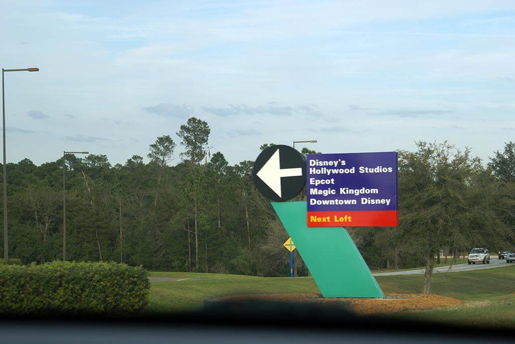
Not sure if I’m remembering this correctly, but I thought the purple road signs were colored that way purposely, possibly for visual clarity. I could be 100% wrong, though.

This could be... ok. I need to see the finished product, of course. I’m not getting my hopes up just yet.
 

TrainsOfDisney

Well-Known Member
Not sure if I’m remembering this correctly, but I thought the purple road signs were colored that way purposely, possibly for visual clarity. I could be 100% wrong, though.

This could be... ok. I need to see the finished product, of course. I’m not getting my hopes up just yet.
If I remember the story right they tested various colors and the purpled signs were the ones that were most effective.

They do pop out very niceley, I like them.
 

Register on WDWMAGIC. This sidebar will go away, and you'll see fewer ads.

Back
Top Bottom