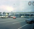
News PHOTOS - New look Magic Kingdom auto-plaza shares similar color scheme with Cinderella Castle

Kman101

Well-Known Member
WDI: “Remember rose gold?”

Humanity: “From six years ago?”

WDI: “Yeah, it’s magical and popular, and we’re going to put it everywhere!”

Humanity: “From six years ago?”

WDI: “It’s the new gold, right? It looks great with those Instagram filters the millennial kids use.”

Humanity: “From six years ago?”

WDI: “Maybe we can find new places to use that hot new song ‘Let It Go’ too.”

LOL. So spot on.

But ... but ... think of the merch sales! [sarcasm]

Sidenote though, I actually don't mind the new castle colors ... lol. It looks nice in person (though I can see why most aren't sold on the pink). I'm not sure what they'll do to ruin it though with the 50th enhancements. They should just leave it be. You'd think money could be spent elsewhere rather than bedazzle the castle ...

I like the royal blue being used on the new parking entrance sign. That's about it. I was tired of the baby/light blue.

I have to say they're doing a decent job with the Epcot entrance, with the blues, etc. I don't even hate the random colors on the ticket booths. (Though I know it isn't likely a 'priority project', could the fountain re-do go any slower?)
 

tirian

Well-Known Member
Over the last few years, every MK Toll Plaza repaint has been an upgrade, IMO, and this is no exception.

And, as has been said a few times, this is the anniversary color scheme. And, this is different from the castle colors.
We know.

That doesn’t make anything better. ;)
 

JoeCamel

Well-Known Member
Not to be a hater, but the MK Toll Plaza is a good example of the flat ornamentation that struck me as cheap and dated when I first started going to WDW after growing up a Disneylander. It's not used as commonly as it once was, and I'm not exactly sure how to describe it– layers of flat sheetmetal to create the illusion of depth?

I do like this paint job, though!
Think IASW scenes.
 

Father Robinson

Well-Known Member
Some one on here said, the Castle is going to be repainted again does that mean they’ll change this to? These colors make me want to loose my lunch. Being a kustom painter air brusher graphics designer. I was happy with the old look” please re-do this! Yuck”
Did we ever get any confirmation as to whether the new castle colors are temporary (for the 50th), or permanent? Again, I'm asking about the castle, not the entrance plaza.
 

tirian

Well-Known Member
Not to be a hater, but the MK Toll Plaza is a good example of the flat ornamentation that struck me as cheap and dated when I first started going to WDW after growing up a Disneylander. It's not used as commonly as it once was, and I'm not exactly sure how to describe it– layers of flat sheetmetal to create the illusion of depth?

I do like this paint job, though!
It’s similar to the reason I don’t mind the new World of Disney. The original ‘90s version had lots of three-dimensional props and unique merch racks. Remember the old Alice stuffed animal display? This was years before smart phones and social media offered endless photo ops.

Over the years, the store became a cluttered mess of cheap toys piled high. Most of the floor props were removed. The cleaner look is somewhat of a throwback to Disney Village.

The paint looks better on the MK toll booth than the castle, but the colors still clash.
 
Last edited:

tirian

Well-Known Member
Did we ever get any confirmation as to whether the new castle colors are temporary (for the 50th), or permanent? Again, I'm asking about the castle, not the entrance plaza.
It was announced as permanent. Now the company refers to it as the “50th Celebration” paint job.

In light of Tokyo’s excellent refurb, strong industry rumors claim execs are unhappy with the WDW castle. We can’t prove that, but a simple paint test would’ve told them the same thing.

In a few years, it will need to be repainted anyway, and the narrative can be whatever the spin doctors decide at the time.
 

disneyC97

Well-Known Member
Boooo. It should be a re-creation of the original toll plaza to celebrate the 50th. Plus less maintenance. Good for the company.
 

Attachments

  • 7038EB6E-38AE-413E-94BE-6A6D987A7DBD.jpeg
    7038EB6E-38AE-413E-94BE-6A6D987A7DBD.jpeg
    67.3 KB · Views: 263

_caleb

Well-Known Member
Boooo. It should be a re-creation of the original toll plaza to celebrate the 50th. Plus less maintenance. Good for the company.
I actually really like the original!

Nevertheless, I think it’s important to have a big welcome as guests arrive. I remember looking with such anticipation for the big Disneyland sign on Harbor Blvd as a kid– it meant you were finally there!
 

tirian

Well-Known Member
I’m just joking 🙃

I actually like the new paint job on the toll plaza.
Better there than on an architectural icon.

The castle was a cold corporate decision to make all Disney castles look like “Fantasyland Disney Parks castles” to match the movie opening. At least we’re hearing former Imagineers acknowledge it looks awful.

Meanwhile, the new Epcot entrance looks great!
 

Mike730

Well-Known Member
Not to be a hater, but the MK Toll Plaza is a good example of the flat ornamentation that struck me as cheap and dated when I first started going to WDW after growing up a Disneylander. It's not used as commonly as it once was, and I'm not exactly sure how to describe it– layers of flat sheetmetal to create the illusion of depth?

I do like this paint job, though!

It has always struck me as cheap and dated and I grew up a WDWer. Would look a lot nicer with a stone/castle motif.
 

Obobru

Well-Known Member
I thought they planned to demolish this toll plaza and move it to a different location as part of the road improvements?
 

tirian

Well-Known Member
It has always struck me as cheap and dated and I grew up a WDWer. Would look a lot nicer with a stone/castle motif.
I’d actually like to see it lean towards the Disneyland Paris entrance so that you still feel like you’re traveling to a different place when you take the monorail or ferry. It would help soften the bus route transition too. Obviously, it would be much smaller and less ornate than the DLP hotel. ;)
 

Mike730

Well-Known Member
I’d actually like to see it lean towards the Disneyland Paris entrance so that you still feel like you’re traveling to a different place when you take the monorail or ferry. It would help soften the bus route transition too. Obviously, it would be much smaller and less ornate than the DLP hotel. ;)
Understandable. Its nice, but not too nice. I wish the TTC wasn't so egregiously utilitarian as well but we can't have everything.
1602779016762.png
 

Register on WDWMAGIC. This sidebar will go away, and you'll see fewer ads.

Back
Top Bottom