View attachment 508531
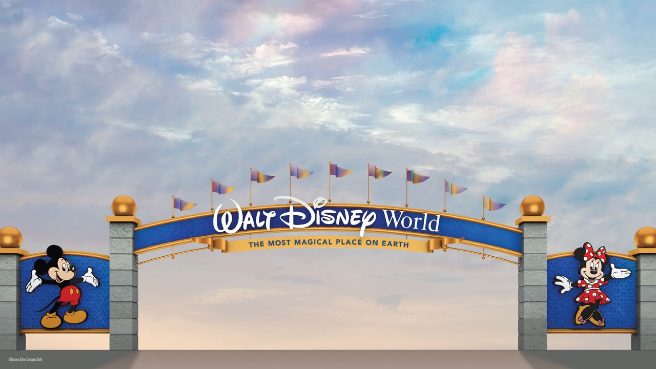
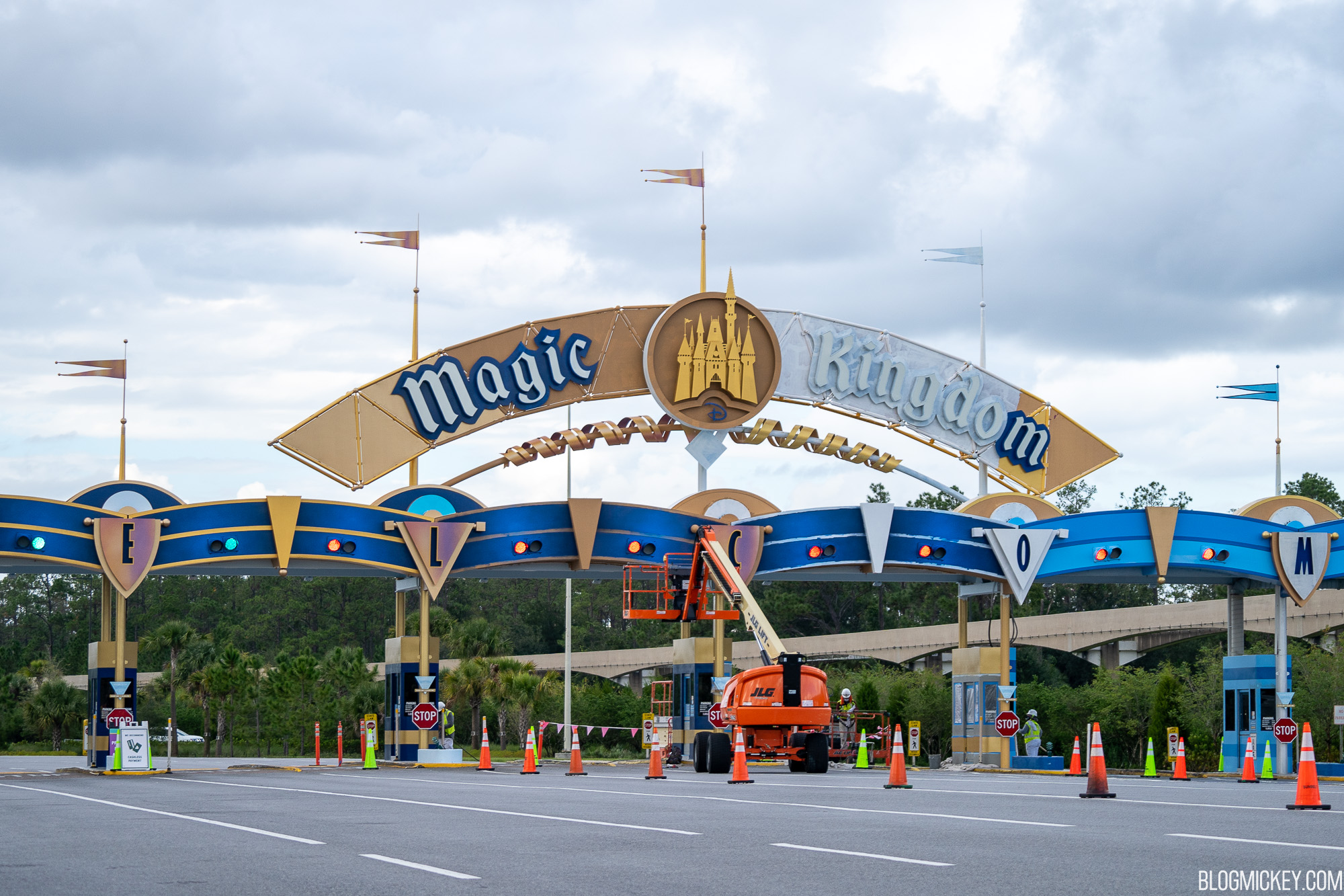
"Starting today, these gateways to a Disney vacation are about to get some pixie dust as we begin to adorn them with a new color palette that complements the recent royal makeover of Cinderella Castle at Magic Kingdom Park. The rendering above gives you a first glimpse at what the entrances will look like when they’re finished; in addition, you’ll see these colors appear on the Magic Kingdom Park Auto Plaza as we bring a new shimmer to that iconic entryway.
These refreshed gateways will continue to set the tone for all the stories you’ll tell and the memories you’ll cherish long after your visit. They’re also part of the broad tapestry of new experiences happening across Walt Disney World as part of the resort’s historic transformation that includes expansive themed lands like
Star Wars: Galaxy’s Edge, new attractions like Mickey & Minnie’s Runaway Railway, and new places to stay like Disney’s Riviera Resort. "
“Are we there yet?” If you’ve ever traveled to Walt Disney World Resort with children – or maybe even adults! – I’m sure you’ve heard that phrase once or a hundred times. Everyone’s just so excited to experience their favorite
disneyparks.disney.go.com