KBLovedDisney
Well-Known Member
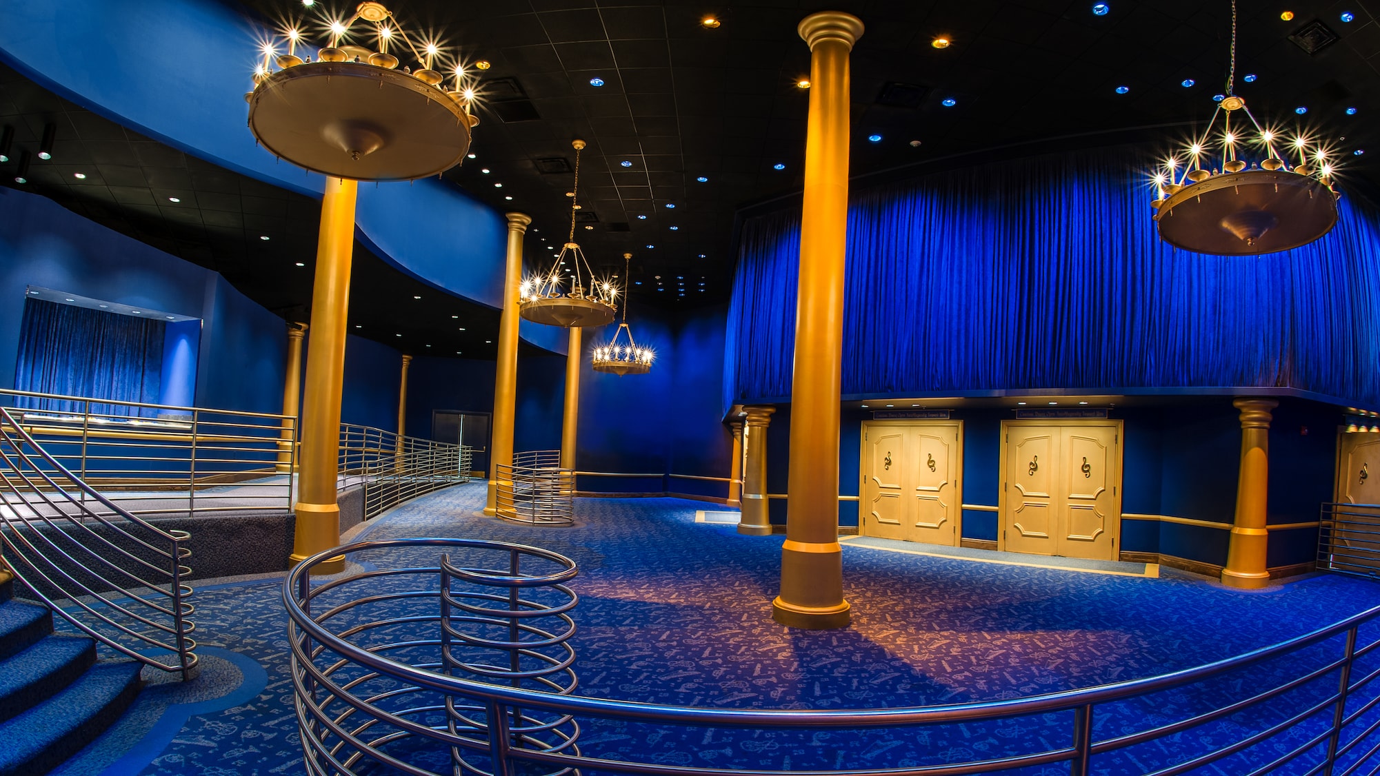
Kind of reminds me more of the color scheme of Mickey's Philharmagic lobby.
I...actually don't mind it.


I...actually don't mind it.


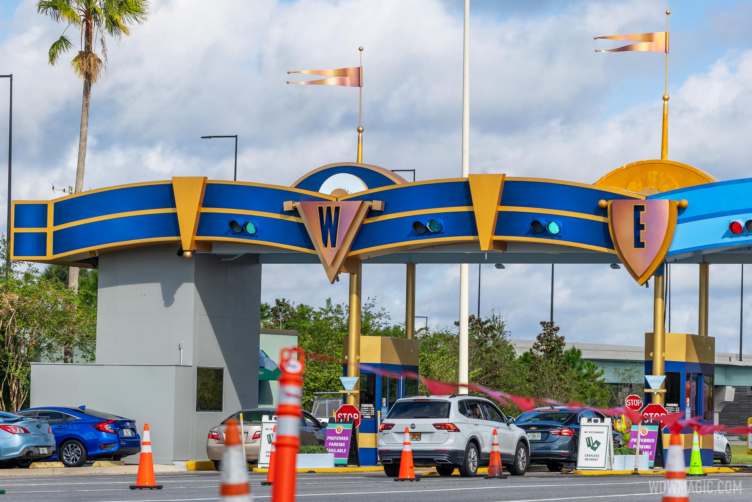
I don't understand why they sell the classic logo on all the merchandise (well, most of it) and yet retain that gawdawful, cold, serif letterhead non-logo everywhere else. I think WDW's main gates are absolutely hideous.Sure would been nice for WDW to bring back the classic/retro logo for the anniversary.
I think it has a deeper, richer feel to it with the new color scheme...I actually like it quite a bit (but still hate the new castle paint-job).Kind of reminds me more of the color scheme of Mickey's Philharmagic lobby.


I...actually don't mind it.
If I remember correctly, Spectromagic was the last time the old WDW logo was used up till 2010. Unless you count the Plane that used to be at Hollywood Studio's tram tour.I don't understand why they sell the classic logo on all the merchandise (well, most of it) and yet retain that gawdawful, cold, serif letterhead non-logo everywhere else. I think WDW's main gates are absolutely hideous.
If I remember correctly, Spectromagic was the last time the old WDW logo was used up till 2010. Unless you count the Plane that used to be at Hollywood Studio's tram tour.
So if it looks regal and rich they won't mind forking over the $28 parking for an opportunity to spend $110+ to walk in the gates so much?I think it has a deeper, richer feel to it with the new color scheme...I actually like it quite a bit (but still hate the new castle paint-job).
It was announced as permanent. Now the company refers to it as the “50th Celebration” paint job.
In light of Tokyo’s excellent refurb, strong industry rumors claim execs are unhappy with the WDW castle. We can’t prove that, but a simple paint test would’ve told them the same thing.
In a few years, it will need to be repainted anyway, and the narrative can be whatever the spin doctors decide at the time.
I've heard similar things. The gist seems to be that the concept art provided (more than the only one that went public) didn't accurately depict the repaint. Like us, many high-ups thought this would be a much lighter/paler pink than it ended up being.This is very interesting. Can you elaborate at all on what has been (possibly) heard?
I thought it might grow on me with time, and then I saw it in person... And now it's in the background of my photos forever...haunting me.I've heard similar things. The gist seems to be that the concept art provided (more than the only one that went public) didn't accurately depict the repaint. Like us, many high-ups thought this would be a much lighter/paler pink than it ended up being.
I'd expect to see at least a minor repaint in the nearer-than-originally-planned future.
I haven’t seen it in person yet, but in addition to the photos across the internet, I’ve had friends call me on video chat to point out how awful it is in person.I thought it might grow on me with time, and then I saw it in person... And now it's in the background of my photos forever...haunting me.
It's bad. Can't imagine anyone that gets paid to make these decisions could be happy with it.
This is very interesting. Can you elaborate at all on what has been (possibly) heard?
I don’t know your personal financial situations, but imagine you make enough money to travel the world and have very expensive, refined taste in clothing, home decor, and cars.The Execs are probably fed up hearing, "You just haven't seen it in the right lighting yet. Check it out with the right Instagram filters applied!"
I've heard similar things. The gist seems to be that the concept art provided (more than the only one that went public) didn't accurately depict the repaint. Like us, many high-ups thought this would be a much lighter/paler pink than it ended up being.
I'd expect to see at least a minor repaint in the nearer-than-originally-planned future.
I've seen how the Bobs dress, so, I know you ain't talking about them.I don’t know your personal financial situations, but imagine you make enough money to travel the world and have very expensive, refined taste in clothing, home decor, and cars.
The problem has less to do with the people who painted it and more to do with the people who selected the paint colors.Wasn’t it painted by Disney’s in-house painters (vs. contractors)?
Moe and Larry were mixing the color and Shemp was slapping it on.The problem has less to do with the people who painted it and more to do with the people who selected the paint colors.
If Curly was involved this wouldn't have happened!Moe and Larry were mixing the color and Shemp was slapping it on.
It was painted by Intex Coatings who do a lot of the large paint jobs. They handle Space Mountain and the new auto-plaza paint.Wasn’t it painted by Disney’s in-house painters (vs. contractors)?
dba "Three Men and a Brush."Moe and Larry were mixing the color and Shemp was slapping it on.
I believe that’s called “Old man trying to look 30.”I've seen how the Bobs dress, so, I know you ain't talking about them.
Register on WDWMAGIC. This sidebar will go away, and you'll see fewer ads.
