FerretAfros
Well-Known Member
I'm struggling to work up any emotion over the removal of Mickey for another corporate logo. Neither have any real relevance to the architecture of the area, nor do they enhance the ride experience. It's just corporate branding for the sake of corporate branding. The easy swap out just highlights how lazy WDI has gotten with this area, where there still isn't really any sense of place.
Passport to Dreams did a great post about this issue not too long ago, and, although it's somewhat long (and WDW-focused), it's definitely worth checking out
http://passport2dreams.blogspot.com/2017/04/making-it-disney.html
The basic crux of the argument certainly applies in this case:
Which brings us to Mickey's Fun Wheel. When DCA was getting redone they needed to make it more "Disney", so they just slapped a Mickey head on the side of it.

It has no relation to anything around it, it's just a giant Mickey head floating in space on the side of a ferris wheel. It doesn't really fit with the purported era of its surroundings, it has nothing to do with the seaside setting, and the graphic design of it doesn't relate to anything else in the panorama. It also has no bearing on the actual ride experience; you can't even see it from the ride entrance, queue, or ride itself.
And now we're supposed to get bent out of shape that they're removing it in favor of another unrelated corporate icon? Meh, I just can't get too worked up over that.
Even the original concept of the sun fit better than what's there now (though the artistic execution was a little goofy), and tied in better with the recurring sun motif throughout the rest of the park (most of which was also removed during the redo). The circular face also fit the spot much better, centered on the sunburst design and echoing the wheel's overall shape, and the colors scheme lasted longer than the sun-faded tones we have now
For those wondering about merchandise, I'm sure they'll just come up with new logos to use; how many icons has the Studios in WDW had during its lifetime? If anything, this will could help them boost sales, with people wanting to get the old logos before they disappear forever, and others wanting the latest and greatest to update their collections. Perhaps this will give them an excuse to trim the foliage and restore Grizzly Peak to its rightful place of honor
Passport to Dreams did a great post about this issue not too long ago, and, although it's somewhat long (and WDW-focused), it's definitely worth checking out
http://passport2dreams.blogspot.com/2017/04/making-it-disney.html
The basic crux of the argument certainly applies in this case:
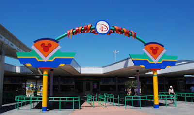
Disney may own the imagery, but ownership does not always guarantee mastery. Just as Fantasyland has become an overkill of castles, Disney has a bad habit of slapping Mickey Mouse on everything as a first attempt to repair problematic design. Like the phalanx of cutout Mickey heads added to the Transportation and Ticket Center attempting to disguise a building that's just begging for demolition:

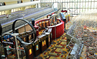
To the Grand Canyon Concourse in the Contemporary, an expensive resort Disney has trouble selling rooms in. If people don't like it, it must not be Disney enough, and what's more Disney than a colossal Mickey head?

I can't think of a single situation where the "slap a Mickey on it" approach actually works, and so much of Walt Disney World has been allowed to fall behind the curve of fashion , that there's a lot of it now. But between the extremes of "not Disney enough" and "giant sheet metal ears", there has to be a middle ground, and it's a middle ground that Imagineering has been groping towards for the past 30 years.

To the Grand Canyon Concourse in the Contemporary, an expensive resort Disney has trouble selling rooms in. If people don't like it, it must not be Disney enough, and what's more Disney than a colossal Mickey head?

I can't think of a single situation where the "slap a Mickey on it" approach actually works, and so much of Walt Disney World has been allowed to fall behind the curve of fashion , that there's a lot of it now. But between the extremes of "not Disney enough" and "giant sheet metal ears", there has to be a middle ground, and it's a middle ground that Imagineering has been groping towards for the past 30 years.
Which brings us to Mickey's Fun Wheel. When DCA was getting redone they needed to make it more "Disney", so they just slapped a Mickey head on the side of it.

It has no relation to anything around it, it's just a giant Mickey head floating in space on the side of a ferris wheel. It doesn't really fit with the purported era of its surroundings, it has nothing to do with the seaside setting, and the graphic design of it doesn't relate to anything else in the panorama. It also has no bearing on the actual ride experience; you can't even see it from the ride entrance, queue, or ride itself.
And now we're supposed to get bent out of shape that they're removing it in favor of another unrelated corporate icon? Meh, I just can't get too worked up over that.
Even the original concept of the sun fit better than what's there now (though the artistic execution was a little goofy), and tied in better with the recurring sun motif throughout the rest of the park (most of which was also removed during the redo). The circular face also fit the spot much better, centered on the sunburst design and echoing the wheel's overall shape, and the colors scheme lasted longer than the sun-faded tones we have now
For those wondering about merchandise, I'm sure they'll just come up with new logos to use; how many icons has the Studios in WDW had during its lifetime? If anything, this will could help them boost sales, with people wanting to get the old logos before they disappear forever, and others wanting the latest and greatest to update their collections. Perhaps this will give them an excuse to trim the foliage and restore Grizzly Peak to its rightful place of honor
