I think regardless of thoughts on Star Wars, it would be impossible to come away from Rise without being impressed with what has been done. Runaway Railway will be a success and is a family ride that is desperately needed in that park, but when you get past projections there isn't a lot to it. Rise on the other hand, is layer upon layer of depth and complexity.What if I hate Star Wars and love Mickey?
-
Welcome to the WDWMAGIC.COM Forums!
Please take a look around, and feel free to sign up and join the community.
You are using an out of date browser. It may not display this or other websites correctly.
You should upgrade or use an alternative browser.
You should upgrade or use an alternative browser.
DHS Mickey and Minnie’s Runaway Railway SPOILER Thread
- Thread starter Surferboy567
- Start date
What if I hate Star Wars and love Mickey?
I hate Star Wars but rise is in another level.
It’s one of life’s little mysteries. All Pans have silly wait times.The wait times say otherwise
In theory Orlando’s should be lowest given its load technique but some would say FP put paid to that.
Last edited:
Cmdr_Crimson
Well-Known Member
This....I gotta ask because I keep seeing photos of it, what is Potatoland?
britain
Well-Known Member
Rich Brownn
Well-Known Member
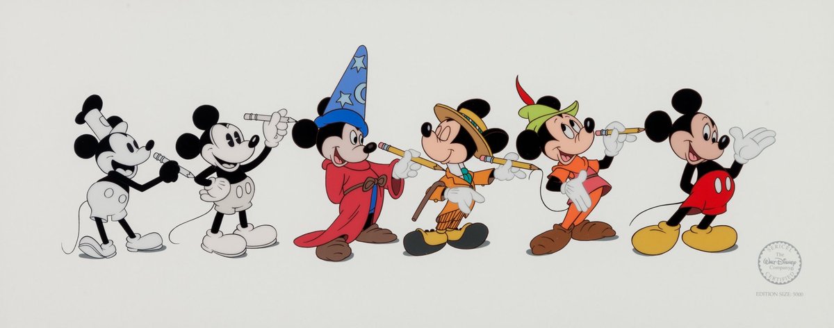
One thing you'll notice that remains the same in every version except the new one - everything is curves. No right angles or sharp lines. This was deliberate as Walt felt straight lines felt "threatening" and by smoothing them out Mickey would seem more friendly. |
britain
Well-Known Member
There's a Mary Poppins lumbering around England that looks like she's had a few too many spoonfuls of sugar. People can figure it out.
Speaking of Poppins, methinks the UK attraction will essentially be Cherry Tree Lane as queue/pre-show, and then a carousel surrounded by Runaway Railway projections. I can see your ride all coming to an end once a rainstorm starts washing away your chalk drawing environments.
I think a regular carousel in an outdoor park would be more charming but, this is Disney. Got to push your latest tech everywhere you can.
Magenta Panther
Well-Known Member
Cool ride!
But I still wish the Imagineers had gone to the trouble of making FULL 3D constructions of the AA heads. The smashed-sideways look is weird and off-putting (did they HAVE to strive so hard to achieve the look of the cartoons? That look only works in the CARTOONS.) As it is, the only AA that looks good is Daisy. If you look at the other AAs in any other way but in front they look dreadful. Bummer.
But I still wish the Imagineers had gone to the trouble of making FULL 3D constructions of the AA heads. The smashed-sideways look is weird and off-putting (did they HAVE to strive so hard to achieve the look of the cartoons? That look only works in the CARTOONS.) As it is, the only AA that looks good is Daisy. If you look at the other AAs in any other way but in front they look dreadful. Bummer.
BasiltheBatLord
Well-Known Member
It looks really cool but couldn't help but think about how much better this would've been if themed after classic 1920's Mickey.
britain
Well-Known Member
Speaking of Poppins, methinks the UK attraction will essentially be Cherry Tree Lane as queue/pre-show, and then a carousel surrounded by Runaway Railway projections. I can see your ride all coming to an end once a rainstorm starts washing away your chalk drawing environments.
I think a regular carousel in an outdoor park would be more charming but, this is Disney. Got to push your latest tech everywhere you can.
Hey hey! An endorsement by Martin! Danka!
RSoxNo1
Well-Known Member
I should have a 360 video up courtesy of VirtualWDW soon.What's really needed is a 360 video from the front and one from the rear. So much to look at.
Also, as one of the vloggers mentioned, you see different things from the front v. back. The back misses some of the beginning action in a scene and the front misses some of the concluding action in a scene.
Some may call that bad story-telling.
@realBobChapek calls that re-ridability, cha-ching!
RSoxNo1
Well-Known Member
Peter Pan is a C.Peter Pan is a D.
EricsBiscuit
Well-Known Member
Objectively, no. But, for some reason, it’s my favorite ride at WDW rn. I think Sinbad is my fav overall. But it’s still an amazing ride!The question I've been dying to hear from some of the members here....
Better than Rise?
ppete1975
Well-Known Member
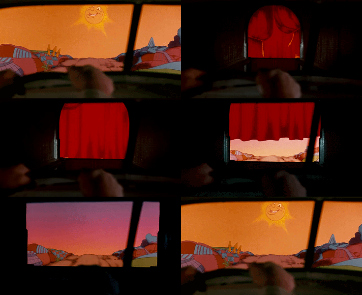
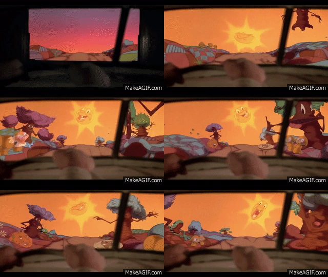
Because disney appears to want to distance themselves from the movieSpeaking of Roger Rabbit, why isn't this ride a Roger Rabbit ride? Imagine being in little cars and seeing this.
WEDway Inc & Company LLC
Well-Known Member
Why are the waits only ~100 minutes? I was expecting 300 all day...
RSoxNo1
Well-Known Member
It's pretty efficient. Assuming timely dispatches it's essentially loading two Frozen Ever After boats at once.Why are the waits only ~100 minutes? I was expecting 300 all day...
Marc Davis Fan
Well-Known Member
One thing you'll notice that remains the same in every version [of Mickey] except the new one - everything is curves. No right angles or sharp lines. This was deliberate as Walt felt straight lines felt "threatening" and by smoothing them out Mickey would seem more friendly.
This. It's a similar concept as the theme parks being designed to feel safe and reassuring by exuding "visual harmony." I wonder if this was a deliberate change, or if the decision-makers actually didn't know about this - in which case, someone has to do a better job coordinating with history/principles in order to ensure that the unexpected/little-known things that make Disney successful remain. Same goes for design principles in the parks...
ppete1975
Well-Known Member
I heard that guy is really nice but somewhat egotisticalLuckily there's a Youtuber out there that does it!
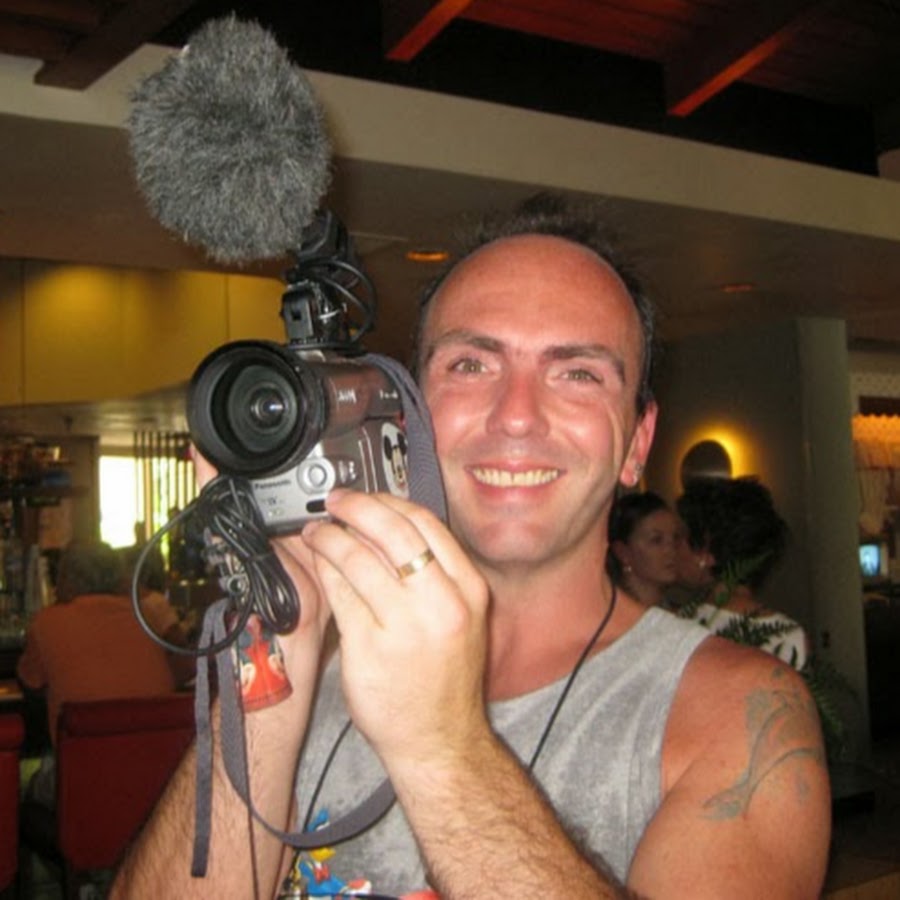
MartinsVidsDotNet
www.youtube.com
...wait a second...
ppete1975
Well-Known Member
Rare ride in todays parks thats actually a people eater. Much neededIt's pretty efficient. Assuming timely dispatches it's essentially loading two Frozen Ever After boats at once.
Register on WDWMAGIC. This sidebar will go away, and you'll see fewer ads.

