Bender123
Well-Known Member
Ditto the Simpsons.
Zombie Simpsons...Ask anybody and it feels like Simpsons ended in season 10. I, honestly, don't know anybody that watches that show anymore. Somebody must watch it...but it is not "The Simpsons".
Ditto the Simpsons.
Not sure about that. I just read again that all Radiator Springs AAs were done by Garner Holt.I thought I read the two moving Maters were also in house though?
You keep talking and all I hear is
Good taste I see. That too is my choice for the “clown anthem”.
Love it!Using it for Halloween this year! lol
So as of now with the current situation, do you guys think that the big rainbow on the model, the imagination poster, and the colorful clouds in the new Epcot concept art means anything? We all know nothing was announced, so do you guys think all of this means something significant, or just for emphasis on the pavilion and it’s historical past?
Those first two pics bring back so many happy memories from the 90s.Yeah that's what I was going for, hopefully if a new version of the ride gets built from scratch. They could find a way to make the interior look closer to the original layout. But that's doubtful at this point. But the murals found at the queue looked thousands times betters than the current version.


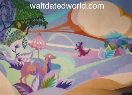
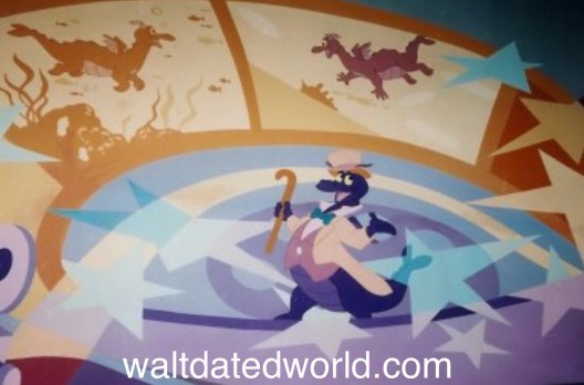
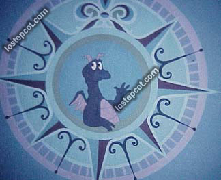
Current state
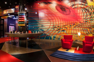
Yeah that's what I was going for, hopefully if a new version of the ride gets built from scratch. They could find a way to make the interior look closer to the original layout. But that's doubtful at this point. But the murals found at the queue looked thousands times betters than the current version.
It's amazing how much better the original version looked. That late-90s early 2000s stuff is looking quite tacky.
I was hearing this one-
I don't think it would really be all that difficult to bring this back again. When you are walking through the store, the stairs and the elevator are still very clearly there, they've more-or-less just put shelves and a couple walls around parts of them and tried to somewhat obscure them; but the astute observer can see they are still very much there. You'd maybe need to move some walls around a bit or simply tear them down. But it's by no means unachievable. I think the original "open" layout they had would better fit the new direction the front of the park is going for.
It's amazing how much better the original version looked. That late-90s early 2000s stuff is looking quite tacky.
Seriously, it's astounding how poorly the aesthetic that was in circa mid-90s/early 00s has aged, not just in Disney but in pop culture in general. Every generation of aesthetics has something about it people aren't exactly eager to bring back (e.g. the strange color palettes of the 70s, some of the 80s more questionable 'neon' choices, etc.), but that particular era had such a busy, crowded look and a vibe of trying to cram far, far too much […]...man, no wonder EPCOT got hit the hardest with that hammer than any of the other parks, and astounding that it's taking this long to finally undo a lot of the worst of it. Doesn't mean what comes next will be perfect, but still.
Great, now I want to read a research paper or book on what social forces informed each generation's overall look, and see if there are reasons that make sense and that I can sympathize with.
But you're forgetting one thing. After fifteen years of operation the attraction was no longer popular with guests. It was like a no man's land around that ride. Guests were bored with the attraction as well as Figment and DreamFinder. They had to change it just to spark some interest!I’m sure there’s more at play, but generally that time was about abundance because the economy was up. The more you had, the more you showed off. The tv show Friends is a good example of this - when Joey got his big break, he bought a bunch of useless junk to display in his place (like the giant dog) because that was a way to show off that he was financially doing well. Empty consumerism. He ends up having to return a bunch of it later because things go south, but Ross helps him out to keep the dog, the one thing Joey actually became attached to.
In turn, TWDC wanted to change Journey Into Imagination, not because they needed to change the show, but because new “stuff” showed off that they had the means to do it (even if it was on Kodak’s dime) - and of course bolster the new millennium celebration. WDI should have noted when they were allotted their approved budget that the money was better suited to simply refurbish the ride, but they chose not to. Because of society’s obsession with needless “stuff” (and potentially some arrogance tied to it) they felt that they were actually going to make the Imagination Pavilion better. Instead, they destroyed an attraction on par with rides such as Pirates of the Caribbean - so great that the ride should have been replicated in other parks, not changed into something unrecognizable.
Facts?But you're forgetting one thing. After fifteen years of operation the attraction was no longer popular with guests. It was like a no man's land around that ride. Guests were bored with the attraction as well as Figment and DreamFinder. They had to change it just to spark some interest!
patently untrue... There was always a demand for Imagination...The lines were probably not as large as they were in the first few years, but it was always well attended...and they had a huge uptick when Honey I Shrunk The Audience debuted...But you're forgetting one thing. After fifteen years of operation the attraction was no longer popular with guests. It was like a no man's land around that ride. Guests were bored with the attraction as well as Figment and DreamFinder. They had to change it just to spark some interest!
Facts?
Register on WDWMAGIC. This sidebar will go away, and you'll see fewer ads.
