EPCOT - 25 Years of photographic memories thread!

vonpluto

Well-Known Member
So, would this structure be where the infamous "rock" in the lake use to be (now just a regular buoy)? Just in front of the Boardwalk dock?

Probably one and the same.

Another shot of the structure from the YC/BC side, 1995:
1995-75-copy.jpg


Aerial shot I found online from 2000. Circled area shows what by then is probably the rock:
d9903-30.jpg


:)
 

vonpluto

Well-Known Member
A couple more.

A really bad pic of a Magic palette in the Image Works:
1998-74-copy.jpg


One of the things I always loved about EPCOT Center was the edutainment factor. They even provided assistance in where to take your photos:
1998-83-copy.jpg


:hammer::brick::ROFLOL::ROFLOL::ROFLOL:
 

hpyhnt 1000

Well-Known Member
I agree, much less intrusive and....LOGOS!:D

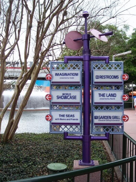
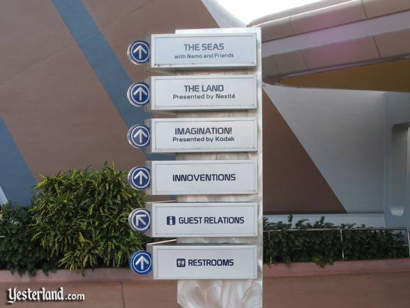
I don't MIND the ones we have now, but I agree, that directional sign is cooler looking (I don't know why, but it is). I personally think some kind of combination of the current Innoventions area directional signs with the one in the picture would be great. :)
 

hpyhnt 1000

Well-Known Member
The kinetics thing might work, but those mechanisms break down so often that I don't think its worthwhile. Actually, I was thinking about a play off of these signs. With some appropriately colored LEDs per pavilion (The Land-Green, The Seas-Blue, Imagination-Pink, etc.) and new logos, I think the new signs could be a nice mix of old and new. :)

past_directions2008.jpg
 

EPCOTPluto

Well-Known Member
The kinetics thing might work, but those mechanisms break down so often that I don't think its worthwhile. Actually, I was thinking about a play off of these signs. With some appropriately colored LEDs per pavilion (The Land-Green, The Seas-Blue, Imagination-Pink, etc.) and new logos, I think the new signs could be a nice mix of old and new. :)

past_directions2008.jpg
Interesting. Now the question would be the new logos. What and how would they be? It can be something like what is seen in the post-show from SSE. In fact, some of the logos shown there could work for, say, Test Track. :lookaroun:lol:
 

EPCOT Explorer

New Member
The kinetics thing might work, but those mechanisms break down so often that I don't think its worthwhile. Actually, I was thinking about a play off of these signs. With some appropriately colored LEDs per pavilion (The Land-Green, The Seas-Blue, Imagination-Pink, etc.) and new logos, I think the new signs could be a nice mix of old and new. :)

past_directions2008.jpg

Ah, I see what you mean...I was thinking of the lattice and purple ones pluto posted.:shrug:
 

hpyhnt 1000

Well-Known Member
Interesting. Now the question would be the new logos. What and how would they be? It can be something like what is seen in the post-show from SSE. In fact, some of the logos shown there could work for, say, Test Track. :lookaroun:lol:

I don't know about those. I'm sure someone has some good ideas though. :shrug:
 

Mr.EPCOT

Active Member
Those Spaceship Earth logos aren't simple enough. Part of the genius of the overall EPCOT design is the sleek, straight-to-the-point simplicity. The classic set for the most part conveys a sense of what the topic is about in a very geometric way, without being a picture inserted into a circle (or in this case, a swirl).

I think all that needs to be done (if anything) to modernize a set of logos for Future World is to simply (buzz word!) take the originals and extrude them into three-dimensions. This has a couple of advantages. That would create an proper advancement of style from the past, add an appropriate dynamic to the park without being overly kinetic and clutter-y like the whirly gigs are, and still be able to retain it's two-dimensional form for print, like guidemaps (and shirts! :D).

Imagine something along the lines of the old silver directional signage, with instead of the white squares, embedded glass spherical versions of each pavilions logo, the name imprinted on the outside, and maybe a fiber optic arrow inside the sphere to point the way. The arrows could point precisely towards the way you'd need to go, instead of being restricted towards direction along the one plane as they are now.
 

perry23

Member
This is sort of "retro". It's from the 2002 Pin Celebration event at Epcot. It is a HUGE super jumbo pin, measuring at least 5-6 inches tall, and 6-7 inches wide. It is in shinny, silvery metal and looks quite impressive.

img8516up9.jpg


I managed to finally acquire this just this past weekend.

Zz.

This is FANTASTIC!!!!
I would love to have it!!
 

hpyhnt 1000

Well-Known Member
Imagine something along the lines of the old silver directional signage, with instead of the white squares, embedded glass spherical versions of each pavilions logo, the name imprinted on the outside, and maybe a fiber optic arrow inside the sphere to point the way. The arrows could point precisely towards the way you'd need to go, instead of being restricted towards direction along the one plane as they are now.

I have no idea if that could logistically be pulled off, but that is one amazing concept for a set of directional signs. :D
 

Figments Friend

Well-Known Member
Original Poster
Sounds fantastic, and it's 'ahead of it's time' concept totally fits in with the overall pupose of the Park to begin with.

Awesome idea Mr. EPCOT!!

:sohappy:
 

EPCOT Explorer

New Member
Those Spaceship Earth logos aren't simple enough. Part of the genius of the overall EPCOT design is the sleek, straight-to-the-point simplicity. The classic set for the most part conveys a sense of what the topic is about in a very geometric way, without being a picture inserted into a circle (or in this case, a swirl).

I think all that needs to be done (if anything) to modernize a set of logos for Future World is to simply (buzz word!) take the originals and extrude them into three-dimensions. This has a couple of advantages. That would create an proper advancement of style from the past, add an appropriate dynamic to the park without being overly kinetic and clutter-y like the whirly gigs are, and still be able to retain it's two-dimensional form for print, like guidemaps (and shirts! :D).

Imagine something along the lines of the old silver directional signage, with instead of the white squares, embedded glass spherical versions of each pavilions logo, the name imprinted on the outside, and maybe a fiber optic arrow inside the sphere to point the way. The arrows could point precisely towards the way you'd need to go, instead of being restricted towards direction along the one plane as they are now.

Who said they need to be simple? They are sleek, however, and the pictures are not that detailed.:shrug:

I do like the idea, though.
 

Register on WDWMAGIC. This sidebar will go away, and you'll see fewer ads.

Back
Top Bottom