Thanks for bringing it up. It is a perfect opportunity to add art to the park for general enjoyment (who doesn't like a cool, illustrated cutaway) and create the needed infographic for ops at the same time.
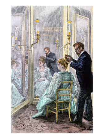
The Map, as you said, ought to have been a 3-D isometric richly illustrated in that Victorian style:
After reading Eddie's post, I drew this very rough, ten-minute sketch of the direction the graphic could/should have gone.
Mine is not a quality drawing, but illustrates the idea: You see the entire Emporium in an isometric cutaway with the illustration telling the story in the time period (gentleman getting fitted by tailor for a waistcoat in the men's sectiont you took the time to illustrate how you , children in dresses playing with dollhouse in the toy section, etc.). The copy would also be period and describe each area for those who need clarification.
I sometimes scratch my head when I see things that look like they could have been outsourced to local Orlando high schoolers: