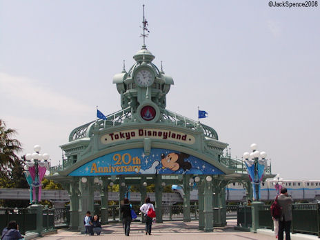
Disney Parks Castles Being Removed From Property Entrance Arches

Wilt Dasney

Well-Known Member
It wasn't nothing. Do an online search. Some geek has to have pics of the 1970s and 80s signage somewhere.

It was just simple and understated ... brown signs (much like at National Parks) with white lettering. And the WDW Village entrance featured a bit more elegant look, including a stylized bird in flight. Classy. Subtle.

The purple signs made their debut in 1989 with Disney-MGM, Typhoon Lagoon and Pleasure Island expansions.

The arches just are garish to me. They're an in your face deal ... like Wishes that you love so much:ROFLOL::rolleyes::cool: ... it's like 'HEY STUPID!!! GUESS WHAT??!??! YOU"RE HERE!!!!! IT'S DISNEY MAGIC WORLD!!!!'

Again, WDW was a whole different place in the 70s and 80s. More dignified. More adult. More upscale. More elegant. And more sophisticated.

It didn't need arches with toons and marketing slogans.

You were at Walt Disney World.

That said it all.
It's just hard for me to take this as a serious criticism when you're going to a place where a giant honkin' fake castle sits at the end of a street where guys sell balloons shaped like Mickey Mouse's head.

I would think if you want elegant and sophisticated, you'd go to Paris.

And yes, I get that there are gradations and levels of tawdriness and ostentatiousness, and that it's all relative and what have you...but the bottom line is that no matter how refined they make the entrance signs, Disney World is always going to be (and I would wager has always been) a place that leans heavily toward the garish and vulgar.

If you want to argue how far in that direction it's appropriate to go, fair enough, but you make it sound like the place used to be the Sistine Chapel and then one day (sometime after 1974, I suppose :lookaroun), they decided to let Mickey Mouse start walking around and there went the neighborhood.

I dunno, maybe I just don't get Disney World. Bright primary (and secondary in purple's case) colors and cartoon characters seem pretty damn congruous with the experience that awaits in the parks to me...and all of that loopiness can't have arisen post-Watergate.
 

Wilt Dasney

Well-Known Member
As a rant postscript, I've seen some of the designs/photos for what used to be called Lake Buena Vista Village and it does seem like a more serene vibe than what's there now. And obviously the old EPCOT Center was talking to grownups and really bright kids in a way that's no longer as true (I wouldn't say "no longer true" completely).

But at best I would think that meant there were islands of calm outside of the colorful funhouse of MK, which was built as the heart and soul of the property. Do I still have it wrong?
 

Tom Morrow

Well-Known Member
I like the arches and purple signage. I think they look fun, magical, and slightly over-the-top... exactly the type of grand entrance WDW deserves.

Also, I think they help drive home the idea to guests that "everything around you IS Walt Disney World, not just the park with the castle."
 

EPCOT Explorer

New Member
It wasn't nothing. Do an online search. Some geek has to have pics of the 1970s and 80s signage somewhere.

It was just simple and understated ... brown signs (much like at National Parks) with white lettering. And the WDW Village entrance featured a bit more elegant look, including a stylized bird in flight. Classy. Subtle.

The purple signs made their debut in 1989 with Disney-MGM, Typhoon Lagoon and Pleasure Island expansions.

The arches just are garish to me. They're an in your face deal ... like Wishes that you love so much:ROFLOL::rolleyes::cool: ... it's like 'HEY STUPID!!! GUESS WHAT??!??! YOU"RE HERE!!!!! IT'S DISNEY MAGIC WORLD!!!!'

Again, WDW was a whole different place in the 70s and 80s. More dignified. More adult. More upscale. More elegant. And more sophisticated.

It didn't need arches with toons and marketing slogans.

You were at Walt Disney World.

That said it all.
Actually, I think they Purple Gates came about in 1996, for the 25th, but I could be wrong.

Anyway...The Gates themselves. I think you are right in the fact that we don't need toons and marketing plastered all over them. Call me crazy, you do that already, but I don't even think we need the Mouse. Or the Castle. You need the name, the logo, and a visual icon that welcomes you to the property. PLAIN gates do that.

A brown sign post? Not really. That just looks lazy.

I'd rather have something that is a little bit in your face, than nothing at all, which is what I thought the original signs were. I saw them. :shrug:

Besides, that's the moment anyway, the finally YOU ARE HERE moment. :lol: Perhaps the gates convey that.
It's just hard for me to take this as a serious criticism when you're going to a place where a giant honkin' fake castle sits at the end of a street where guys sell balloons shaped like Mickey Mouse's head.

I would think if you want elegant and sophisticated, you'd go to Paris.

And yes, I get that there are gradations and levels of tawdriness and ostentatiousness, and that it's all relative and what have you...but the bottom line is that no matter how refined they make the entrance signs, Disney World is always going to be (and I would wager has always been) a place that leans heavily toward the garish and vulgar.

If you want to argue how far in that direction it's appropriate to go, fair enough, but you make it sound like the place used to be the Sistine Chapel and then one day (sometime after 1974, I suppose :lookaroun), they decided to let Mickey Mouse start walking around and there went the neighborhood.

I dunno, maybe I just don't get Disney World. Bright primary (and secondary in purple's case) colors and cartoon characters seem pretty damn congruous with the experience that awaits in the parks to me...and all of that loopiness can't have arisen post-Watergate.

I agree in full. Well said.
 

lazyboy97o

Well-Known Member
Having not experienced them, I can only guess, but I feel the brown signs would no longer work today. When they existed the Resort was much less developed. The brown signs, the same as used for national and state parks, welcomed people into this huge plot of land that was, for the most part, completely undeveloped. It was only after entering and exploring this place did one finally come upon the resort area. I have heard stories of that endless drive along the trees as one headed towards the Magic Kingdom area and the building of tension as one waited to finally arrive. The brown signs served as part of an exposition that is no longer in existence.
 

EPCOT Explorer

New Member
picture.php


....Yeah, I don't find that up to par for what an entrance to WDW should be.


This, though not too cohesive, in terms of visual style, is a little bit better. A lot, in fact.

2273908195_ac836cf20c.jpg
 

CaptainMichael

Well-Known Member
How about making the columns, arches, and walls of the gates look like Cinderella Castle? Also, implement the silver globe with mouse ears somewhere instead of toons.
 

lazyboy97o

Well-Known Member
picture.php


....Yeah, I don't find that up to par for what an entrance to WDW should be.


This, though not too cohesive, in terms of visual style, is a little bit better. A lot, in fact.
But if the entire arrival into the resort is supposed to be a gradual revealing, then it makes a lot of sense. A small simple sign, followed by a drive up a highway, then the toll booths, and then off to either the Transportation and Ticket Center or your hotel.
 

jt04

Well-Known Member
But if the entire arrival into the resort is supposed to be a gradual revealing, then it makes a lot of sense. A small simple sign, followed by a drive up a highway, then the toll booths, and then off to either the Transportation and Ticket Center or your hotel.

Exactly. Old school Imagineering magic. OSIM.
 

EPCOT Explorer

New Member
How about making the columns, arches, and walls of the gates look like Cinderella Castle? Also, implement the silver globe with mouse ears somewhere instead of toons.
Then it shifts it to all MK, pirates, princesses and pixie dust. Which is what we don't want to represent all of WDW, right?

It needs something that looks good, but isn't park specific.

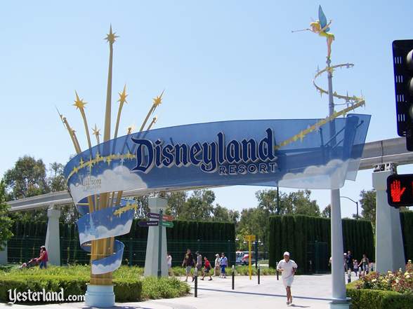
Like this:
anaheim_welcome.jpg


But if the entire arrival into the resort is supposed to be a gradual revealing, then it makes a lot of sense. A small simple sign, followed by a drive up a highway, then the toll booths, and then off to either the Transportation and Ticket Center or your hotel.

I think that's near impossible now, with the Mousesprawl, as it were. The Blessing of Size, as Walt called it, is a little cluttered now...but if it weren't, I would agree with you.

As it stands, you enter WDW, and right away, you can see something. The best, of course, is seeing, the gates, and the Earful Tower. Ironic that you see a movie studio first. ;) :D If they need gates, it should at least look classy and representative of the resort.


BTW...This is Hong Kong's gate. Like it.

Welcome%20to%20Disneyland%20HK.jpg
 

Wilt Dasney

Well-Known Member
Having not experienced them, I can only guess, but I feel the brown signs would no longer work today. When they existed the Resort was much less developed. The brown signs, the same as used for national and state parks, welcomed people into this huge plot of land that was, for the most part, completely undeveloped. It was only after entering and exploring this place did one finally come upon the resort area. I have heard stories of that endless drive along the trees as one headed towards the Magic Kingdom area and the building of tension as one waited to finally arrive. The brown signs served as part of an exposition that is no longer in existence.

But if the entire arrival into the resort is supposed to be a gradual revealing, then it makes a lot of sense. A small simple sign, followed by a drive up a highway, then the toll booths, and then off to either the Transportation and Ticket Center or your hotel.

These posts make a lot of sense and explain how an understated sign served the resort well as it existed in the '70s. The obvious problem now (if you consider it a problem) is that the gradual reveal is impossible because the property is so developed. A plain brown sign would make no sense when you have the Earfful Tower clearly visible from the highway.

These posts do help me understand views like '74's a little clearer, though. It seems like his biggest problem isn't with the signs, but with the fact that the resort he fell in love with 36 years ago — so pristine and virgin, with a wacky theme park waaaaay at the north end — just doesn't exist anymore. The arches are just a symptom.
 

Mr.EPCOT

Active Member
This post is brought to you live from The Magic Kingdom

It's just hard for me to take this as a serious criticism when you're going to a place where a giant honkin' fake castle sits at the end of a street where guys sell balloons shaped like Mickey Mouse's head.

I would think if you want elegant and sophisticated, you'd go to Paris.

And yes, I get that there are gradations and levels of tawdriness and ostentatiousness, and that it's all relative and what have you...but the bottom line is that no matter how refined they make the entrance signs, Disney World is always going to be (and I would wager has always been) a place that leans heavily toward the garish and vulgar.

If you want to argue how far in that direction it's appropriate to go, fair enough, but you make it sound like the place used to be the Sistine Chapel and then one day (sometime after 1974, I suppose :lookaroun), they decided to let Mickey Mouse start walking around and there went the neighborhood.

I dunno, maybe I just don't get Disney World. Bright primary (and secondary in purple's case) colors and cartoon characters seem pretty damn congruous with the experience that awaits in the parks to me...and all of that loopiness can't have arisen post-Watergate.
You're right, you don't get Walt Disney World. If you think the castle and balloons and cartoon mice are the defining qualities of Walt Disney World, if you think that's what it's all about, you definitely don't get it. Unfortunately, I think there's alot of people running the place that think the same way.

As a rant postscript, I've seen some of the designs/photos for what used to be called Lake Buena Vista Village and it does seem like a more serene vibe than what's there now. And obviously the old EPCOT Center was talking to grownups and really bright kids in a way that's no longer as true (I wouldn't say "no longer true" completely).

But at best I would think that meant there were islands of calm outside of the colorful funhouse of MK, which was built as the heart and soul of the property. Do I still have it wrong?

This is where some of your misconception stems from. First, EPCOT is the heart and soul of Walt Disney World. The Magic Kingdom was always just a weenie to get people interested in the property as a whole. Second, the Magic Kingdom did have a much more stately vibe for the first couple of decades. Now, it's overwhelmed with CASTLE CASTLE CASTLE PRINCESSES WISHES DREAMS SHINY MAGIC CARTOONS BUY STUFF!

I like the arches and purple signage. I think they look fun, magical, and slightly over-the-top... exactly the type of grand entrance WDW deserves.

Also, I think they help drive home the idea to guests that "everything around you IS Walt Disney World, not just the park with the castle."

Except for the big castle sitting on it for the past couple of years. :lol:

Actually, I think they Purple Gates came about in 1996, for the 25th, but I could be wrong.

Anyway...The Gates themselves. I think you are right in the fact that we don't need toons and marketing plastered all over them. Call me crazy, you do that already, but I don't even think we need the Mouse. Or the Castle. You need the name, the logo, and a visual icon that welcomes you to the property. PLAIN gates do that.

A brown sign post? Not really. That just looks lazy.

I'd rather have something that is a little bit in your face, than nothing at all, which is what I thought the original signs were. I saw them. :shrug:

Besides, that's the moment anyway, the finally YOU ARE HERE moment. :lol: Perhaps the gates convey that.


I agree in full. Well said.

The purple road signage came along around 1989, when you entered property the first road sign would have Mickey peeking over it, until the arches were built around 1996. You are correct in the rest of your post, however. :D
 

Register on WDWMAGIC. This sidebar will go away, and you'll see fewer ads.

Back
Top Bottom