Disney Parks Castles Being Removed From Property Entrance Arches

WDW1974

Well-Known Member
Even if prominent signs are to be kept, the existing arches are just ugly. They are a part of this horrid philosophy that bright, garish, tacky colors are somehow synonymous with the Disney name, history and legacy. Its the same reason the Transportation and Ticket Center looks like a clown vomited all over the place.

Good analogy.

I'd say the TLC colors and look are best described as 'pukey' myself ... try to spend very little time there.
 

hpyhnt 1000

Well-Known Member
Being someone who lived through the 70s and 80s, I wonder how folks ever found WDW with just a simple, small brown 'Welcome to Walt Disney World' sign on World Drive for almost two decades. Or a Walt Disney World Village at LBV sign at Hotel Plaza Blvd. ... I know WDW has grown. But frankly, the arches symbolize (to me) a general dumbing down of the product to toons, wishes, dreams and MAGIC! BLECH!!!!

Even if prominent signs are to be kept, the existing arches are just ugly. They are a part of this horrid philosophy that bright, garish, tacky colors are somehow synonymous with the Disney name, history and legacy. Its the same reason the Transportation and Ticket Center looks like a clown vomited all over the place.

You're right; Walt would never have built big, attention-getting signs at the entrance to his theme parks, nor would he have used bright, contrasting colors on them. I mean, just look at the original Disneyland sign:

KTPBKYC_7_63_N14R_v2.jpg


:rolleyes:
 

Captain Hank

Well-Known Member
Original Poster
Good analogy.

I'd say the TLC colors and look are best described as 'pukey' myself ... try to spend very little time there.
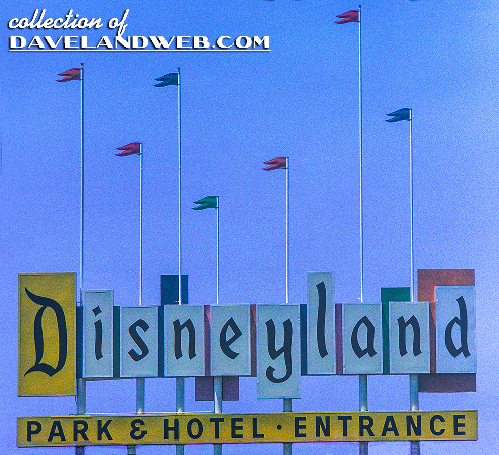
I'll give you that. In fact, I think the property-wide color scheme needs to be redone. Far too much teal for my tastes.

Anyone have ideas for a better one?
I've always thought that the TTC would work well themed to be somewhat reminiscent of a 1920s art deco train station, primarily in burgundy and silver. Cleveland's airport switched to that kind of style, and it looks fantastic--very classy and enduring.
 

Wilt Dasney

Well-Known Member
You're right; Walt would have NEVER used bright, contrasting colors on the entrance sign for his theme parks. I mean, just look at the original Disneyland sign:


:rolleyes:
I'm glad you found that, because I really enjoy the bright primary colors at Disney property boundaries. It isn't the most refined look, but...it ain't Buçkingham Palace, ya know?
 

hpyhnt 1000

Well-Known Member
I'm glad you found that, because I really enjoy the bright primary colors at Disney property boundaries. It isn't the most refined look, but...it ain't Buçkingham Palace, ya know?

No, I'll admit that its not, and a new color scheme for the arches wouldn't necessarily be a bad thing. Heck, I wouldn't say no to a brand new arch design entirely.

But to say that having a big entrance sign somehow dumbs down the entire resort, or imply that using bright colors to decorate the sign is a horrible philosophy that goes against the history of Disney is completely ludicrous.
 

Tom Morrow

Well-Known Member
To be fair, the castles were added as part of the Year of a Million Dreams promotion, which was what that castle logo was created for... not necessarily to add "Disney Parks" branding to the archways.
Being someone who lived through the 70s and 80s, I wonder how folks ever found WDW with just a simple, small brown 'Welcome to Walt Disney World' sign on World Drive for almost two decades. Or a Walt Disney World Village at LBV sign at Hotel Plaza Blvd. ... I know WDW has grown. But frankly, the arches symbolize (to me) a general dumbing down of the product to toons, wishes, dreams and MAGIC! BLECH!!!!:rolleyes::eek::snore:
Any pictures of this? I would love to see it.

When were the archways created?
 

Figment1986

Well-Known Member
When were the archways created?

Around the 25th anniversary in 96 was when the arches were added, or in the process of being added if I remember right, but back then they really only had 3 entrances... (why they need one for western beltway seems a waste, a smaller sign would have worked better due to little to no traffic really.)
 

wm49rs

A naughty bit o' crumpet
Premium Member
And sometimes what is oldest really is best ... and timeless ... and shouldn't be Walmarted.

That's what happened in 1996 when WDW decided to incorporate the 'stylized' :rolleyes: Walt Disney name into the logo. Making WDW completely corporate and losing a lot of its individuality since that script is used for countless Disney things.

Not saying the logo couldn't have been tweaked. But removing it for something very simple and basic wasn't the answer.

Oh, and the archways? I hate them.

Being someone who lived through the 70s and 80s, I wonder how folks ever found WDW with just a simple, small brown 'Welcome to Walt Disney World' sign on World Drive for almost two decades. Or a Walt Disney World Village at LBV sign at Hotel Plaza Blvd. ... I know WDW has grown. But frankly, the arches symbolize (to me) a general dumbing down of the product to toons, wishes, dreams and MAGIC! BLECH!!!!:rolleyes::eek::snore:

Being in the same demographic, I saw them no better than the "Pedro" signs for South of the Border that dominated the North Carolina landscape (at least on I95 South).....
 

smalld

New Member
This makes me think the missing Castles are simply being cleaned/repainted. Why else whould they only remove three of the five? (there are only five gates, right?)
I hope they are takings them down. It should be the classic arch with all the flags. The banner that says "where dreams come true" is fine but is still a bit much.

There are five gates? I'm only coming up with four Lol.

1. World Dr.
2. By Pop/ESPN sports complex
3. Downtown Disney
4. Epcot Center Dr

But Downtown is not a full arch its just the side pannels
 

Captain Hank

Well-Known Member
Original Poster
I hope they are takings them down. It should be the classic arch with all the flags. The banner that says "where dreams come true" is fine but is still a bit much.

There are five gates? I'm only coming up with four Lol.

1. World Dr.
2. By Pop/ESPN sports complex
3. Downtown Disney
4. Epcot Center Dr

But Downtown is not a full arch its just the side pannels
You're missing Western Way, near DAK.
 

Mouse Detective

Well-Known Member
Is it possible that the castles are being removed because Disney does not want anyone to think about that new castle that is opening a few miles up the road?
 

EPCOT Explorer

New Member
Magic moved out and sold its home to Dreams.


:lookaroun:lol:
They keep changing it, unfortunately.
And sometimes what is oldest really is best ... and timeless ... and shouldn't be Walmarted.

That's what happened in 1996 when WDW decided to incorporate the 'stylized' :rolleyes: Walt Disney name into the logo. Making WDW completely corporate and losing a lot of its individuality since that script is used for countless Disney things.

Not saying the logo couldn't have been tweaked. But removing it for something very simple and basic wasn't the answer.

Oh, and the archways? I hate them.

Being someone who lived through the 70s and 80s, I wonder how folks ever found WDW with just a simple, small brown 'Welcome to Walt Disney World' sign on World Drive for almost two decades. Or a Walt Disney World Village at LBV sign at Hotel Plaza Blvd. ... I know WDW has grown. But frankly, the arches symbolize (to me) a general dumbing down of the product to toons, wishes, dreams and MAGIC! BLECH!!!!:rolleyes::eek::snore:

And how is that better than arches, albeit ones that are a bit glaring?

They could do better than both of those ideas, but what we have now is better than nothing, which is what we had. :lol:

The purple gates would be fine, if they were just that, gates. Not a billboard.


...But the real question, Spirit, is how will you refference this to TREES!?:goodnevil:ROFLOL::lookaroun
 

lazyboy97o

Well-Known Member
The old Disneyland marquee primarily features white. The yellow accents "Park & Hotel · Entrance" and the "D" which was used as a monogram for the park in its early years. The pink, blue, green and orange are not just added panels of color, but the backs of the "D", "i", "y", "l" and the small spaces in between the letters.

The Walt Disney World color motifs do not offer such a broad use of colors or as accents. Throughout the resort the motif is based on shades of purple. There is also the lack of texture, which makes the arches seems to be fake. They look a lot like giant, plastic toys.
 

WDW1974

Well-Known Member
They keep changing it, unfortunately.


And how is that better than arches, albeit ones that are a bit glaring?

They could do better than both of those ideas, but what we have now is better than nothing, which is what we had. :lol:

The purple gates would be fine, if they were just that, gates. Not a billboard.


...But the real question, Spirit, is how will you refference this to TREES!?:goodnevil:ROFLOL::lookaroun


It wasn't nothing. Do an online search. Some geek has to have pics of the 1970s and 80s signage somewhere.

It was just simple and understated ... brown signs (much like at National Parks) with white lettering. And the WDW Village entrance featured a bit more elegant look, including a stylized bird in flight. Classy. Subtle.

The purple signs made their debut in 1989 with Disney-MGM, Typhoon Lagoon and Pleasure Island expansions.

The arches just are garish to me. They're an in your face deal ... like Wishes that you love so much:ROFLOL::rolleyes::cool: ... it's like 'HEY STUPID!!! GUESS WHAT??!??! YOU"RE HERE!!!!! IT'S DISNEY MAGIC WORLD!!!!'

Again, WDW was a whole different place in the 70s and 80s. More dignified. More adult. More upscale. More elegant. And more sophisticated.

It didn't need arches with toons and marketing slogans.

You were at Walt Disney World.

That said it all.
 

Wilt Dasney

Well-Known Member
There are five gates? I'm only coming up with four Lol.

1. World Dr.
2. By Pop/ESPN sports complex
3. Downtown Disney
4. Epcot Center Dr

But Downtown is not a full arch its just the side pannels

^ You forgot the Western Way arch, when coming in off of 429. Hardly anyone sees this one.

I just spent an hour on Google Maps Street View looking up photos of all these gates. I never knew all their specific locations. :lol:
 

Register on WDWMAGIC. This sidebar will go away, and you'll see fewer ads.

Back
Top Bottom