News Cítricos to reopen July 15 reimagined to the whimsy and elegance of Mary Poppins Returns

castlecake2.0

Well-Known Member
Yeah and I prefer the bottom - it's not the decor per se. I'll admit Mizner's was "tiny" and kind of dingy but that was part of the charm to me. Enlarging it was definitely a plus and they desperately need to do the same for Trader Sams at the Poly. I'm not even against the Beauty and the Beast theming (only that A - it sucks compared to Be Our Guest and B - Do we want children to join mommy and daddy at the bar?)
Martha’s Vineyard at beach club is pretty much a copy of mizners, so you could always swing by there one night. I totally understand what you mean about the “charm”. A lot of beach club still has that 90s vacation planning video Disney feel to it. Also the strollers at the bar ... I wish after 9pm the bars became 18+. Maybe do something like interior bars 18+ and pool bars for anyone or something like that. It really kills the mood when the fam shows up in their tshirts and crocs with strollers, balloons, bubble wands etc when you’re trying to have an after dinner drink ...
 

Missing20K

Well-Known Member
Easiest to start with the third - we all know there's a mandate to integrate IP and branded storytelling across the property. Do I agree with it? No, but it's happening regardless.

Taking that into consideration, this is clearly a best-case outcome, as Mary Poppins is an IP that many consider appropriate for GF, and if you can't stand the tie-ins, it's not blatant at all.

To those who aren't specifically looking for IP (myself included), the new design appears to take inspiration from other colors and motifs already present throughout GF. I also disagree that the execution is poor, that's a matter of opinion. Neither one of us is alone, but is there a single instance of interior design that appeals to everyone? Not that I can think of. Even Poly, WL, and AKL have their detractors who'd rather be somewhere like GF or Yacht Club.
This is not "poor execution". This is execution in a manner that you don't like, which is fine, but they did what they set out to do. This is also pretty consistent with the level to which they theme common areas and restaurants in the deluxe resorts. Yes, they're being a lot more overt in the rooms now, but think about things like the carpet in 'Ohana with minor Moana details that the average guest might miss and not care about. This is nothing new; they've done plenty of little nods without making a restaurant overtly "the Mary Poppins restaurant" or "the Moana restaurant".
My point seems to be getting lost but oh well. I just think if you’re gonna tell people it’s a Mary Poppins inspired restaurant and all you care to do is change fabrics, furniture and fixtures, that is poor execution. If the project doesn’t live up to the standard that the company themselves set decades ago, it’s poor execution (in my opinion, not sure why you’ve both pointed it out, I said this was all my opinion more than once and I didn’t know my posts had any authority lol). If the environments created do not create an aura of reassurance and instead one of thematic dissonance, it’s poor execution.

Fwiw, I actually don’t think it’s terrible execution at face value in other contexts. I do think this is terrible execution for this context. Ymmv
 

GimpYancIent

Well-Known Member
My point seems to be getting lost but oh well. I just think if you’re gonna tell people it’s a Mary Poppins inspired restaurant and all you care to do is change fabrics, furniture and fixtures, that is poor execution. If the project doesn’t live up to the standard that the company themselves set decades ago, it’s poor execution (in my opinion, not sure why you’ve both pointed it out, I said this was all my opinion more than once and I didn’t know my posts had any authority lol). If the environments created do not create an aura of reassurance and instead one of thematic dissonance, it’s poor execution.

Fwiw, I actually don’t think it’s terrible execution at face value in other contexts. I do think this is terrible execution for this context. Ymmv
1625095904062.png
 

UNCgolf

Well-Known Member
Definitely not my fave bar on property, but it can’t be said it’s not an upgrade from Mizners.

I'm not sure I'd even say that, although that's mainly because the Enchanted Rose eliminated the space for the orchestra.

Mizner's definitely needed an overhaul but they could have done so much better.
 

eliza61nyc

Well-Known Member
We’ve got folks angry it’s not obviously Poppins and folks angry it’s Poppins. Can’t win. 😂
and that's usually the argument. we've always had folks who are the disney architectural experts. The signs in france are not actually "french" looking enough, too much IP, not enough theme. :) and it always looks like something else.

Back onto Citricos, the menu looks tasty, and it's always been one of our favorite places so I'll give it a whirl. new decor looks pretty
 

James Alucobond

Well-Known Member
My point seems to be getting lost but oh well. I just think if you’re gonna tell people it’s a Mary Poppins inspired restaurant and all you care to do is change fabrics, furniture and fixtures, that is poor execution. If the project doesn’t live up to the standard that the company themselves set decades ago, it’s poor execution (in my opinion, not sure why you’ve both pointed it out, I said this was all my opinion more than once and I didn’t know my posts had any authority lol). If the environments created do not create an aura of reassurance and instead one of thematic dissonance, it’s poor execution.

Fwiw, I actually don’t think it’s terrible execution at face value in other contexts. I do think this is terrible execution for this context. Ymmv
I don't think your point is lost. I just fundamentally disagree that it's problematic to practice varying degrees of IP integration. IP-immersive, IP-themed, and IP-inspired environments can all coexist, and one is not inherently more deficient than another.
 

James Alucobond

Well-Known Member
Who is this supposed to appeal to?
Based on this thread, the majority of people? A rough count of the opinions posted over the first several pages shows at least twice as many people are positive about the updates (only counting comments on the decor). It's a soft goods refurbishment with some fun injected. You'd think Disney skinned puppies to upholster the chairs based on the level of disgust some have for this change.
 

DonaldDoleWhip

Well-Known Member
Based on this thread, the majority of people? A rough count of the opinions posted over the first several pages shows at least twice as many people are positive about the updates (only counting comments on the decor). It's a soft goods refurbishment with some fun injected. You'd think Disney skinned puppies to upholster the chairs based on the level of disgust some have for this change.
Yep, this site of all places would react negatively to unnecessary IP, but clearly a lot of us think it looks good.

Among those that don't, a handful hate GF anyway (e.g. "I hate this hotel. That is all" - liked 5 times). Citricos getting some new colors and a menu update was never going to change that.
 

TrainsOfDisney

Well-Known Member
Yep, this site of all places would react negatively to unnecessary IP, but clearly a lot of us think it looks good.

Among those that don't, a handful hate GF anyway (e.g. "I hate this hotel. That is all" - liked 5 times). Citricos getting some new colors and a menu update was never going to change that.
I love the Grand. I also love Mary Poppins. I don’t quite understand this.

It doesn’t bother me.. the reason it exists bothers me but the actual execution is fine.
 

DonaldDoleWhip

Well-Known Member
I love the Grand. I also love Mary Poppins. I don’t quite understand this.

It doesn’t bother me.. the reason it exists bothers me but the actual execution is fine.
I love the Grand, am neutral on Poppins, and am fine with this. I think the colors suit the resort well, bringing in greens and floral elements from the lobby (carpet, artwork, etc.) and gardens.

Was IP necessary? No, but it really doesn’t hurt, and if you don’t want to notice it you don’t have to.
 

Missing20K

Well-Known Member
I don't think your point is lost. I just fundamentally disagree that it's problematic to practice varying degrees of IP integration. IP-immersive, IP-themed, and IP-inspired environments can all coexist, and one is not inherently more deficient than another.
That wasn’t my point. My point is that this particular environment, as well as others at wdw, is antithetical to the concept of themed entertainment. Themed environments should tell a story.

A genuine question. What is the story the space is telling the guest?
 

LittleBuford

Well-Known Member
A genuine question. What is the story the space is telling the guest?
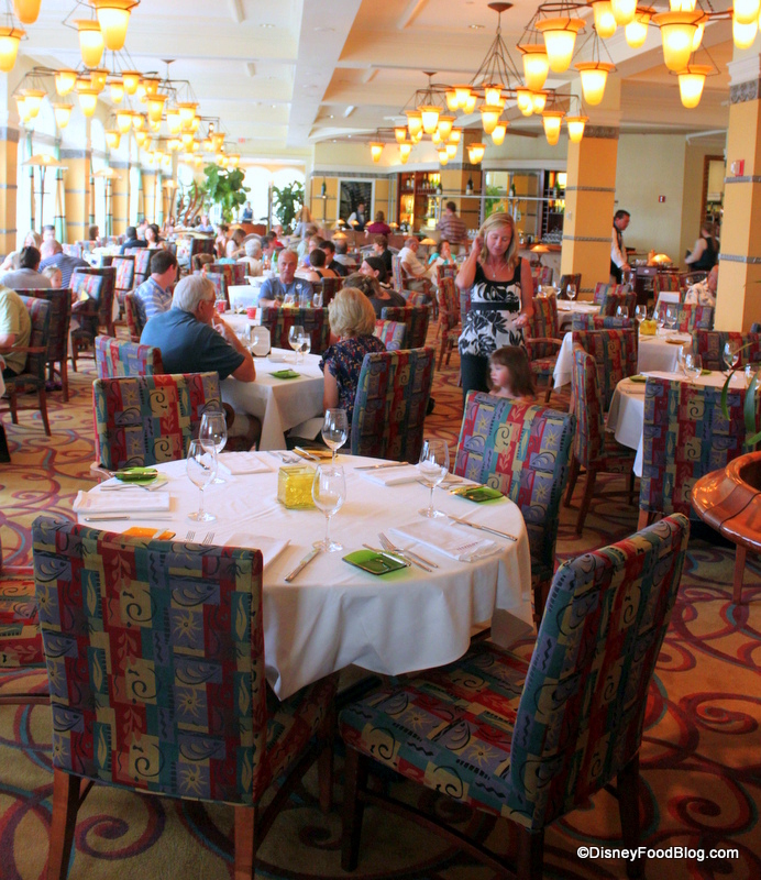
Would you be willing to answer the same question of the old scheme?

long-shot-of-seating-area-citricos.jpg


ETA: My answer would be London Transport upholstery and bad ’90s hotel carpet. While there are elements of it I don’t like, I find the new scheme far more evocative of the sort of vintage grandeur the hotel represents.
 
Last edited:

Ponderer

Well-Known Member
That wasn’t my point. My point is that this particular environment, as well as others at wdw, is antithetical to the concept of themed entertainment. Themed environments should tell a story.

A genuine question. What is the story the space is telling the guest?

Theming does not always need to be so literal. It can be just be lightly applied to evoke a mood or a memory. People don’t always need to be clubbed over the head with it these days. It can be subtextual, something extra if you choose to look for it.
 

James Alucobond

Well-Known Member
That wasn’t my point. My point is that this particular environment, as well as others at wdw, is antithetical to the concept of themed entertainment. Themed environments should tell a story.

A genuine question. What is the story the space is telling the guest?
Because it's not themed. It's inspired by the color palette and patterns—in particular from the animated sequence—of the movie. Nothing more. The press release literally says this. It's not trying to tell a story. It's a visual homage because they thought it would add a fun dash of whimsy to the space. As I said, there's a difference between a space that is immersive, one that is themed, and one that is merely inspired by a property.
 

Disney Analyst

Well-Known Member
Would you be willing to answer the same question of the old scheme?

long-shot-of-seating-area-citricos.jpg


ETA: My answer would be London Transport upholstery and bad ’90s hotel carpet. While there are elements of it I don’t like, I find the new scheme far more evocative of the sort of vintage grandeur the hotel represents.

Thanks for sharing this, I hadn’t seen the before…

How anyone can be whining about the new look is beyond me. It’s far more fitting, grand, elegant, and worthy of a deluxe resort.

That photo in your post… is… atrocious.
 

Richie248

Well-Known Member
I've always enjoyed the food at Citricos but found the decor dated. This is an improvement and think it looks great. Also love the new menu. Can't wait to hopefully dine here during my trip this fall.
 

Register on WDWMAGIC. This sidebar will go away, and you'll see fewer ads.

Back
Top Bottom