50 MAGICal Enhancements for the 50th ...

Kman101

Well-Known Member
Idk???? Maybe. Probably? 55 pages of posts, I may have missed one or two :)

I only said it because you quoted me and the reply really didn't have much to do with what I was saying, and a few posts before that I mentioned something similar. Wasn't trying to tell you not to post what you did because I agree with you on a lot of what you said.
 

Dapper Dan

Well-Known Member
The hub I give them slack on because they needed to do everything possible to make as much viewing space for fireworks as possible. Even with the additional space it can still be gridlock there. Throw in some trees and now you are just removing spaces people are willing to stand in. The rest of MK could definitely use more trees and areas of shade. Hopefully this is something corrected with updates to the park for the 50th.
They could have created a fireworks show that spread crowds around the park instead of trying to pack everyone on one side of the castle. Sacrificing the look and feel of a central area of your park to make things better for a fifteen minute show is not what I would call a good decision. The nighttime show was the thing that needed to be reworked, not the hub.
 

Kman101

Well-Known Member
The hub absolutely needed to be re-worked. It had already lost it's charm by this time so to spread crowds it is MUCH better. The problem is simply a lack of trees. The hub re-do WAS needed. I know we cling to things and sometimes don't like change but this was a change that was needed. I like the new hub it just lacks trees.
 

The Empress Lilly

Well-Known Member
NFL was needed because old fantasyland looked like a local fair when put up against the likes of Paris (and by all accounts the whimsical charm of DL). The theming is very nice. The rides may be not what people wanted, but theyre possibly 2 of the best rides in Fantasyland now.
Nah. The two new rides are okay, I enjoy them, but each slightly falling short of being great for different reasons.

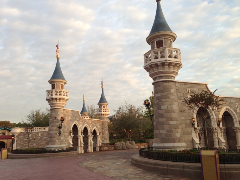
The area is detailed, but devoid of life, of place. NFL doesn't communicate between its different constituting elements, nor with its surroundings. It lacks charm, intimacy, placemaking.

A big square at the entrance that communicates better with the MK parking lot than with the park (the different stroller parking areas soon to be themed to villain and heroes!). A big rock with some vegetation in the center that stands with its back to the park from every direction. And rocks and more rocks everywhere else, albeit in different colours so to correspond even less.

This is not good design, this is rubbish, saved somewhat by intricate detail:
New_Fantasyland_Media_Day_105.jpg
 

MisterPenguin

President of Animal Kingdom
Premium Member
This is not good design, this is rubbish, saved somewhat by intricate detail:
New_Fantasyland_Media_Day_105.jpg

I'll agree with you there. Fantasyland was already cement canyons, and so, in the one wide open space where five paths converge... they put up cement walls! This should have been a mini-hub with a garden and fountain and flowing banners. What do the cool imagineers call it? Oh, yeah, kinetics!!

Or, it could have been a giant tree, like the tree of life, but a magical one where Keebler Disney elves live.

But wasn't this meant to be an outside M&G area? They seemed to be doing that like 2 years ago, but haven't seen it used for M&G since. And there's no need for it to be a M&G when there's Princess Hall right next door.
 

Belpois2712

Active Member
Nah. The two new rides are okay, I enjoy them, but each slightly falling short of being great for different reasons.

The area is detailed, but devoid of life, of place. NFL doesn't communicate between its different constituting elements, nor with its surroundings. It lacks charm, intimacy, placemaking.

A big square at the entrance that communicates better with the MK parking lot than with the park (the different stroller parking areas soon to be themed to villain and heroes!). A big rock with some vegetation in the center that stands with its back to the park from every direction. And rocks and more rocks everywhere else, albeit in different colours so to correspond even less.

This is not good design, this is rubbish, saved somewhat by intricate detail:
New_Fantasyland_Media_Day_105.jpg
I believe those turrets, such as the ones in the hub were input to signify the reach of the castles forecourt and rear courtyard so theaming wise it makes sense.
 

becca_

Well-Known Member
I'll agree with you there. Fantasyland was already cement canyons, and so, in the one wide open space where five paths converge... they put up cement walls! This should have been a mini-hub with a garden and fountain and flowing banners. What do the cool imagineers call it? Oh, yeah, kinetics!!

Or, it could have been a giant tree, like the tree of life, but a magical one where Keebler Disney elves live.

But wasn't this meant to be an outside M&G area? They seemed to be doing that like 2 years ago, but haven't seen it used for M&G since. And there's no need for it to be a M&G when there's Princess Hall right next door.
I believe Cinderella's stepsisters meet behind one of those, but I'm not 100% sure on that
 

Mike S

Well-Known Member
They could have created a fireworks show that spread crowds around the park instead of trying to pack everyone on one side of the castle. Sacrificing the look and feel of a central area of your park to make things better for a fifteen minute show is not what I would call a good decision. The nighttime show was the thing that needed to be reworked, not the hub.
I tried explaining this at Disneyland but the people I was with were having none of it even though it was easy as heck to get an unobstructed view at the castle.
 

Disone

Well-Known Member
I like the new Hub. It is far better than the Hub was before they remodeled it. It actually does have some trees in it now. They're just placed so that they're not in the way. But they are their complete with twinkle lights. It also has fountains that it's a nice touch. And it has the artificial grass area which gets quite the use from guests just sitting down on the grass in joined area as if it was a park. Which actually it is a park. This never happened with the old Hub. The one thing I wish the new Hub would have is some more benches. Scratch that, the one thing I wish the Magic Kingdom would have is some more benches.
 

mimitchi33

Well-Known Member
I'd love to see a new Imagination ride with Bing Bong, something new replacing Stitch's Great Escape, and something like the 50th Anniversary Disneyland event where they brought Disney attractions from around the world-oh wait, they're already possibly doing the latter with the addition of Ratatouille and Tron!
 

brb1006

Well-Known Member
I'd love to see a new Imagination ride with Bing Bong, something new replacing Stitch's Great Escape, and something like the 50th Anniversary Disneyland event where they brought Disney attractions from around the world-oh wait, they're already possibly doing the latter with the addition of Ratatouille and Tron!
Bing Bong in Journey Into Imagination?
 

Phil12

Well-Known Member
NFL is beautiful. The new hub is an improvement. I like the Mine Train and the Little Mermaid ride better than the subs (I've only experienced the ones at DL but I assume it was a worse experience due to it being older).
You're right. The 20K subs were the pits.
 

Bocabear

Well-Known Member
NFL is beautiful. The new hub is an improvement. I like the Mine Train and the Little Mermaid ride better than the subs (I've only experienced the ones at DL but I assume it was a worse experience due to it being older).
Your assumption would be wrong about the subs...Some people hated them, some people liked them, they were unique to Disney parks... the original experience was beautifully done and amazing to have underwater settings and animations...the Disneyland versions combines projections and has a different theme with Nemo and friends. Overall the Subs were more than a sum of their parts...they provided a great attraction, a unique experience, and some amazing eye-candy to the park.
 

Register on WDWMAGIC. This sidebar will go away, and you'll see fewer ads.

Back
Top Bottom