News Tomorrowland love

ppete1975

Well-Known Member
Love this idea (sort of a take on stuff they've gone with in movies like Blade Runner, 5th Element, etc.) but the reality is, it wouldn't age well because Disney wouldn't be bothered to update any of it. Seeing all that stuff for the first time would be awesome. Seeing it all exactly the same 15 years later on your 15+ plus visit back but with parts not working correctly anymore wouldn't be.

If they could be bothered to keep up with the maintenance and design it so that the content could be easily updated and start out with a large basic catalog of stuff so it wasn't an instant and obvious loop and then swapping some of it out from time-to-time (maybe annually) so it didn't immediately go stale with people knowing it all before it's even said or seen, it would be great, though!

None of this would be hard or expensive. Even I could probably get something working with an uneatable interface using few arduino boards and I'm sure they could have their existing bloggers pump out enough Disney-approved content during down time to keep it going indefinitely... but they won't. :confused:
they could even use it to push some of their movies and disney plus. All you would have to do is call it a classic movie lol. Or Watch no gravity space ball tonight on ESPN (fake game but advertising espn) OR if they are trying to push a new character. Same thing as using a ned talk show in stitchs spot.
 

owlsandcoffee

Well-Known Member
I liked the big gear. Im waiting to hear the new sign for tomorrow land is going to be changed again . Its to minimalistic for me I enjoyed the last one better, bring it back please!
No shame to you, that's totally fair. My mind has been blown because all I saw for years was that Tomorrowland was too jumbled and it should be more like it was before 94 etc. and then as soon as they changed it people turned around and said that Tomorrowland 94 was their favorite and Disney was crazy for changing it. I know different people feel different ways about things, but still.

I hope someday they make a tomorrowland that you like, sincerely!
 

_caleb

Well-Known Member
its cool at night from the astro orbiter or people mover.. outside of that i dont even notice the architecture, which is sad compared to everything else disney.

I wouldnt even mind seeing led ribbon boards or ad boards for fictitious companies (maybe they talk to you... hey you in the yellow hat buy some Astro juice) or use the magic band.. (hey richard have you been to mars lately)
and then on the ribbon leds have fictitious news or even ride times, or disney history
So Back to the Future, pt. 2 then?
 

MrPromey

Well-Known Member
No shame to you, that's totally fair. My mind has been blown because all I saw for years was that Tomorrowland was too jumbled and it should be more like it was before 94 etc. and then as soon as they changed it people turned around and said that Tomorrowland 94 was their favorite and Disney was crazy for changing it. I know different people feel different ways about things, but still.

I hope someday they make a tomorrowland that you like, sincerely!
I think a lot of it comes down to the era you grew up with.

If 94 was all you ever knew, that is classic Tomorrowland for you.

If you saw what came before, that's your touchpoint.

It'll be the same with whatever comes next for the ones who grow up with it.

The version prior to 94 was really showing its age by the time they did that referb and nobody knew that Apple would make all of that look retro-cool if they'd only held out with the dated design for another 4-5* years.

The fact that they were so close to turning the corner on it being relevant again really shows how long past its prime, it really was.

The 94 version was intended to solve the problem of quickly outdated by presenting us with "the future that never was" and making it retro-dated from the start. It had a good run but as it turns out, even the future that never was has a shelf life.

It seems likely that what we will end up with now will continue to be a modified version of what's already there with maybe a few real new changes thrown in for a nice mix-mosh of styles rather than a radical and cohesive redesign. They don't seem to be willing to budget for this kind of stuff the way they did back in 94 which is why I'm confident we'll continue to see painted over stuff that was added in 94 rather than totally new or rethought architectural embellishments in a lot of places.

It's the same with what's happening in Future World now - a "bold new vision" that will conveniently use as much existing stuff as they can get away with while trying to make it look like it all makes sense together when it was designed in different eras for different purposes and aesthetic effects.


*EDITED to change 7-8 years to 4-5. Release date on the original iMac which was off-the-top-of-my-head was wrong which I realized when looking for photos to post further down on this thread...
 
Last edited:

marni1971

Park History nut
Premium Member
Original Poster
The version prior to 94 was really showing its age by the time they did that referb and nobody knew that Apple would make that look retro-cool if they'd only held out with the dated design for another 7-8 years.
Bingo.

92B0B5EE-8A94-4476-B73B-CCB01A30AC4C.jpg
C8D9C03E-541B-4BDE-A5D0-2F1544CFDF7C.jpg
5AACF336-0DA8-41FA-B560-A45FF8051FAA.jpg
4B5E2C2E-4FA0-40BE-9246-5907857E46D9.jpeg
5DDBD0F1-163B-43B2-B97F-B238179BAA71.jpg
2F731B4B-934D-4595-A6AA-46130FC7EC90.jpeg
F2A0AE26-C310-4394-9CA0-2EEF2DDA2078.jpeg
6E7B79BC-6059-46B6-8B67-68174BE18B3A.jpeg

5148C4A4-DEB0-4FEE-B0CE-6E1E11B29A30.jpeg
639F778B-CA1D-40A5-B810-CA8B9EA757CA.jpeg
 
Last edited:

GladToBeHear

Well-Known Member
I'd love to see it return to the original design -- but with updated lighting. The only thing I would want to see included is an "artificial" skyline (through forced perspective) -- similar to the city of the future photo you posted here. Is that from the Tomorrowland movie?

BTW. As the OP for this thread -- have you heard anything new in regards to the overall design changes for the land? IS there a plan at this point?
 

TikibirdLand

Well-Known Member
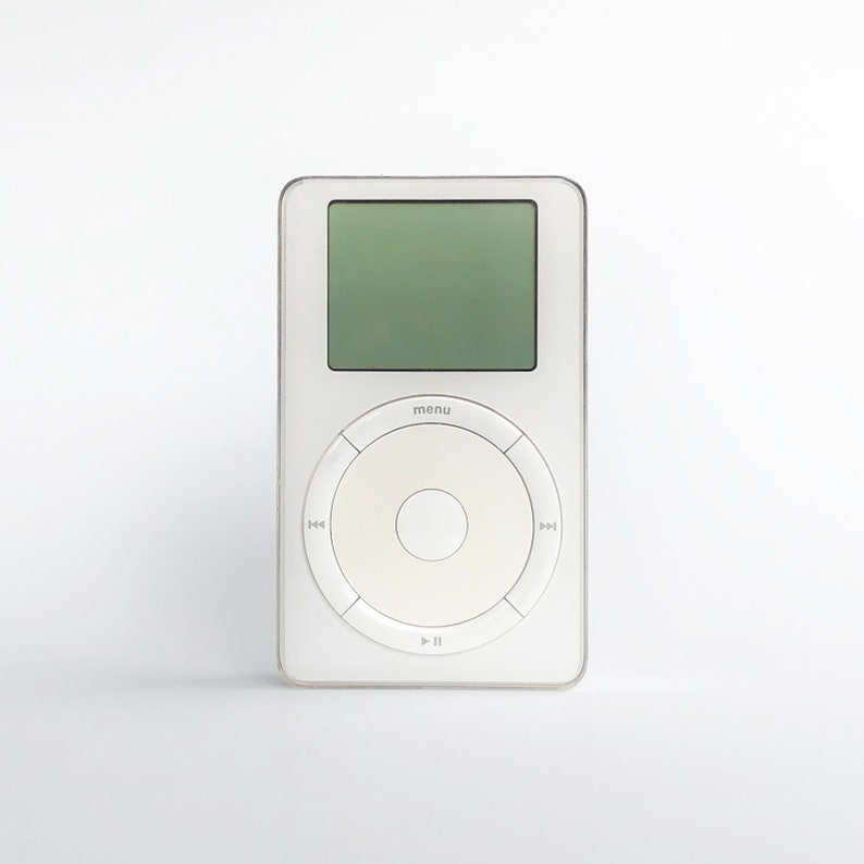
And of course, all that Apple stuff started with this*:

2012-12-13-bondi-blue.jpeg


and then this:

il_794xN.2808955799_g3lk.jpg


*absolutely horrible, horrible ergonomics on that mouse design, btw...
Loved the click-wheel on the 2nd gen iPOD. They kinda jumped the shark on the iPhone looking IPOD though. They should have brought that interface back for the music player on the iPhone.
 

Heppenheimer

Well-Known Member
they could even use it to push some of their movies and disney plus. All you would have to do is call it a classic movie lol. Or Watch no gravity space ball tonight on ESPN (fake game but advertising espn) OR if they are trying to push a new character. Same thing as using a ned talk show in stitchs spot.
Now you're speaking a language Bob Chapek understands!
 

MadTeacup

Well-Known Member
I'm actually quite happy with the dark pavement - finally something that will be consistent throughout the entire land! I was kinda hoping for more of a design, but I'll take it over the gears. Also, I can think of 3 spots where construction had resulted in the gear pattern getting messed up and I'm really glad I won't have to look at them anymore.
 

ShoalFox

Well-Known Member
In the Parks
Yes
I miss the continuity of the 94 version, it was cool having a Tomorrowland with different attractions that all felt like they could exist within the same story or “universe.” It’s a shame the look only carried through around half the land and then the attractions that did fit really well got IP’d.
Honestly, this is the biggest thing I miss from Tomorrowland 94.
 

Register on WDWMAGIC. This sidebar will go away, and you'll see fewer ads.

Back
Top Bottom