If only there was a recent movie that they could somehow leverage for an overall look for a revamped Tomorrowland... oh of course... Tron! Nothing says “vision of the future” more than a nearly-40-year old movie.
How about Xandar from Guardians? I hear that's popular with the kids.If only there was a recent movie that they could somehow leverage for an overall look for a revamped Tomorrowland... oh of course... Tron! Nothing says “vision of the future” more than a nearly-40-year old movie.
Not to mention that the theme is largely dystopian.If only there was a recent movie that they could somehow leverage for an overall look for a revamped Tomorrowland... oh of course... Tron! Nothing says “vision of the future” more than a nearly-40-year old movie.
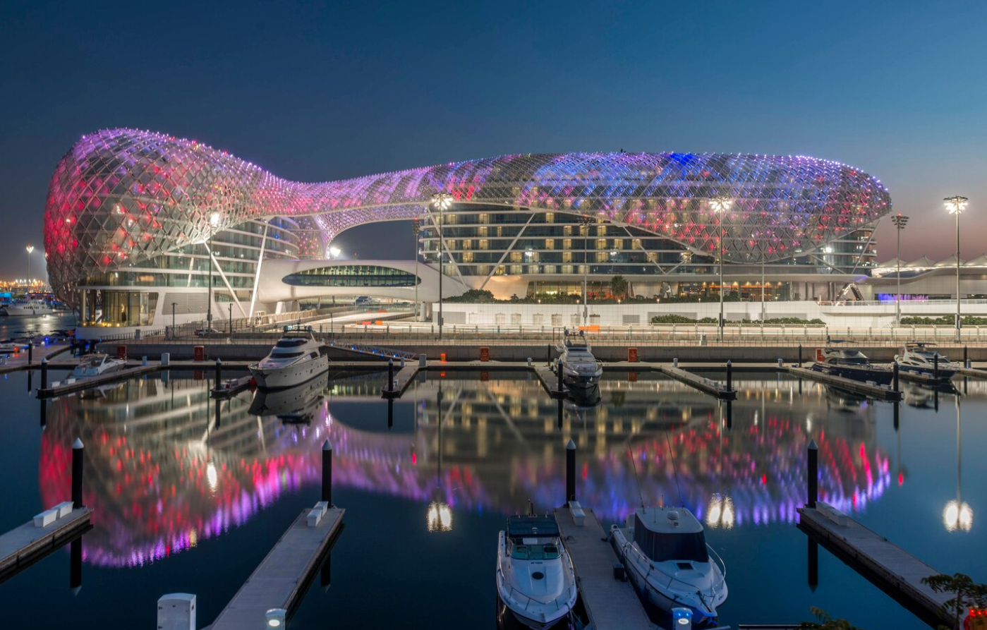
Wow, take away the pod structures, and that actually looks quite a bit like the Liege train station. Add a red light district and some shady gambling parlors and you have an exact replica!
That ship sailed when they decided they couldn’t over-Marvel Epcot.
If disney did build something that beautiful, they would prob mess up and blind everyone that walked by.....Not to mention that the theme is largely dystopian.
The concept artwork also reminds me of the main train station in Liege, Belgium:
View attachment 559777
View attachment 559778
Although it's a stunning building, the city itself isn't one most people would voluntarily visit. Kind of like a big, flashy new building in tired, past-its-prime Tomorrowland.
i loved that movie... id forgotten space mountain was in back there.. time for a rewatch!!I think it’s from the Tomorrowland movie that came out a few years ago, I’m not sure tho, didn’t see it
Didn't Archimedes try to defeat the Roman invasion using a similar concept?If disney did build something that beautiful, they would prob mess up and blind everyone that walked by.....
View attachment 559787
The reflective qualities of the surface were amplified by the concave sections of the Founders Room walls. Some residents of the neighboring condominiums suffered glare caused by sunlight that was reflected off these surfaces and concentrated in a manner similar to a parabolic mirror. The resulting heat made some rooms of nearby condominiums unbearably warm, caused the air-conditioning costs of these residents to skyrocket and created hot spots on adjacent sidewalks of as much as 140 °F (60 °C).[15] There was also the increased risk of traffic accidents due to blinding sunlight reflected from the polished surfaces. After complaints from neighboring buildings and residents, the owners asked Gehry Partners to come up with a solution. Their response was a computer analysis of the building's surfaces identifying the offending panels. In 2005 these were dulled by lightly sanding the panels to eliminate unwanted glare
I liked the film and I would like to see more of that look incorporated into Tomorrowland.Man, that Tomorrowland movie was garbage I wanted to like it soo much. That movie had an identity crisis. Hopefully Jungle Cruise will be an enjoyable watch
difference is his was intentionalDidn't Archimedes try to defeat the Roman invasion using a similar concept?
If the glare hit the DVC rooms at the Contemporary, they could upcharge for "extra Florida sunshine".
This wasn’t a Disney company project. While The Walt Disney Company would eventually give a sizable amount of money for the project it started with a donation from Lilian Disney in the 80s.If disney did build something that beautiful, they would prob mess up and blind everyone that walked by.....
View attachment 559787
The reflective qualities of the surface were amplified by the concave sections of the Founders Room walls. Some residents of the neighboring condominiums suffered glare caused by sunlight that was reflected off these surfaces and concentrated in a manner similar to a parabolic mirror. The resulting heat made some rooms of nearby condominiums unbearably warm, caused the air-conditioning costs of these residents to skyrocket and created hot spots on adjacent sidewalks of as much as 140 °F (60 °C).[15] There was also the increased risk of traffic accidents due to blinding sunlight reflected from the polished surfaces. After complaints from neighboring buildings and residents, the owners asked Gehry Partners to come up with a solution. Their response was a computer analysis of the building's surfaces identifying the offending panels. In 2005 these were dulled by lightly sanding the panels to eliminate unwanted glare
No disrespect, but comparing those two structures is, in my opinion, akin to comparing a Fiero to a Ferrari. They are both cars, and look vaguely similar. But one is a masterpiece of engineering and performance and the other is a Pontiac.Not to mention that the theme is largely dystopian.
The concept artwork also reminds me of the main train station in Liege, Belgium:
View attachment 559777
View attachment 559778
Although it's a stunning building, the city itself isn't one most people would voluntarily visit. Kind of like a big, flashy new building in tired, past-its-prime Tomorrowland.
the art on this one makes me laugh, if you see this angle youd think the subs were coming back.... but nope thats an speedway car.......Not to mention that the theme is largely dystopian.
The concept artwork also reminds me of the main train station in Liege, Belgium:
View attachment 559777
Although it's a stunning building, the city itself isn't one most people would voluntarily visit. Kind of like a big, flashy new building in tired, past-its-prime Tomorrowland.
Disney's concept art has been all over the map for a while now. Sometimes they can produce decent renderings like the Ratatouille concept for Epcot, other times (such as this and a lot of the New Fantasyland art) they produce concept art that actually looks significantly worse than what they end up building. Considering WDI's rich history in this field, it is truely puzzling.the art on this one makes me laugh, if you see this angle youd think the subs were coming back.... but nope thats an speedway car.......
I think the tron building and train were well done...even the people look good. But has this person seen a car?
It’s just a really FAST car!the art on this one makes me laugh, if you see this angle youd think the subs were coming back.... but nope thats an speedway car.......
I think the tron building and train were well done...even the people look good. But has this person seen a car?
Not comparing their merits, only that the one seems like it may have been inspired by the other. I've been to the Liege train station many times and it is a stunning and surprisingly practical building. If only they were able to rebuild the surrounding area in a similar style, people might discuss Liege the same way they talk about Bilbao.No disrespect, but comparing those two structures is, in my opinion, akin to comparing a Fiero to a Ferrari. They are both cars, and look vaguely similar. But one is a masterpiece of engineering and performance and the other is a Pontiac.
I mean, the train station was by Santiago Calatrava. It's simply not an apt comparison. At all. Again, my opinion.
Register on WDWMAGIC. This sidebar will go away, and you'll see fewer ads.