castlecake2.0
Well-Known Member
What are people expecting the Crêperie sign to look like?
Off the top of my head with assistance from a quick internet search, maybe something that looks like these:What are people expecting the Crêperie sign to look like?
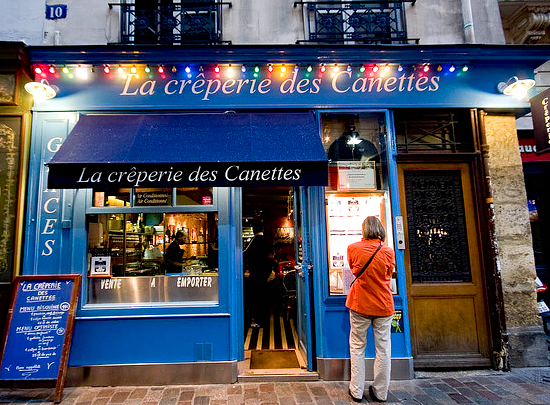


Off the top of my head with assistance from a quick internet search, maybe something that looks like these:
Instead of something that looks like it belongs here:
There are a wide variety of things that a creperie might look like, but they tend to have several things in common: they're typically small establishments, not overly fancy, and mostly serve people walking by. That means that the signs are typically rather unassuming, with simple bold lettering and limited (if any) graphics, often painted directly on the building or awning itself, and at a scale that speaks to a pedestrian environment.
Instead, we have a sign that's stuck on to the side of the building, which is distinctly rooted in (typically American) automobile-based environments, making it easier to locate when moving at high speeds. The art nouveau scrollwork is clearly French-inspired, but is too ornate for a simple establishment. The font and multi-sized lettering make it difficult to read; it's a stylized logo of a known destination, rather than one that primarily serves unplanned meals to passersby. The sign's shape is oddly reminiscent of the Federalist style, rather than anything French; similarly, the C(?) logo at the top is more reminiscent American preppy brands than European styling. Even the lamps they chose reinforce an automobile-centric design philosophy, shielding drivers eyes from direct exposure, unlike lantern-style lights that would illuminate both the sign and the sidewalk for pedestrians/diners.
This is the difference between "decorating" and "theming;" the ornamentation is inspired by France, but nothing about the sign itself actually evokes French design sensibilities. It's sort of like how Applebee's has tons of things on the wall, but it doesn't create any particular sense of place or history.
Yes, there's a lot of "stuff" on the sign; some people may call it "detail." But when the "stuff" does nothing to evoke the product as a whole, what purpose does it actually serve?
"More" doesn't always mean "better."
")
I totally see what you’re saying. This is something that’s been happening across the parks for a while now, and from a CM perspective I can see why. A lot of guests get confused with signage in the parks, and whether it’s a real thing or just a facade/theming. An example that comes to mind are the new restrooms in American Adventure. If that building was built 10-15 years ago I’m sure it wouldn’t have had RESTROOMS in block letters across it, but now it does. Another example is the original Pirates of the Caribbean sign. It was simple brass lettering on the front of the building, now it’s a massive ship sail out front with a skeleton on top. When I worked the tip board at the end of Main Street the most common question was “where’s the rides?”. Things were almost themed TOO well, and it confuses a lot of people. I’m not saying that means we should dumb down the product we offer, but this could be a reason why the sign is designed the way it is. It also might be by request of the third party operator thats funding this venue as they want their product to be visible. Again, none of these are excuses, just thoughts. I appreciate you showing some examples though, they definitely use that as inspiration! Would be cool if the side was done in that kind of style, whit the the front being a little more “cleaned up”.Off the top of my head with assistance from a quick internet search, maybe something that looks like these:
Instead of something that looks like it belongs here:
There are a wide variety of things that a creperie might look like, but they tend to have several things in common: they're typically small establishments, not overly fancy, and mostly serve people walking by. That means that the signs are typically rather unassuming, with simple bold lettering and limited (if any) graphics, often painted directly on the building or awning itself, and at a scale that speaks to a pedestrian environment.
Instead, we have a sign that's stuck on to the side of the building, which is distinctly rooted in (typically American) automobile-based environments, making it easier to locate when moving at high speeds. The art nouveau scrollwork is clearly French-inspired, but is too ornate for a simple establishment. The font and multi-sized lettering make it difficult to read; it's a stylized logo of a known destination, rather than one that primarily serves unplanned meals to passersby. The sign's shape is oddly reminiscent of the Federalist style, rather than anything French; similarly, the C(?) logo at the top is more reminiscent American preppy brands than European styling. Even the lamps they chose reinforce an automobile-centric design philosophy, shielding drivers eyes from direct exposure, unlike lantern-style lights that would illuminate both the sign and the sidewalk for pedestrians/diners.
This is the difference between "decorating" and "theming;" the ornamentation is inspired by France, but nothing about the sign itself actually evokes French design sensibilities. It's sort of like how Applebee's has tons of things on the wall, but it doesn't create any particular sense of place or history.
Yes, there's a lot of "stuff" on the sign; some people may call it "detail." But when the "stuff" does nothing to evoke the product as a whole, what purpose does it actually serve?
"More" doesn't always mean "better."
Did it replace something else or was it just going to be landscaping?I’m pretty sure I mentioned the eaterie was a very very late addition. I want to say it wasn’t completely designed by Burbank and had quite a bit of local input but I can’t verify it.
Empty space IIRC. Was a few years back now.Did it replace something else or was it just going to be landscaping?
The restrooms were in the crêperie’s location before it was added to the project.Did it replace something else or was it just going to be landscaping?
Stroller parking originally, then restrooms.The restrooms were in the crêperie’s location before it was added to the project.
Stroller parking was adjacent to the restrooms between them and the exterior queue. The restrooms are code required so they’ve always been part of the expansion space.Stroller parking originally, then restrooms.
The original plan was smaller. Stroller parking only, no restrooms. This is around 5 years ago.Stroller parking was adjacent to the restrooms between them and the exterior queue. The restrooms are code required so they’ve always been part of the expansion space.
What wouldn’t be fine?The sign is fine.
What wouldn’t be fine?
This is where backstories are supposed to come into play. There are stacks of requirements for theme parks that limit and dictate a variety of aspects of any design, from the legal to the practical. Some of these requirements can be very prescriptive but few are absolute.I totally see what you’re saying. This is something that’s been happening across the parks for a while now, and from a CM perspective I can see why. A lot of guests get confused with signage in the parks, and whether it’s a real thing or just a facade/theming. An example that comes to mind are the new restrooms in American Adventure. If that building was built 10-15 years ago I’m sure it wouldn’t have had RESTROOMS in block letters across it, but now it does. Another example is the original Pirates of the Caribbean sign. It was simple brass lettering on the front of the building, now it’s a massive ship sail out front with a skeleton on top. When I worked the tip board at the end of Main Street the most common question was “where’s the rides?”. Things were almost themed TOO well, and it confuses a lot of people. I’m not saying that means we should dumb down the product we offer, but this could be a reason why the sign is designed the way it is. It also might be by request of the third party operator thats funding this venue as they want their product to be visible. Again, none of these are excuses, just thoughts. I appreciate you showing some examples though, they definitely use that as inspiration! Would be cool if the side was done in that kind of style, whit the the front being a little more “cleaned up”.
For the sake of argument: and the MK monorail station? Commonly acclaimed, but every one of your objections to the EPCOT Skyliner station apply.This is where backstories are supposed to come into play. There are stacks of requirements for theme parks that limit and dictate a variety of aspects of any design, from the legal to the practical. Some of these requirements can be very prescriptive but few are absolute.
Ops almost certainly does have signage requirements that dictate things like visibility, prominence, size of text, amount of illumination on the face of the sign and other criteria. What they probably don’t dictate is the actual style of any of those elements besides legibility, meaning an overly ornamented calligraphy is probably going to get rejected. Even just switching to a blade sign would evoke a more old urban feel that would actually be more visible to guests. This is what backstories are supposed to help inform. How would a small crêperie expand to the size of a Disney theme park facility? How would a sign that meets Ops’ requirements be designed and added?
One of the really bad things about this expansion, Riviera and the Skyliner is the way that they reduce Art Nouveau to a mere ornamental appliqué. Outside of the intricate Ratatouille marquee arch it is largely some frilly lines that are painted on a bare surface and “Voila! It’s French!” They’re not just on this sign, but also the bare walls of the ugly yellow building. The Skyliner building tries to add some ornament but it is incredibly poorly realized with tube steel and metal strips. Art Nouveau was an entire style of arts and crafts, not just painting and other visual arts, but furniture, interior design, architecture and even structural design. It was an all encompassing design movement. Instead of some painted lines on the crêperie sign why not do a full on Art Nouveau sign?
Some painting being done to the Creperie building.
View attachment 531743
Source and more pics here:
Stroller parking was adjacent to the restrooms between them and the exterior queue. The restrooms are code required so they’ve always been part of the expansion space.
Both correct: this spot has always been designated the space where you take a crêpe.The original plan was smaller. Stroller parking only, no restrooms. This is around 5 years ago.
Register on WDWMAGIC. This sidebar will go away, and you'll see fewer ads.