Rose&Crown
Well-Known Member
Oh goodness the ticket booth paint.....why
I just didn't believe they would be that big. Based on the photos taken... it already blocks out the bottom of SSE.
Not me. The OCD in me screams "WHY DID YOU PAINT 3/4 of the front of one window a color but go to a natural breakpoint on the back?!?!" I would not have a problem if they painted the entire booth one color or the front and back half of each booth, but stopping 3/4 of the window, WHY?!At first glance at the article, I thought this was going to look like the horrendous Ben and Jerry's innoventions plaza. But I dig it against the blocks of white and the now-white ceiling. It looks like they are incorporating the new pavilion symbol colors. Looks like a good early step in making the park feel cohesive. I like it.
Not me. The OCD in me screams "WHY DID YOU PAINT 3/4 of the front of one window a color but go to a natural breakpoint on the back?!?!" I would not have a problem if they painted the entire booth one color or the front and back half of each booth, but stopping 3/4 of the window, WHY?!
")

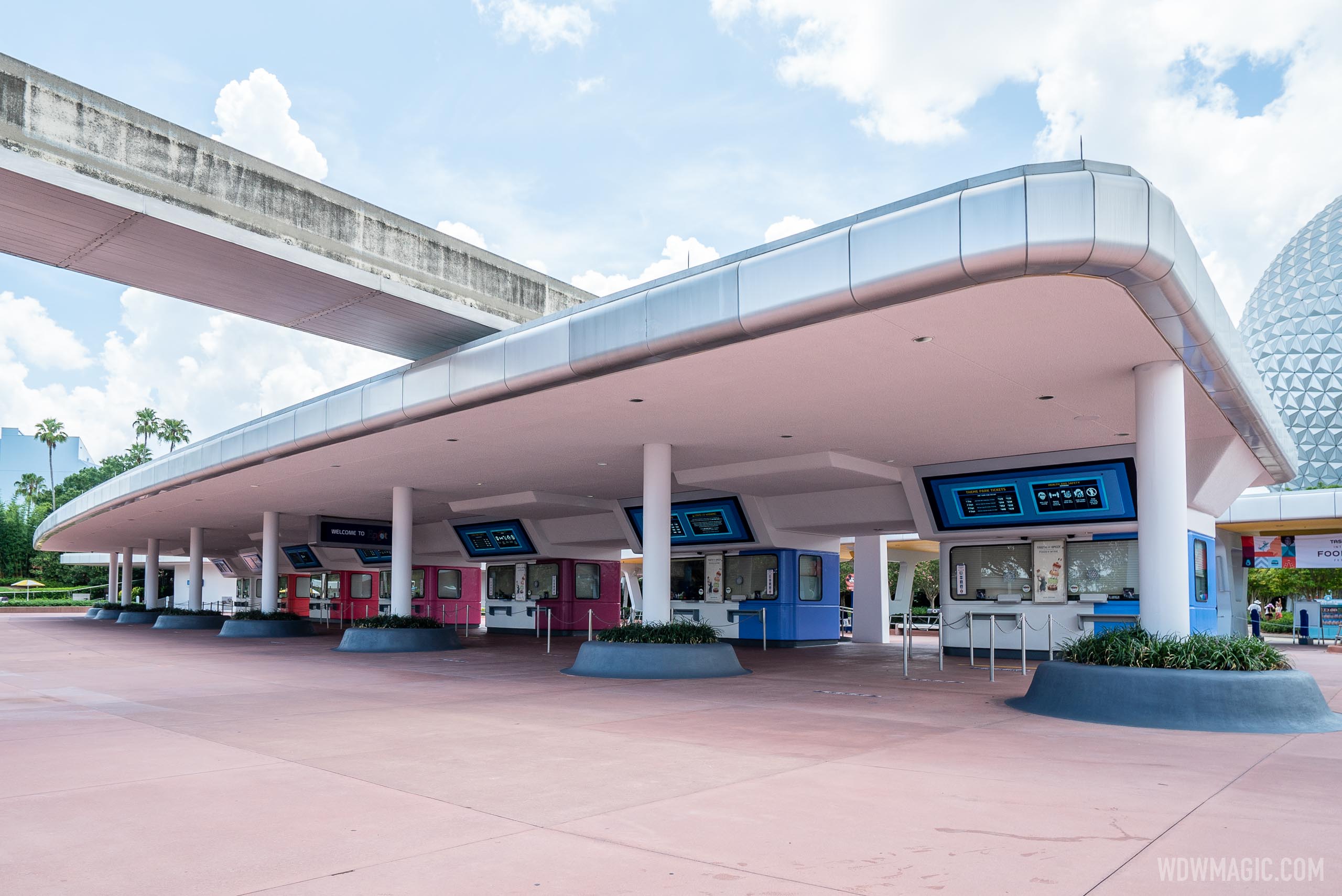
At first glance at the article, I thought this was going to look like the horrendous Ben and Jerry's innoventions plaza. But I dig it against the blocks of white and the now-white ceiling. It looks like they are incorporating the new pavilion symbol colors. Looks like a good early step in making the park feel cohesive. I like it.
no, LOLI get the OCD thing. But I think the reason the color stops in the middle of a window is because that's how far the color goes on the back side. So in some sense it's symmetrical. Does that make you feel any better?
Well it never did make it even after the reopening - taste Track has become the Donut Box.
View attachment 483952
Noticed this from theTaste Track Burgers and FriesDonut Box thread - with the repainting, the ticket booths and this food kiosk now have very similar looks. So it seems there may be some attempt at park wide consistency (at least in ex-Future World) but we'll see if they actually follow through.
The periwinkle one of course, silly!Wait, am I supposed to go to the mauve ticket counter or the lavender counter?
")
I...kinda like the new scheme for the ticket booths? No, I can't explain why, and the logical side of my brain keeps screaming I should in no way like this. Weird colors! Strange blocking! And yet...
I'm not saying it's the best thing ever, but I do think it's cleaner and brighter than what was there before. Removing the yellow from the ceiling makes a world of difference. Never liked that mix of pink concrete, purple walls, and yellow ceiling from the old scheme. Blegh...
Old:
From: https://www.burnsland.com/wdw/ec_tickets_703.shtml
New:
Good point on the logo colors. The booth colors are very clearly intended to match these. Wonder if the logos were supposed to be included on the ticket booths as well, but were left off since some of these new additions are "paused."
Original EPCOT Center had that; the concrete came in the ‘90s.The more “Green Futurism” the better. Bring on the trees.
Register on WDWMAGIC. This sidebar will go away, and you'll see fewer ads.