World of Disney expansion

WDWtraveler

Well-Known Member
Photo update as of Thursday, March 8, 2018. In the part of World of Disney that remains open, the background behind the checkout counters has been changed from "castle stained glass windows" to these Disney logos. Could this be a hint of the future décor? Additionally, the cutout above the windows used to be dark green trees and leaves. It's now painted over with a light green that matches the plain walls. See the next photo.
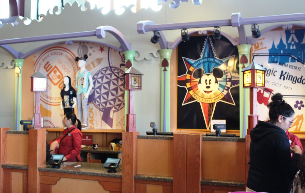
IMG_0281.JPG


The color accents on the walls have been painted over.
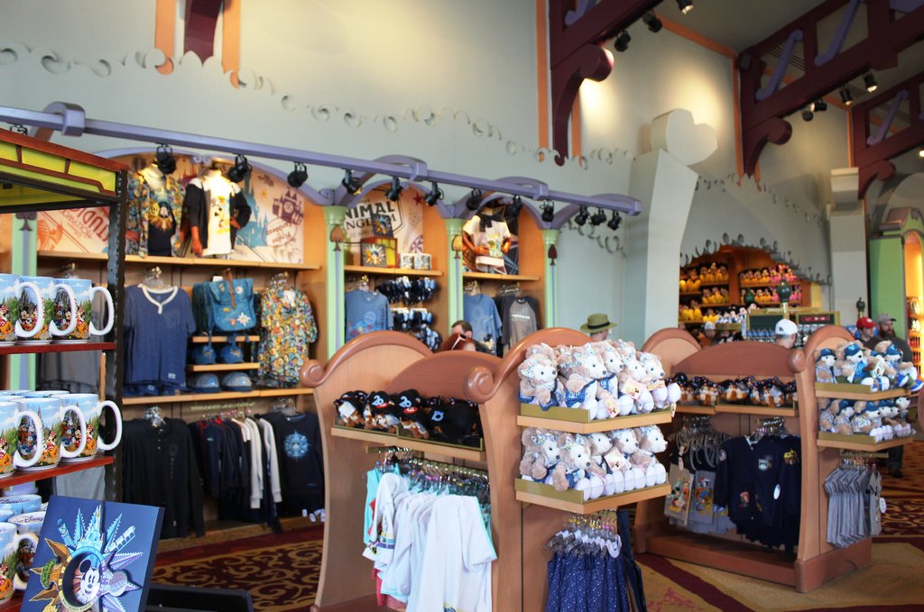
IMG_0282.JPG
 

mm121

Well-Known Member
Photo update as of Thursday, March 8, 2018. In the part of World of Disney that remains open, the background behind the checkout counters has been changed from "castle stained glass windows" to these Disney logos. Could this be a hint of the future décor? Additionally, the cutout above the windows used to be dark green trees and leaves. It's now painted over with a light green that matches the plain walls. See the next photo.

View attachment 269107

The color accents on the walls have been painted over.

View attachment 269108
seems so odd they'd go to the effort to repaint this area when its most likely going to be gutted in a few months

maybe they are doing it to get customers use to the "blandness" so it wont be such a shock when the new part opens

or maybe using this to test customer reaction to different colors
 

anchorman314

Well-Known Member
It looks like all of those background panels match the design theme of all the 2018 merchandise. So I'm wondering if it could be either a temporary change until the store opens fully remodeled, or they're going for an easy-to-change design that can be swapped out as the main marketing theme changes.
 

Kman101

Well-Known Member
I like the graphics behind the cash wrap (because I really like this year's merch)

They're fine, I just can't stop picturing how nice it was before ... lol.

I like this years merch too.

That section, I know hopefully won't be the final look (I'm sure it was just a temporary "refresh"), lol, but it's just a mess of different types of paint and decor and carpeting. None of it goes together so it's just ... ugly.

I'll miss the wood, the stained glass, etc. It was nice. Yeah it was "busy" and cluttered but I'm dreading it looking plain.
 

Casper Gutman

Well-Known Member
They're fine, I just can't stop picturing how nice it was before ... lol.

I like this years merch too.

That section, I know hopefully won't be the final look (I'm sure it was just a temporary "refresh"), lol, but it's just a mess of different types of paint and decor and carpeting. None of it goes together so it's just ... ugly.

I'll miss the wood, the stained glass, etc. It was nice. Yeah it was "busy" and cluttered but I'm dreading it looking plain.
But plain equals sophisticated! And sophisticated equals expensive! So naturally, the blander something is, the more people will want to spend!

In a related move, later this year Disneyland's motto will be officially changed to:

"Disneyland: A Place on Earth"
 

mousekedoc

Premium Member
I’m sure it’s gonna turn out like the store in Anaheim. That is a real shame because the Downtown Disney store is, in my opinion, bleah.
 

peter11435

Well-Known Member
Due to him "spitting"?

I am hoping this store doesn't lose its theming in the remodel. I really don't want to see an all white boring look to this store. The characters gave it some of its charm.

Due to him being out of scale and ugly.

The original themeing in this location was far superior.
 

Register on WDWMAGIC. This sidebar will go away, and you'll see fewer ads.

Back
Top Bottom