cjrciadtster
Member
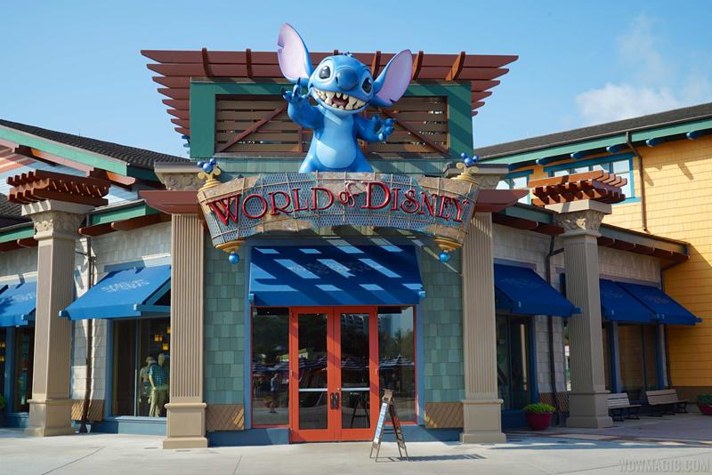
New Color scheme is being painted on the outside already, and lightposts throughout The marketplace.
Photo update as of Saturday, June 20.
As posted earlier, parts of the interior of the World of Disney store are being refreshed or changed. The east room (facing Basin) is now two rows of 10 checkout counters each, with lighted posts numbered 1 through 20 to indicate open or closed, for a total of 20 checkout counters. The center of the room is now two queues for these checkout stands, with grab-and-go trinket shelves.
Checkout stands 1-10.
View attachment 97749
Check out stands 11-20. The doors at the east end of the building are now EXIT only.
View attachment 97750
The doors at the east end of the building (facing Basin) are now EXIT only. Note there are no door handles and small labels on each door reading "Exit Only."
View attachment 97751
The World of Disney room at the northeast entrance (under Stitch), which recently was boy's toys, is now men and boy's clothing. The check out counters on the left side of this room are gone, replaced by merchandise. Note the removal of some freestanding shelves to provide a wide walkway into the room and directing traffic into the next room.
View attachment 97752
Rearranges it for better guest flow and faster guest service. The store will be gaining a good amount of space once the addition is complete.their really changing around the inside,
does adding checkouts like that reduce the amount of retail space or simply rearrange it?
adding exit only doors could give the store a bit of a better flow
it is hard to judge a new color scheme until it is finished... most cannot visualize it with new colors until mostly complete... that is why Lowes and Home Depot sell so much paint(covering the color mistake that you just made)Saw the block off for the added room when I was down. That store is already huge. The change is great. I'm not sure about this new color scheme though.


Register on WDWMAGIC. This sidebar will go away, and you'll see fewer ads.
