Disney Analyst
Well-Known Member
Love these.
Not sure why they think a theme park complex that can charge almost $200 for a single day ticket, should lead theirFrom Laughing Place:
"Signage for the Pixar Place Hotel at the Disneyland Resort has been installed at the back entrance to the hotel, coming from the Downtown Disney District. "
View attachment 763991
From Laughing Place:
"Signage for the Pixar Place Hotel at the Disneyland Resort has been installed at the back entrance to the hotel, coming from the Downtown Disney District. "
View attachment 763991
I continue to be impressed with how cheap and amateurish this entire project looks.
Even that font they used screams "Generic Airport Hotel".

I blame the oversimplification of logos and signage from the 2ks onward. Of course nowadays everyone's a graphic designer. The result is sameness.I continue to be impressed with how cheap and amateurish this entire project looks.
Even that font they used screams "Generic Airport Hotel".

Meanwhile all I can think is how much better this is than it used to be.
Thankfully it's a dying trend but Disney didn't get the memo. I agree, it's very generic.

though idealy id like to see that hotel demolished for a CA expansion, they did a pretty good job with what they had imo.
The stripes on the side of the building are hideous.
For me they’re just stripes, not hideous imo.
Hideous to me would be the old rooms.
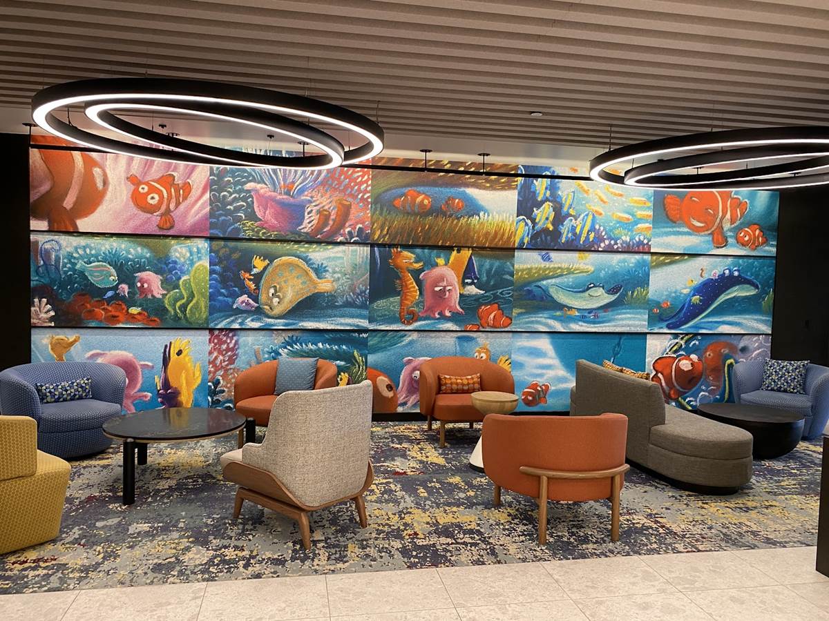
View attachment 764503
View attachment 764504

"Stripes are not on trial here!"What excuse do those stripes have?
This isn't amazing and the furniture and colors are outdated, but to me both these items should have been fixed without needing to throw random pixar graphics all over the room.For me they’re just stripes, not hideous imo.
Hideous to me would be the old rooms.
View attachment 764503
View attachment 764504

Register on WDWMAGIC. This sidebar will go away, and you'll see fewer ads.
