-
Welcome to the WDWMAGIC.COM Forums!
Please take a look around, and feel free to sign up and join the community.
You are using an out of date browser. It may not display this or other websites correctly.
You should upgrade or use an alternative browser.
You should upgrade or use an alternative browser.
News Tomorrowland love
- Thread starter marni1971
- Start date
The Rocketeer
Well-Known Member
I almost wish they'd take this land out of its misery and (temporarily) shutter everything until they get a plan going, but they'd never do that obviously. Carousel of Progress has had audio issues recently and could really use an update at this point, the TTA will reopen Lord knows when, still no replacement for Stitch, and Laugh Floor might not come back this year, if at all. Space Mountain could use some TLC too. It's hard to believe, but it has been almost 12 years since its last major refurbishment in 2009. I understand not wanting to pull the trigger presently, but why didn't they move forward with anything over the last 2, 3, or 4 years?
I really do not understand this overhaul at all. Did they really think TRON would just solve all their problems? IMO, the return to the old 70's sterile look in the front doesn't compliment the appearance of Lightcycle Run at all, unless they were planning on it being different from the Shanghai facade, though it doesn't appear that way in all of the concept art. Since the fall of 2014 when this all began it seems like it's only been small or purely aesthetic changes, aside from the obvious addition but who know when that will get done either. Signs are pointing to next spring at the earliest unless something's changed.
Do you think the imagineers have no idea what to do with the budget the have been given? Do they even have (or had) a budget and a team together?
*sighs*
Movielover
Well-Known Member
It feels like Imagineering is conducting this project through a giant game of telephone. 1st imaginer has vision, puts it in motion then leaves, passing along the info to the 2nd Imagineer who then proceeds to pass it along to the third and so forth.Do you think the imagineers have no idea what to do with the budget the have been given? Do they even have (or had) a budget and a team together?
IMO this whole makeover was a mistake. While I enjoy the sleekness of the Tron aesthetics (don't hate me, I enjoy the movie) The fantastical nature of this Tomorowland to me worked really well in contrast to the realism future aesthetic of Epcot and really help fit it in to The Magic Kingdom. The bright neon, crazy "cogs and gears" look fit well with the fun atmosphere.
castlecake2.0
Well-Known Member
I agree, I wish they would have just left it how it was. ‘94 tomorrowland kinda fizzled out by space mountain anyways, they could have just made a separate “neighborhood” back there with the tron look and leave the rest of the land alone. Would been nicer than the mess we have now.It feels like Imagineering is conducting this project through a giant game of telephone. 1st imaginer has vision, puts it in motion then leaves, passing along the info to the 2nd Imagineer who then proceeds to pass it along to the third and so forth.
IMO this whole makeover was a mistake. While I enjoy the sleekness of the Tron aesthetics (don't hate me, I enjoy the movie) The fantastical nature of this Tomorowland to me worked really well in contrast to the realism future aesthetic of Epcot and really help fit it in to The Magic Kingdom. The bright neon, crazy "cogs and gears" look fit well with the fun atmosphere.
Movielover
Well-Known Member
Out of all the Tomorrowland makeovers on both coasts, '94 Tomorrowland was the best (I'm excluding DL Tomorrowland 1967 due to IMO that's when that land was officially complete).‘94 tomorrowland kinda fizzled out by space mountain anyways
The Empress Lilly
Well-Known Member
I think TL looks better than it has in years. I'm still on board. I only wish they would push the overhaul further.
TL75 > TronLand > TL94 > ToonLand
TL75 > TronLand > TL94 > ToonLand
oogie boogie man
Well-Known Member
I think Tomorrowland is looking more boring than ever. Going back to the original look isn't a good idea when it was plain and unpleasing to the eye.
They should have went with the alien spaceport theming. Talk about a feast for the eyes that would have been.
They should have went with the alien spaceport theming. Talk about a feast for the eyes that would have been.
oogie boogie man
Well-Known Member

My grandma's living room is more exciting looking. It looks like Kennedy Space Center threw up.
Bocabear
Well-Known Member
In 1994 (27 years ago) Tomorrowland looked fresh and colorful and vibrant. An exciting new addition...that unfortunately never went far enough and was never completed as the idea was envisioned... But the change at the time was exciting and new...Colorful and lots of night time lighting and eye candy.
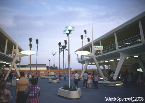
Removing the color and painting everything white is a teeny tiny step into restoring the look and feel of the original Tomorrowland and not even slightly close enough to what needs to happen to reinvigorate the land... It desperately needs a giant statement piece at the entrance...Like the original towers and Gull-wing waterfalls... The rocks are tragic and completely underwhelming The TRON building is now visible...Should they not have used some of the same architectural elements of the new Tron building in the entry concourse to tie it into the land rather than leave it as something "dropped" in from another park? Architectural elements from Space Mountain used in the entry concourse? (The original attraction signs had the look of the Space Mountain spires)
I am glad for the return of the white paint... It was time for a change again...but they need to complete the job and tie all of Tomorrowland together...
Last edited:
The Empress Lilly
Well-Known Member
Eh, this is incomplete TL before '75.
My grandma's living room is more exciting looking. It looks like Kennedy Space Center threw up.
Without its weenie: the soaring rockets circling the giant spaceship for the space age land!
At least most of TL94 had something of a cohesive theme. And phenomenal background music.
GimpYancIent
Well-Known Member
The clean look makes the place look fresh. The steam punk look was dated and got run down. I like the clean retro.
My grandma's living room is more exciting looking. It looks like Kennedy Space Center threw up.
Movielover
Well-Known Member
I like the simplicity of the clean look I just think it needs more color.The clean look makes the place look fresh. The steam punk look was dated and got run down. I like the clean retro.
_caleb
Well-Known Member
I think (with nothing to actually back up my opinion) they were going to try to add lighting—projection mapping and LEDs—to do a sort of overlay “The Grid” from TRON on the stark white space-age look to tie it all together in some way.
Well, that would have been a pre-pandemic dream, anyway.
Well, that would have been a pre-pandemic dream, anyway.
I’m not a fan of Disney’s continued overuse and reliance on projections. I’m also not a fan of a sterile white and gray color scheme for TL. Something creative and in the middle of those two would do wonders. IMHO.
The Rocketeer
Well-Known Member
I agree it wasn't fully fleshed out, but I still enjoyed it for it once was.In 1994 (27 years ago) Tomorrowland looked fresh and colorful and vibrant. An exciting new addition...that unfortunately never went far enough and was never completed as the idea was envisioned...
The Rocketeer
Well-Known Member
Cool idea, but during the day it would still be very bland unless they used those blues and oranges recently painted on the walls under the PeopleMover track on each side of the avenue of the planets on the supports, which would still probably look tacky and especially the orange. I would definitely not be opposed to a full Tron Legacy grid look if done right as I love that film, but it really wouldn't fit with any of the other attractions thematically and they wouldn't dare to change Space Mountain's color scheme after Disneyland's... interesting... bronze look that seemingly everyone detested.I think (with nothing to actually back up my opinion) they were going to try to add lighting—projection mapping and LEDs—to do a sort of overlay “The Grid” from TRON on the stark white space-age look to tie it all together in some way.
Well, that would have been a pre-pandemic dream, anyway.
Agreed. I was glad they spared the Speedway when they announced Tron, but honestly if they removed it they could've made it look a whole lot better with a straight on angle and even added another small attraction or Flynn's Arcade. Now its crammed in the back, yet still sticks out like a sore thumb in many places. Tron wasn't designed for this park and it shows.I agree, I wish they would have just left it how it was. ‘94 tomorrowland kinda fizzled out by space mountain anyways, they could have just made a separate “neighborhood” back there with the tron look and leave the rest of the land alone. Would been nicer than the mess we have now.
The art direction in Meet the Robinsons was perhaps the best attempt at a fun and futuristic world of Tomorrow. Given it's proximity to Fantasyland, this would have probably been the best aesthetic when transitioning between lands. Even Tron's canopy with it's bouncy vibe would have fit. The Meet the Robinsons' art direction seemed to incorporate both the '75 treatment (quintessential Tomorrowland) with the colors from the '94 overlay. I think a similar treatment would have worked here, if done properly. Anything that distances itself from Epcot and makes it uniquely a "Magic Kingdom" theme would be appropriate.
The trick would be making it futuristic without being too saccharine sweet or too "Space Race". Something in between. Groening's FUTURAMA would probably work as a good baseline color concept so long as Imagineering also kept the white '75 JFK airport architecture.
I think they're close to fleshing it out. They just need to drop the pastel paints and tangrams which doesn't work, IMO.
Last edited:
lazyboy97o
Well-Known Member
I don’t understand why Tomorrowland has to have a singular color scheme and style. Other lands are not as singular in their look.I’m not a fan of Disney’s continued overuse and reliance on projections. I’m also not a fan of a sterile white and gray color scheme for TL. Something creative and in the middle of those two would do wonders. IMHO.
Register on WDWMAGIC. This sidebar will go away, and you'll see fewer ads.
